BARD
Weaving poetry and purpose through the brand identity, website design, custom typeface and series of campaign videos we developed for award-winning architecture practice, BARD.
Creative direction, branding and design proposal for Edinburgh Art Festival
Warriors were selected as one of four agencies to produce a proposal for the creative direction, brand identity and design work for Edinburgh Art Festival 2020.
The festival takes place alongside Edinburgh’s Fringe Festival which welcomes 2.7 million visitors each year. Standing out in a city swamped with people and performers is not an easy feat.
Our proposal was not selected, however we believe it could offer a strong step towards achieving the objectives outlined by the festival.
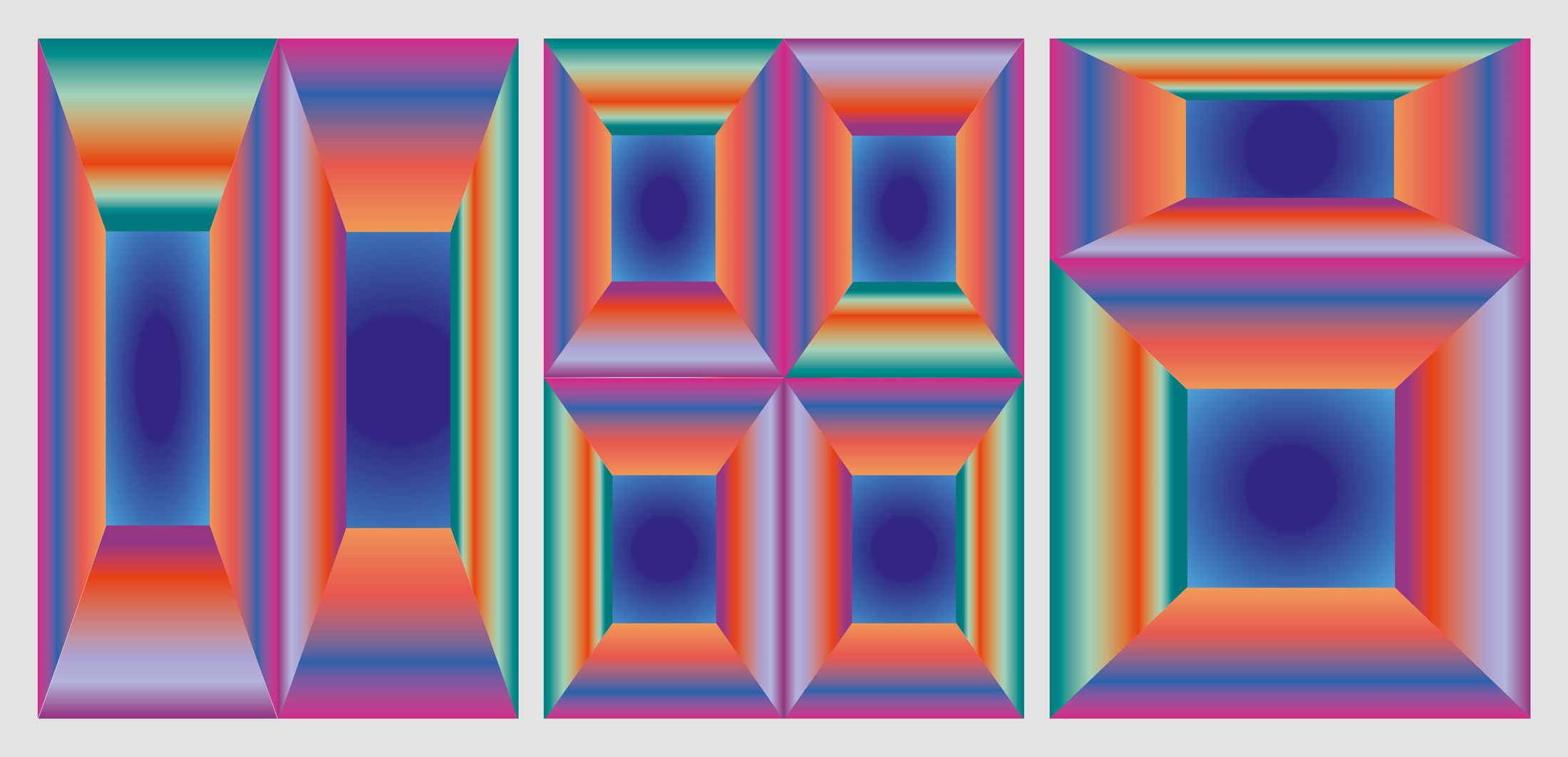
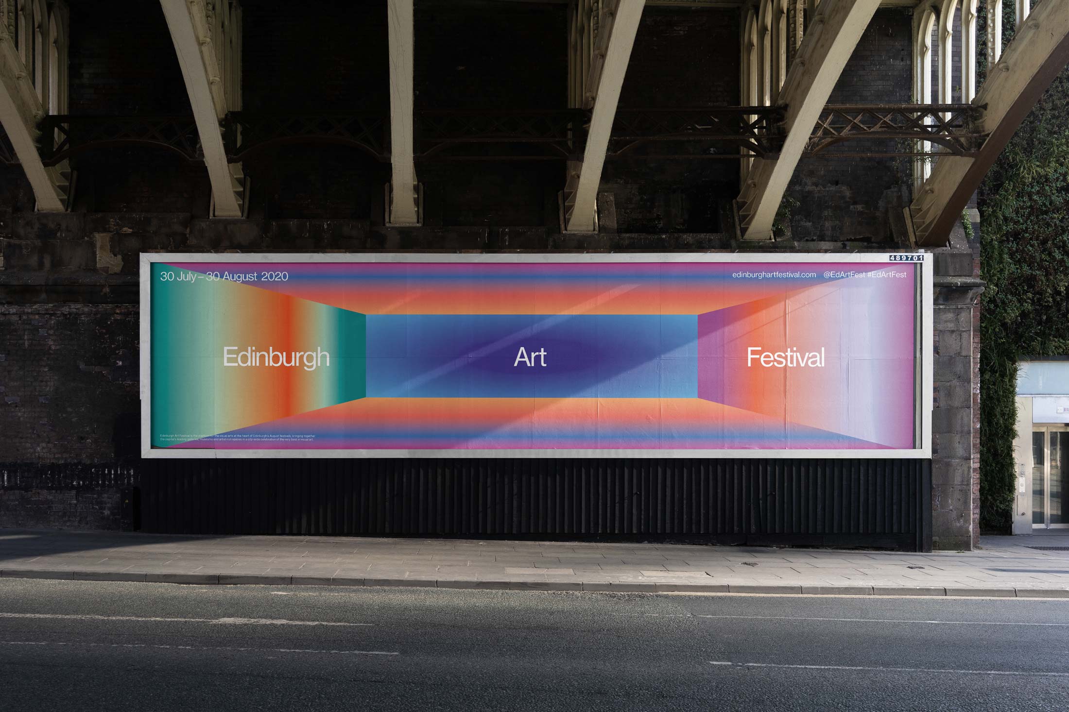
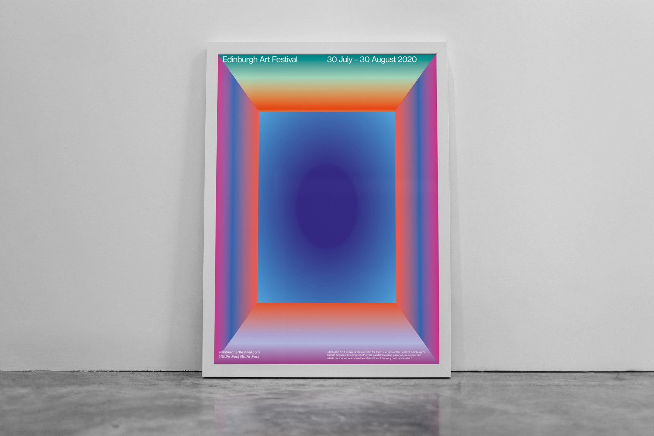
We wanted to create the impression of looking into a new space and through attending the festival you could step into a new stimulating world.
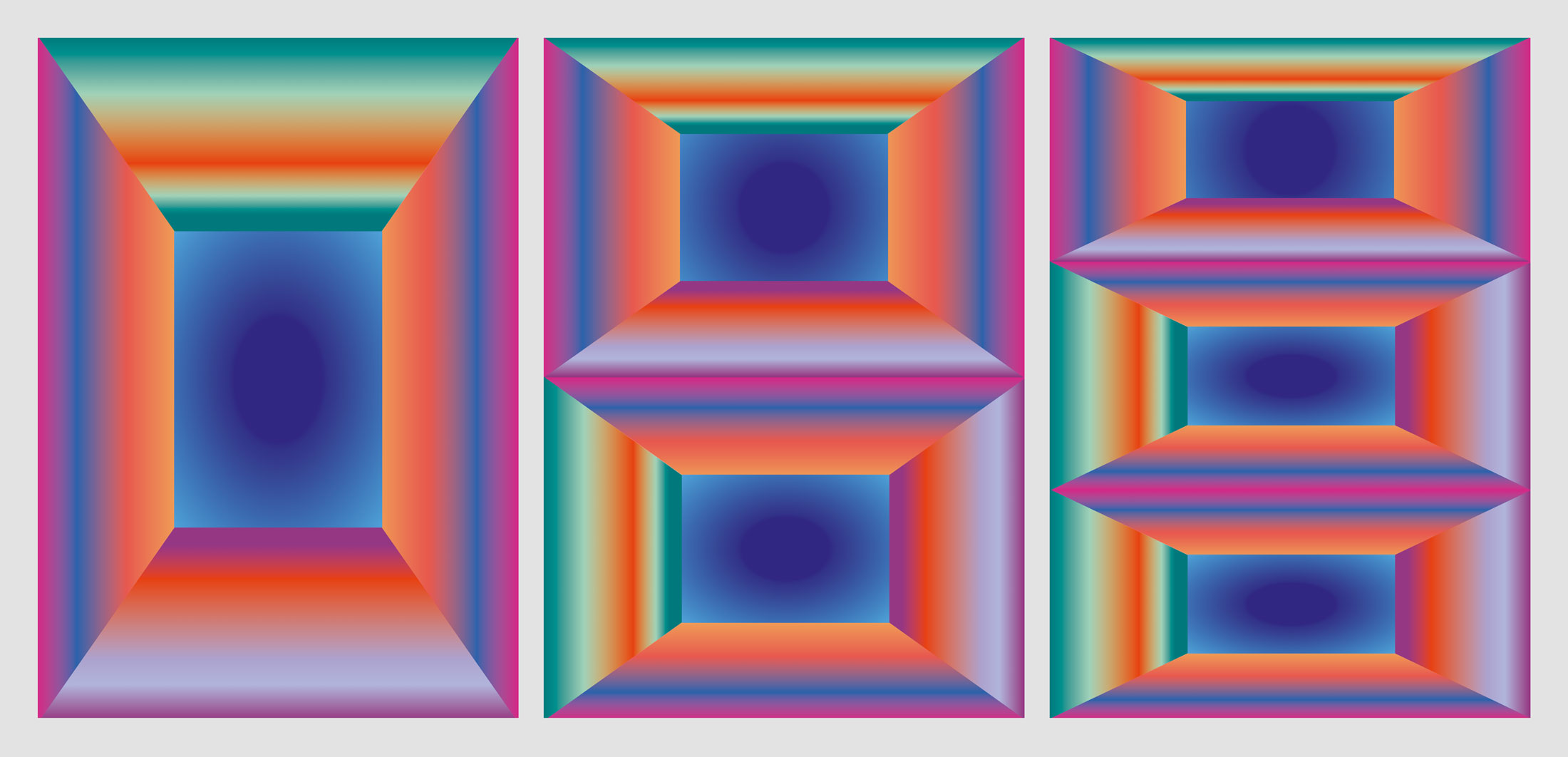
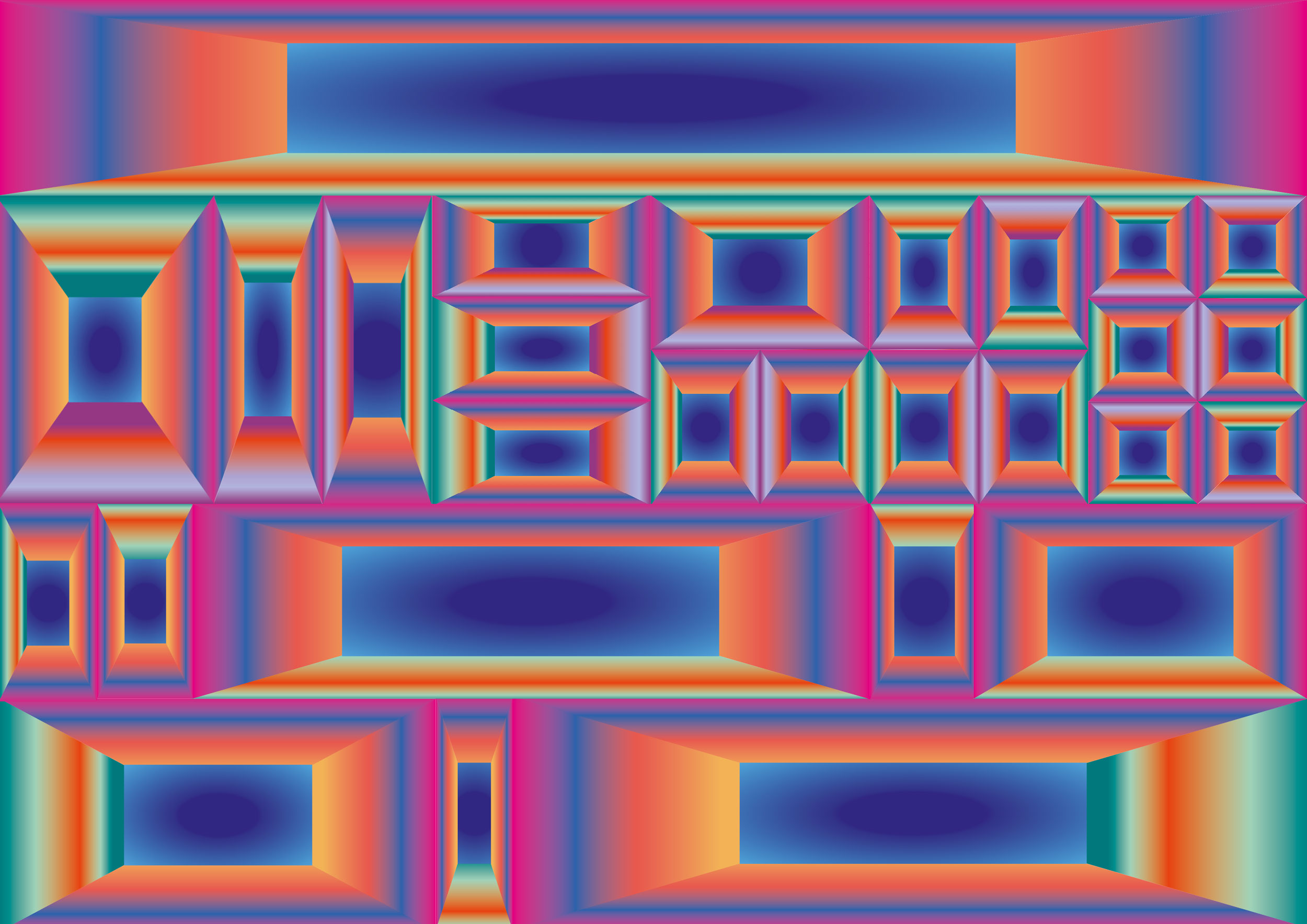
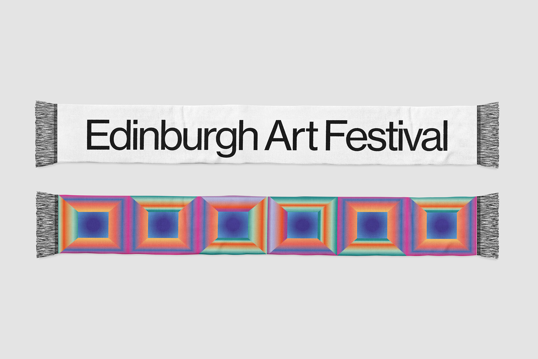
The shapes in the artwork form an abstract representation of a room, like the gallery spaces offering new contexts for artwork, or a frame – like the theoretical and literal framing used to highlight artwork.
A spectrum of powerful colours ensure the identity is visually arresting and reflects the broad range of artists and artwork exhibited.
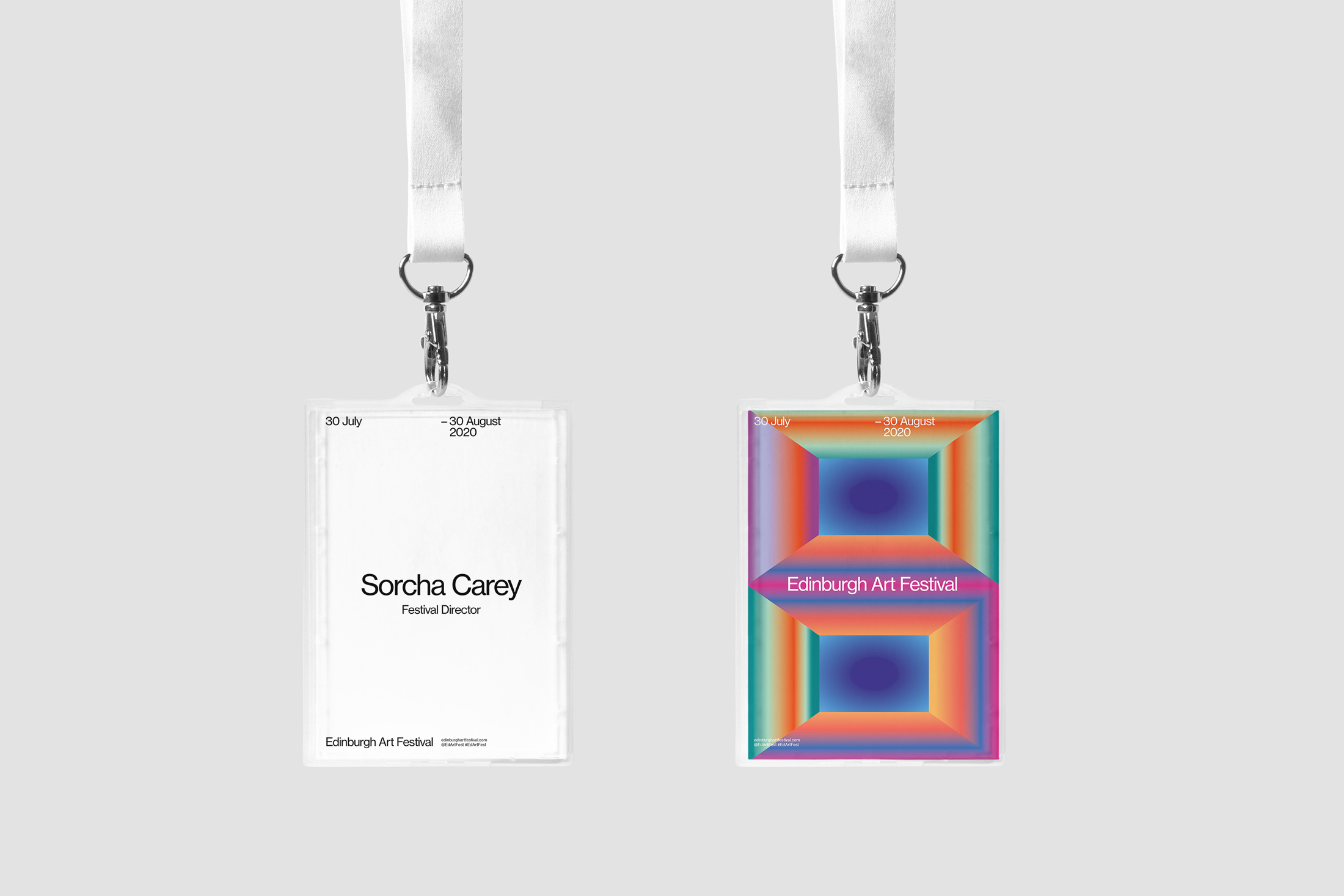
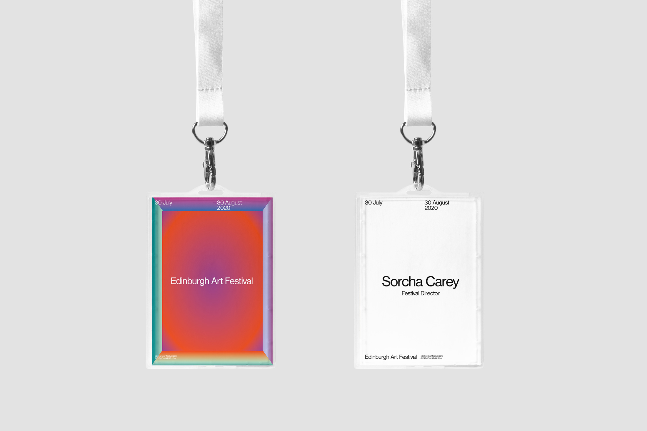
These artwork spaces or frames can then be multiplied and arranged to create a modular system which fits any size or shape of media.
Combining bright, bold colours with clear, functional typography ensures the festival commands attention on the street and online while communicating key information clearly.
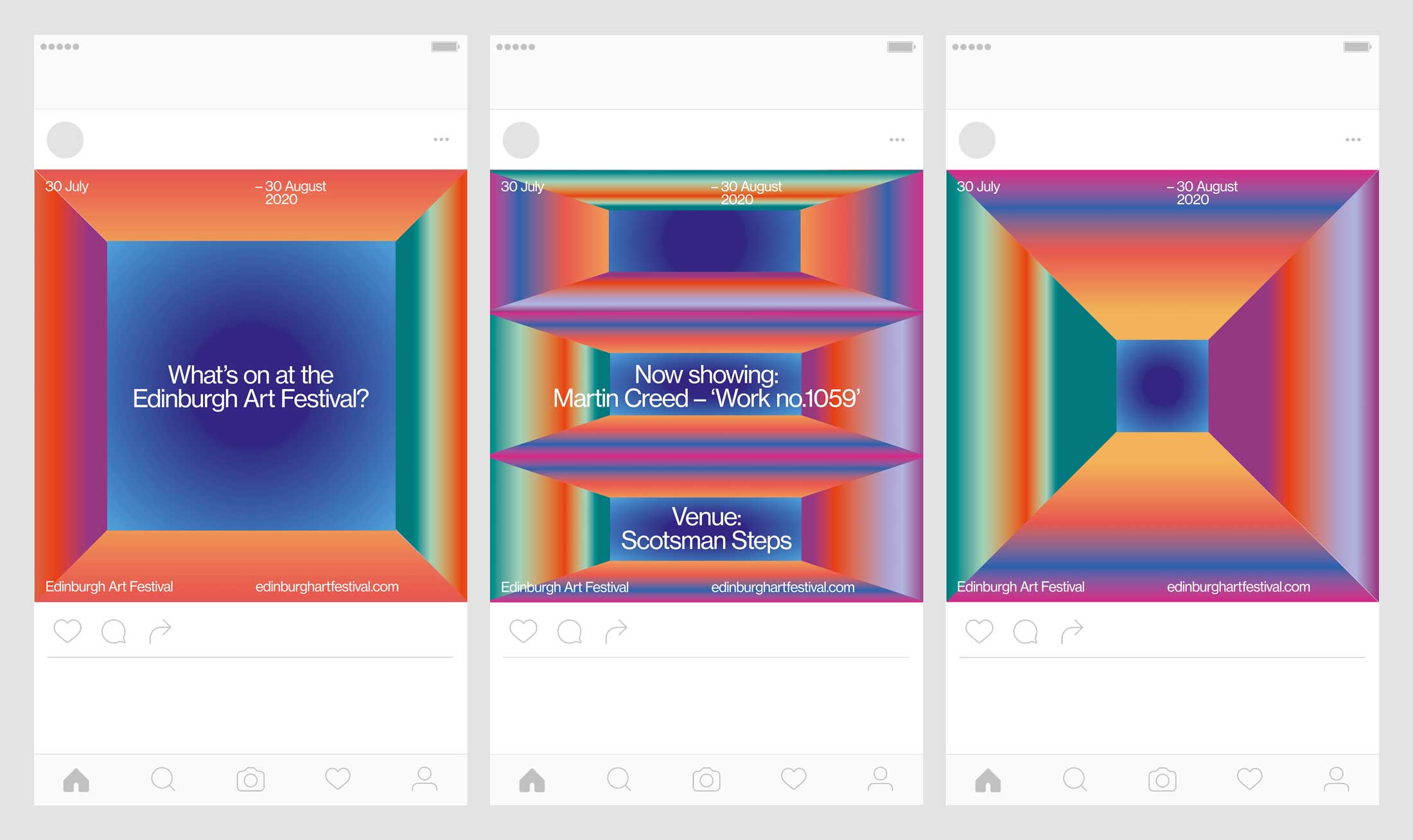
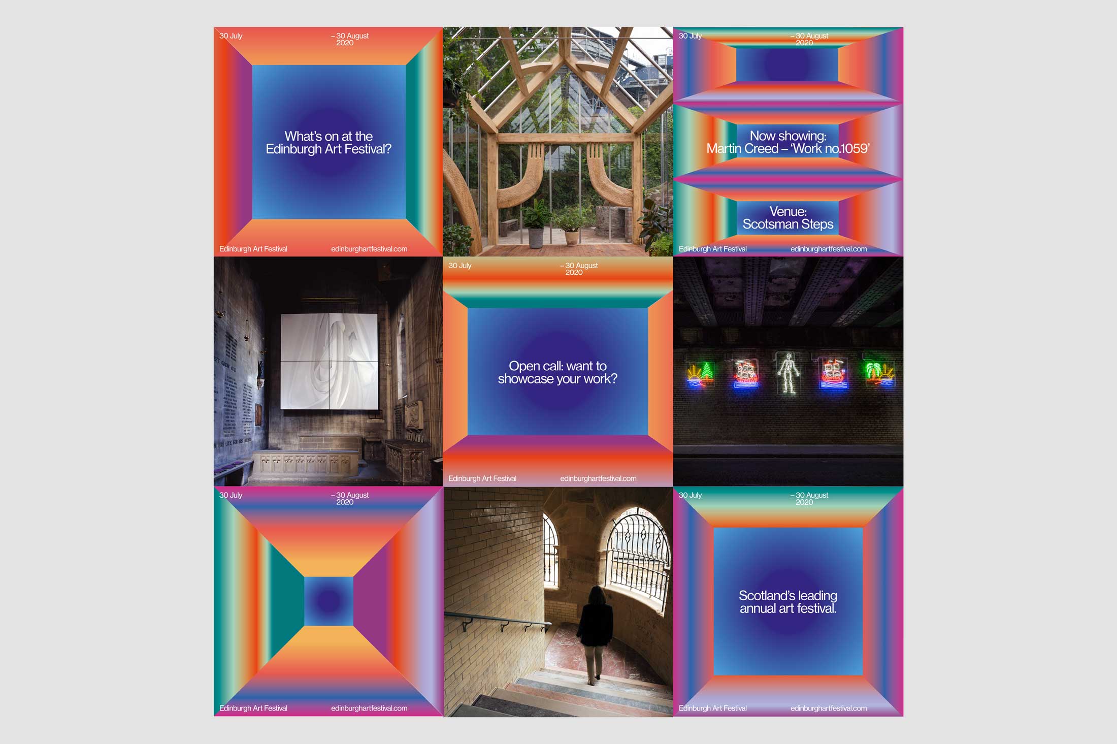
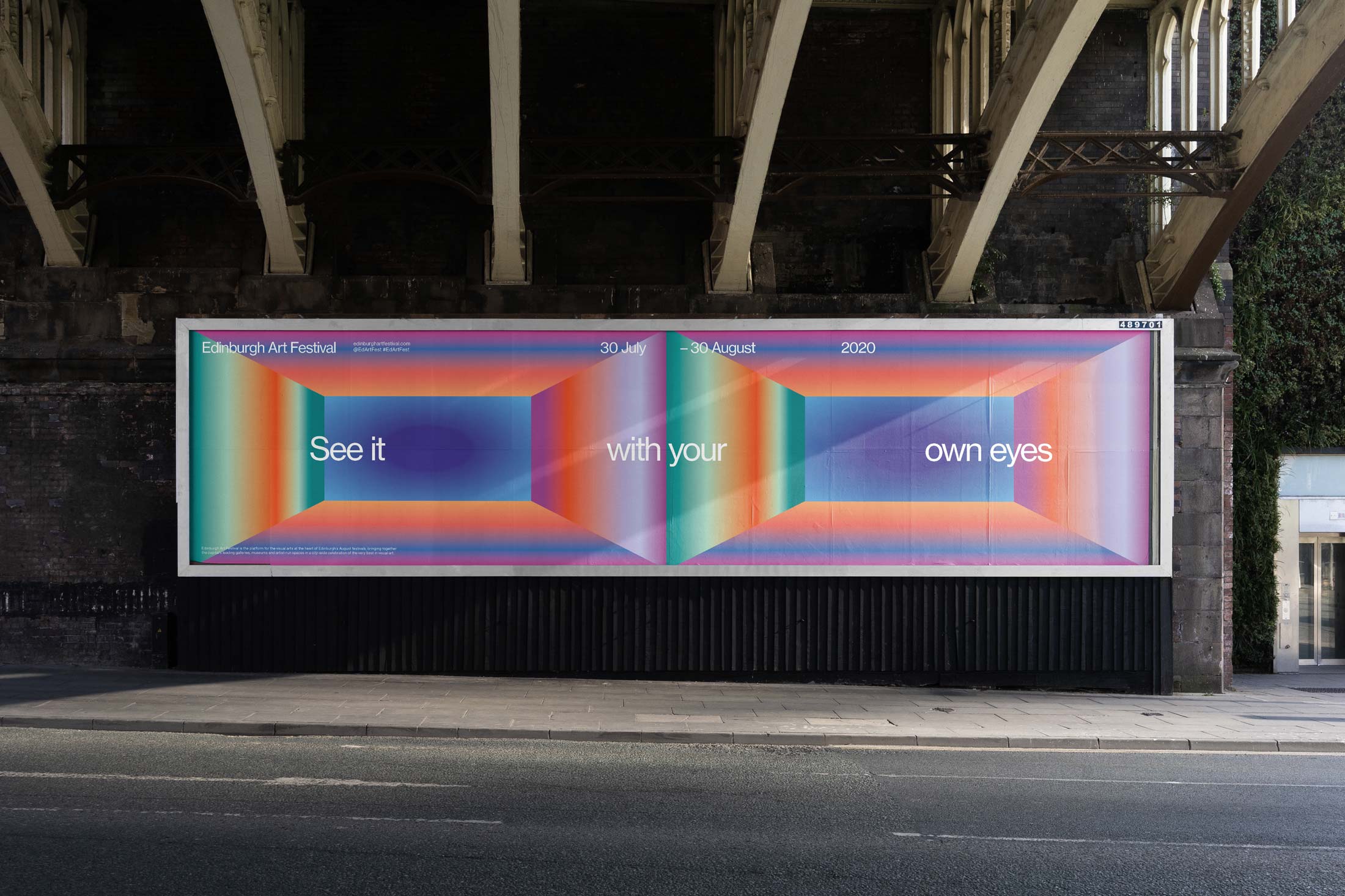
To help engage with new audiences who may not consider engaging with art, we created a series of statements and direct invitations written in a personal tone for the campaign which might intrigue and encourage potential new visitors to visit exhibitions.
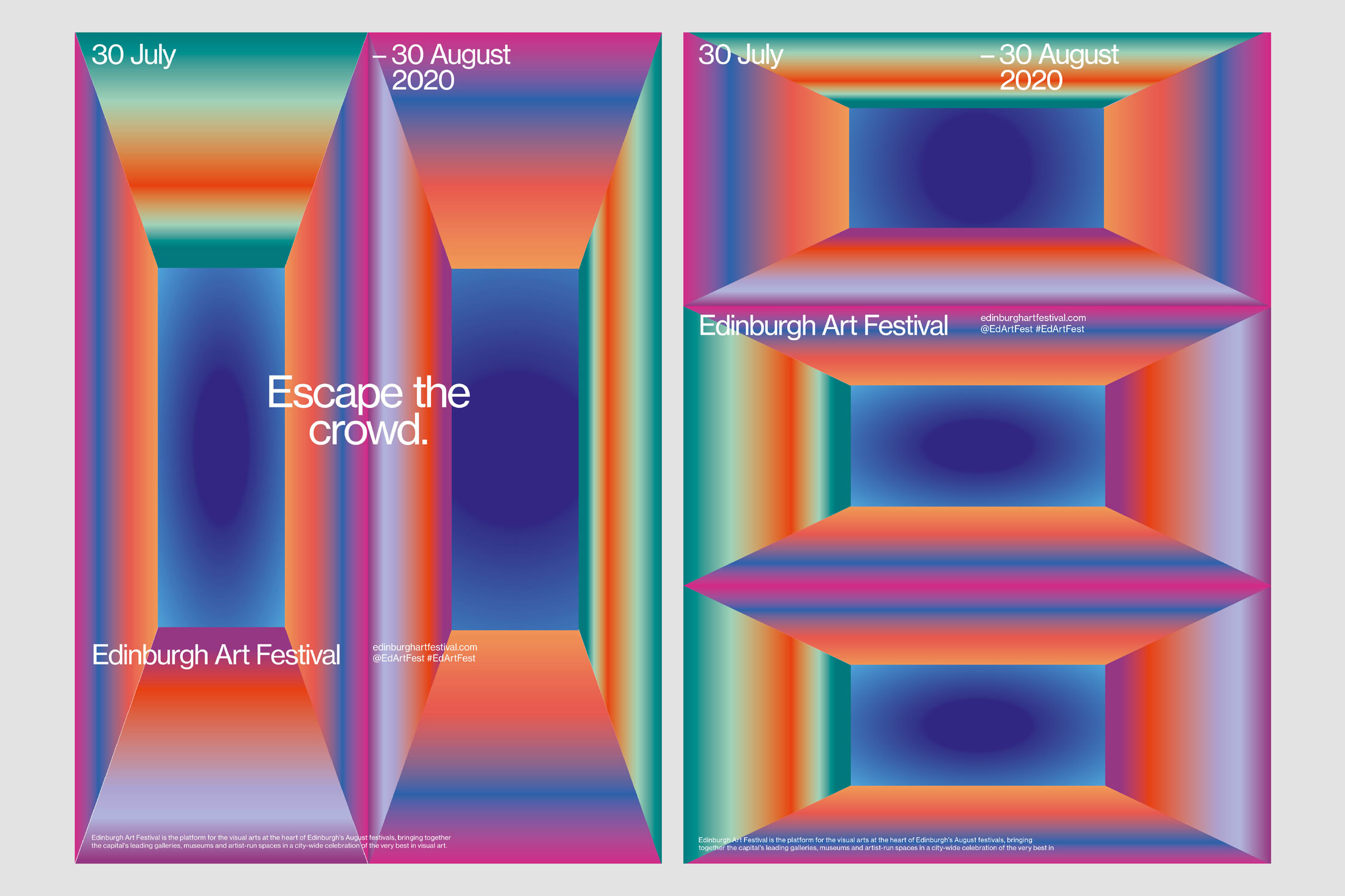
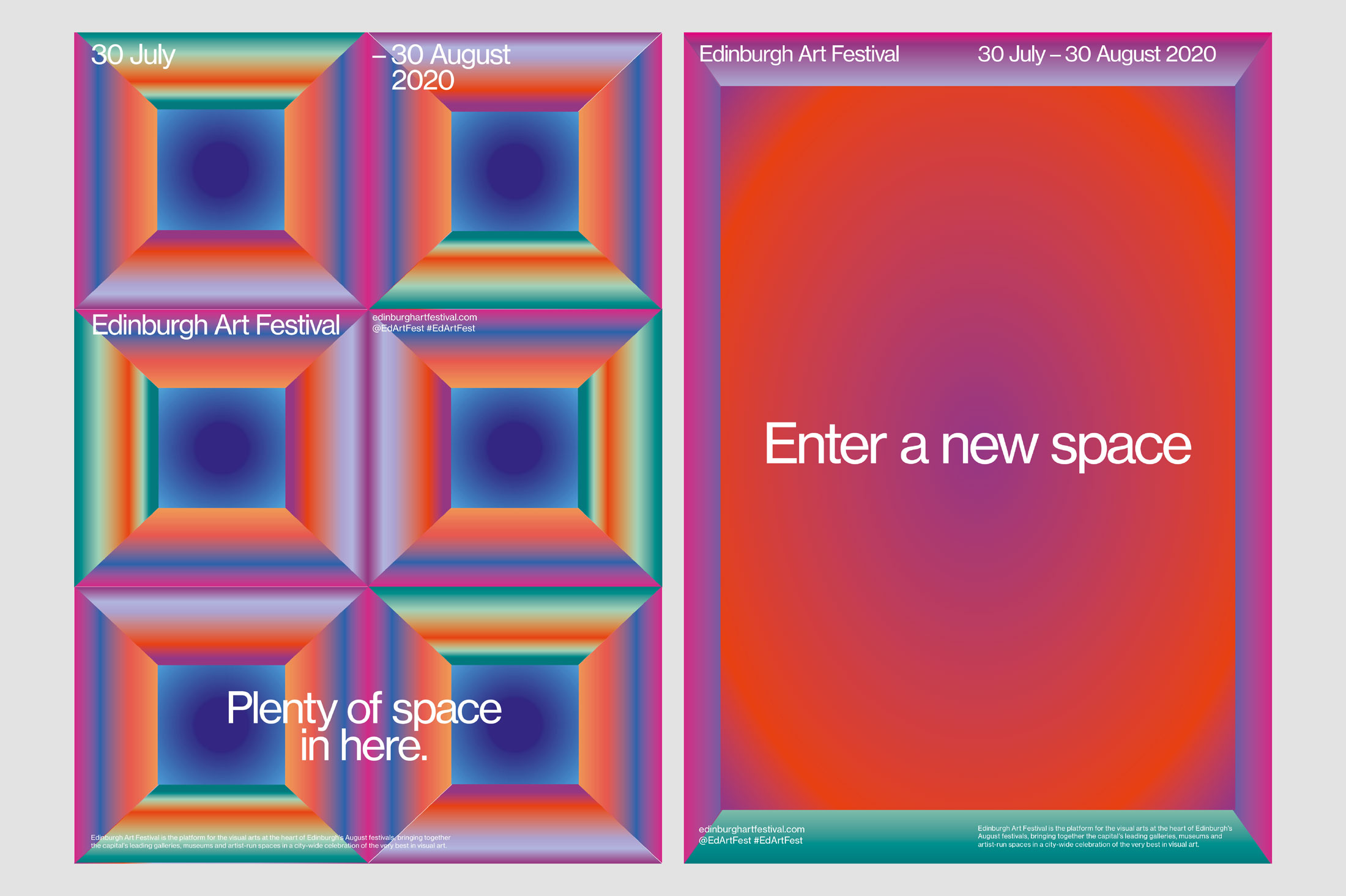
The identity and campaign spans print, digital and environmental:
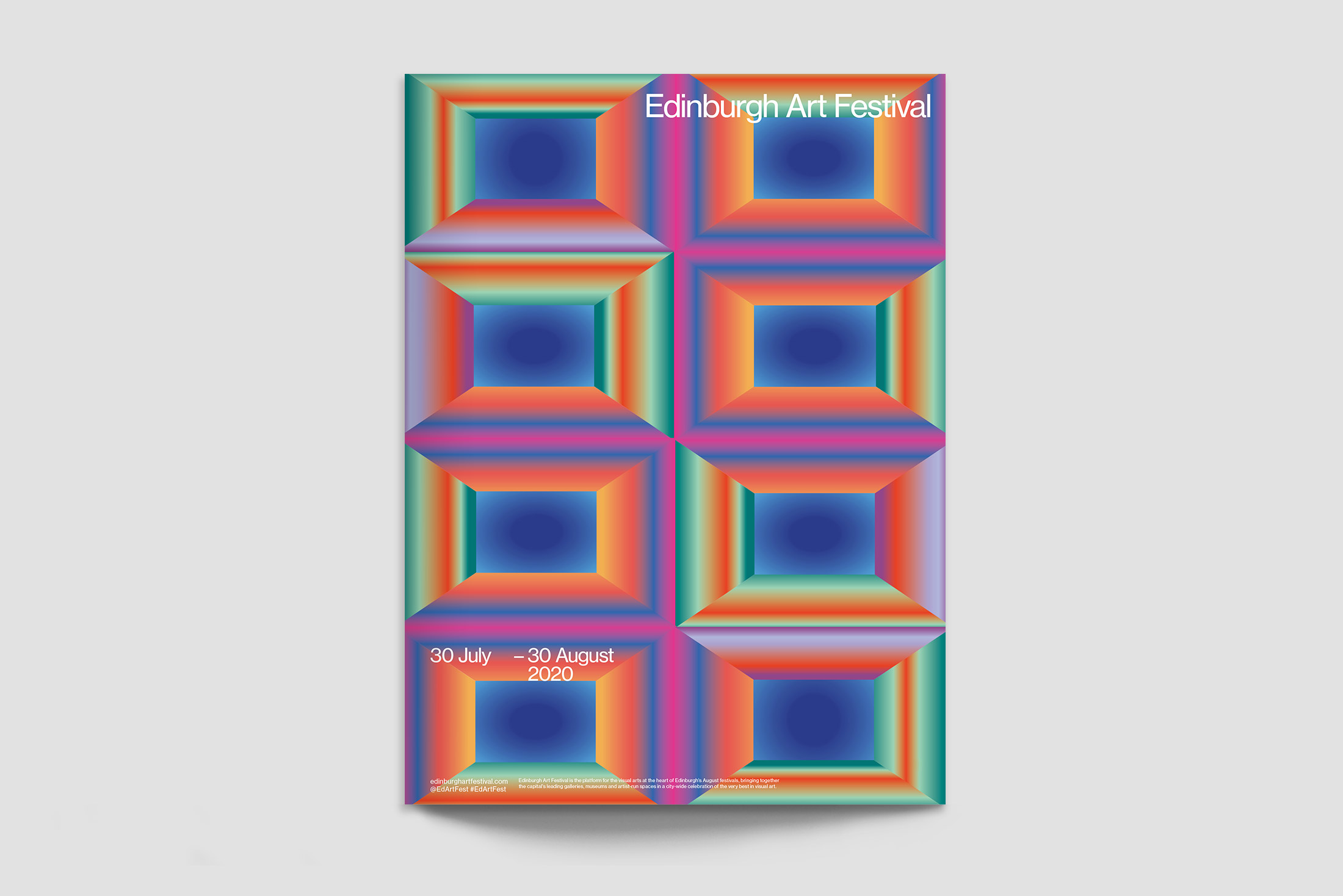
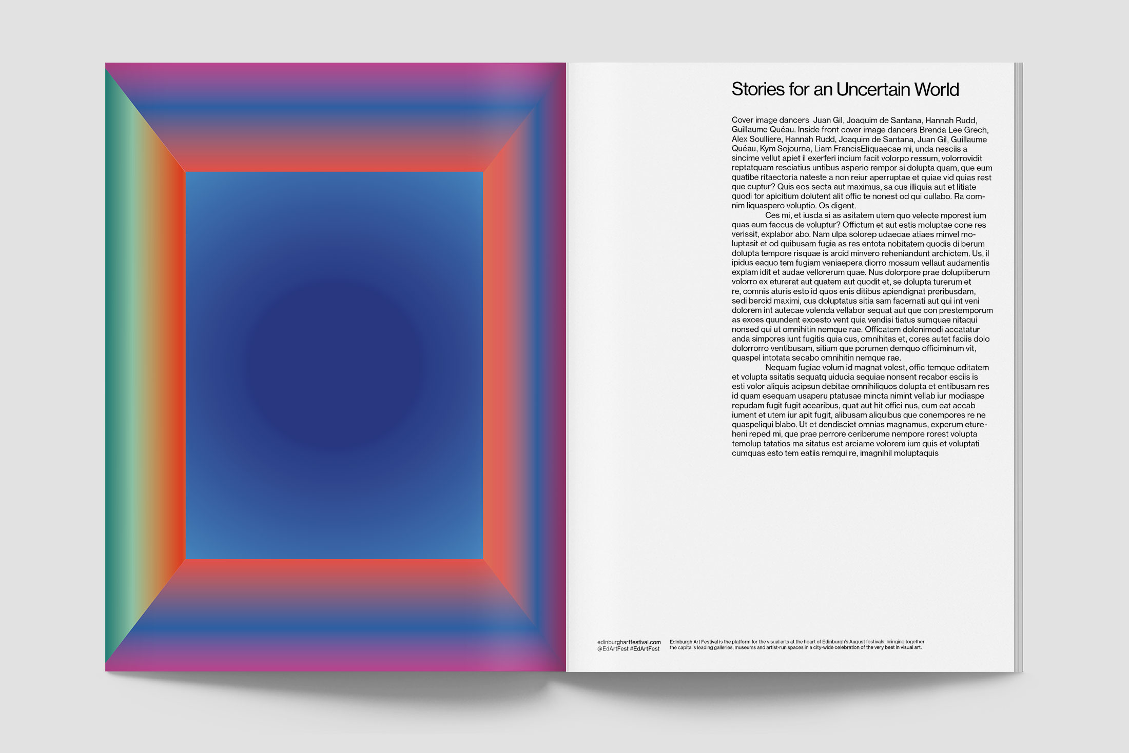
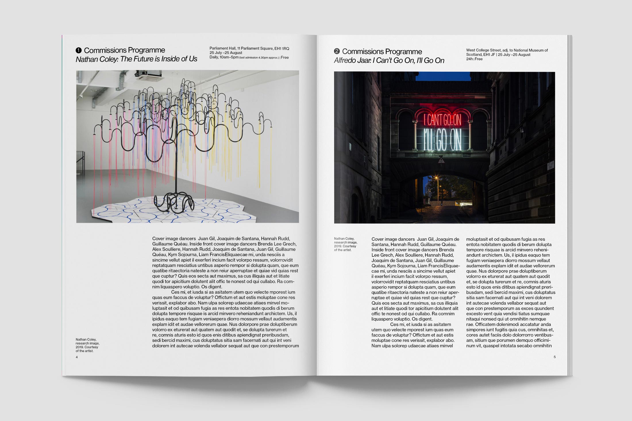
Using colour and abstract forms to create the campaign artwork ensures the identity is not tied with a specific artwork, artist or gallery but instead feels like a broad contemporary art festival and reflects the diversity of the programme.
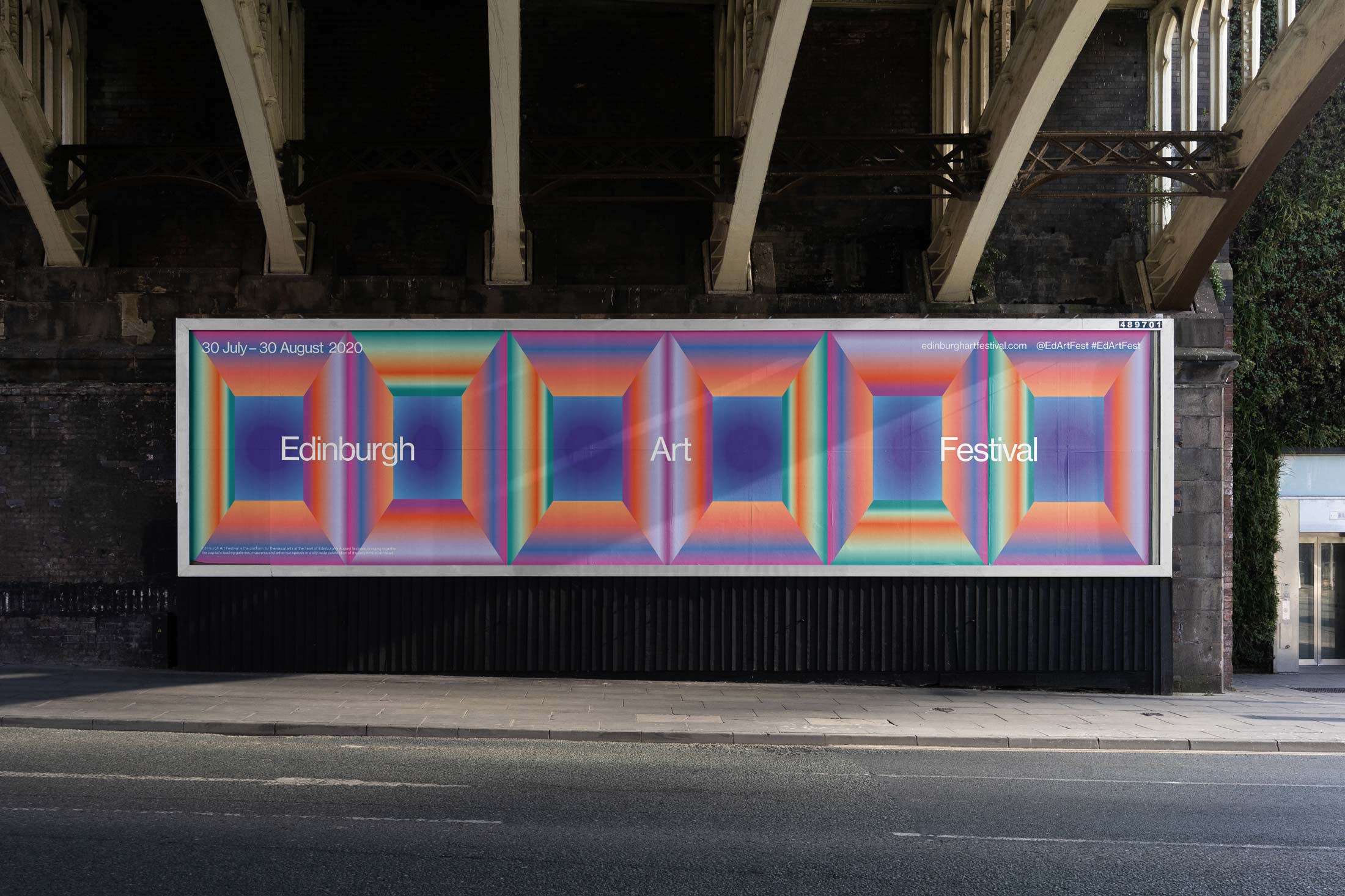
Billboards ensure the festival identity commands attention on the street and can be adapted to stand out in advertising spaces of any shape or size.
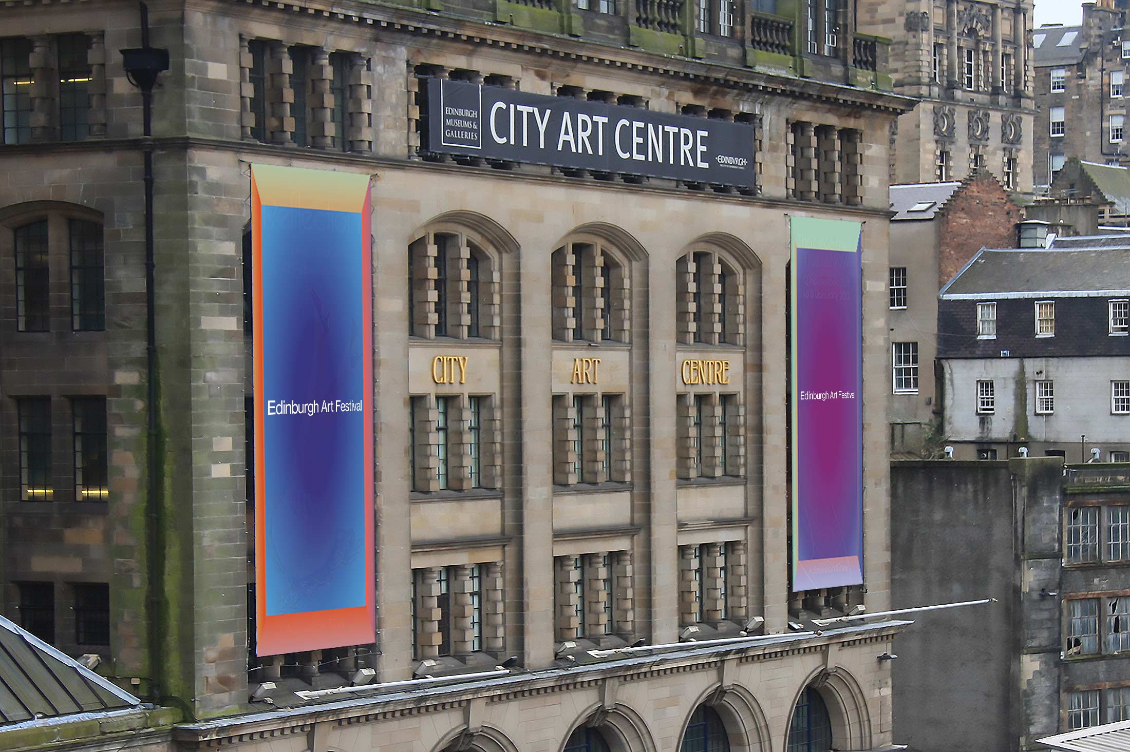
We designed the identity with motion in mind. The gradient colours and flexiblility lends itself perfectly to digital advertising. Whether small-scale on mobile phone screens through social media or large-scale digital advertising.
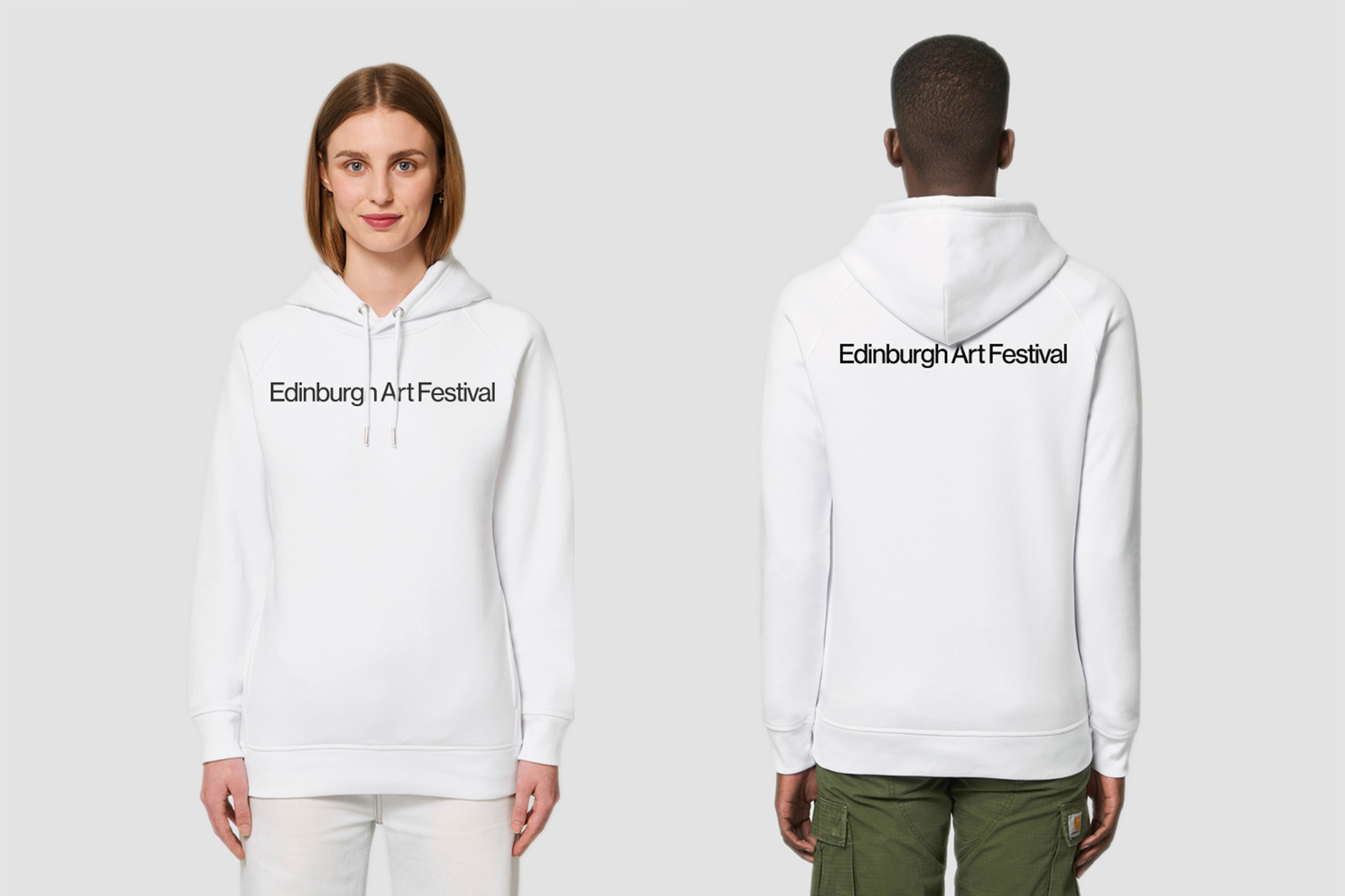
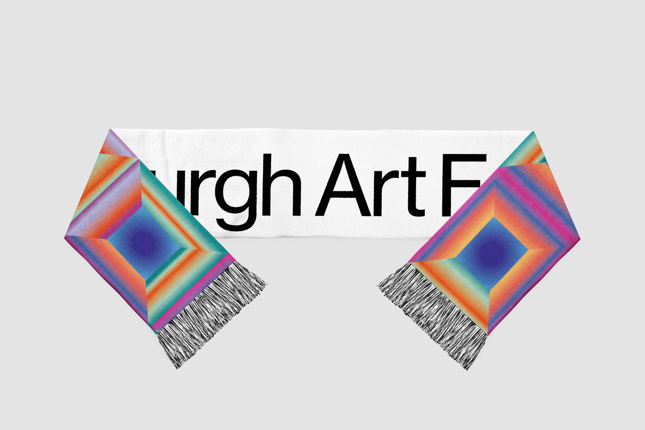
By creating an identity which is aesthetically pleasing and emotive through colour, we aimed to create desirability and the opportunity to sell prints and merchandise including printed posters and clothing.
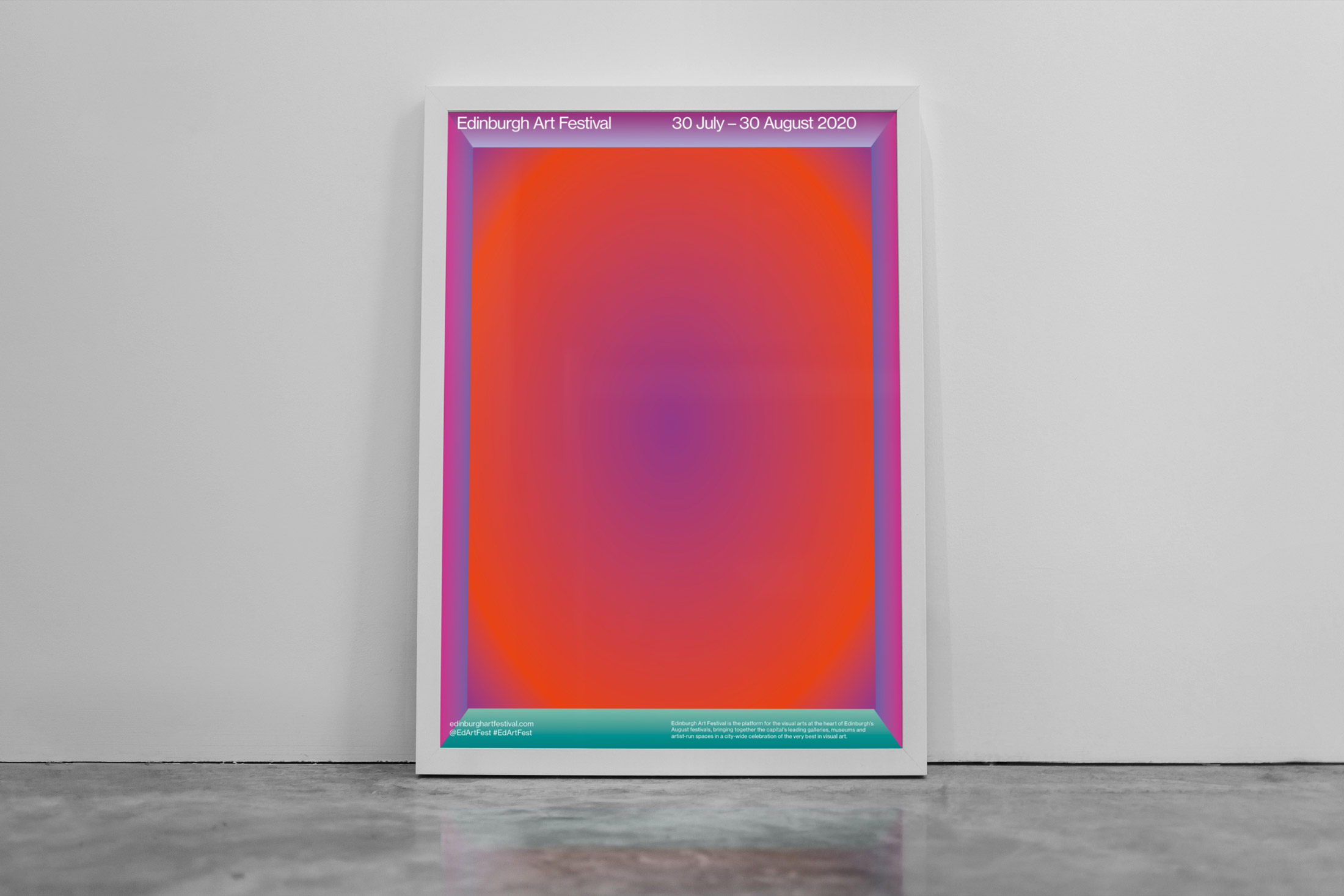
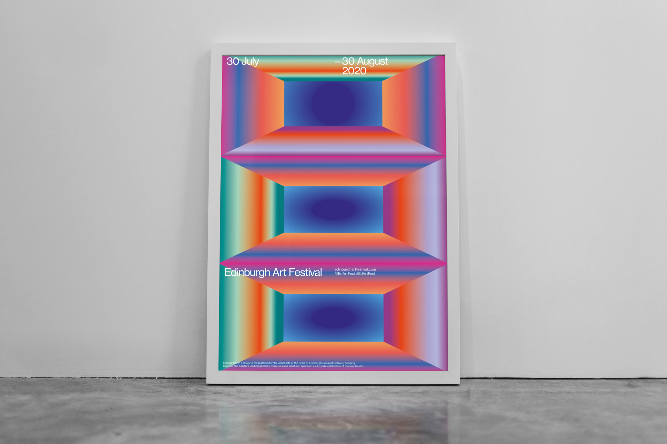
Improving digital engagement by implementing a considered, targeted social media campaign and bringing graphic artwork and motion in to play where possible in the lead up, during and following the festival.
