Shorts Film Festival
Establishing a short film festival through naming, branding and a promotional campaign which helped welcome thousands of inspiring submissions
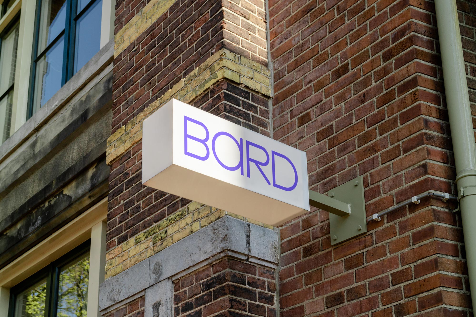
Balancing poetry with practicality in our brand identity, custom typeface and website for award-winning architecture practice BARD
BARD reached out to discuss how their practice is presented with the aim of improving perception and building a strategy for the future.
Presenting the business professionally while conveying the vision, qualities and approach of their team was our challenge.
Within Celtic cultures BARD can mean storyteller, maker, poet so we wove this through every aspect of the identity:
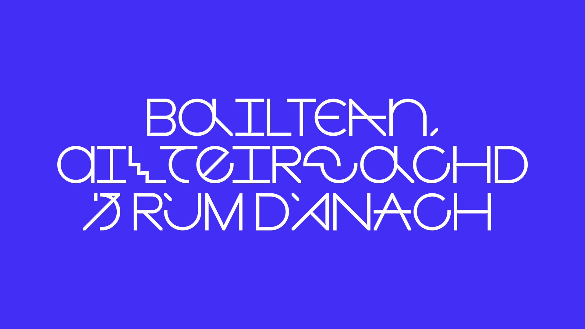
At the heart of the identity is a custom typeface developed in collaboration with Mitchell Gillies inspired by Charles Rennie Mackintosh, medieaval lettering, architectural drawings and pushing creativity within limitations - reflective of how BARD approach each of their projects.
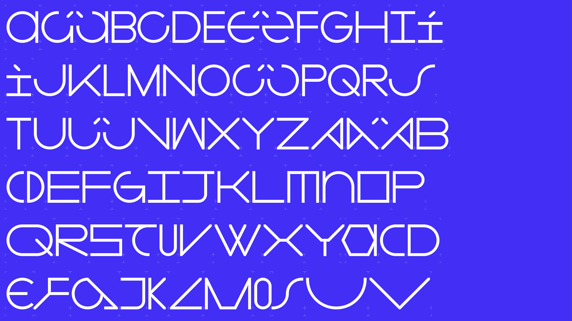
BARD Type includes a rethinking of accents created specifically for Scottish Gaelic (Gàidhlig) to respect the roots of the practice.
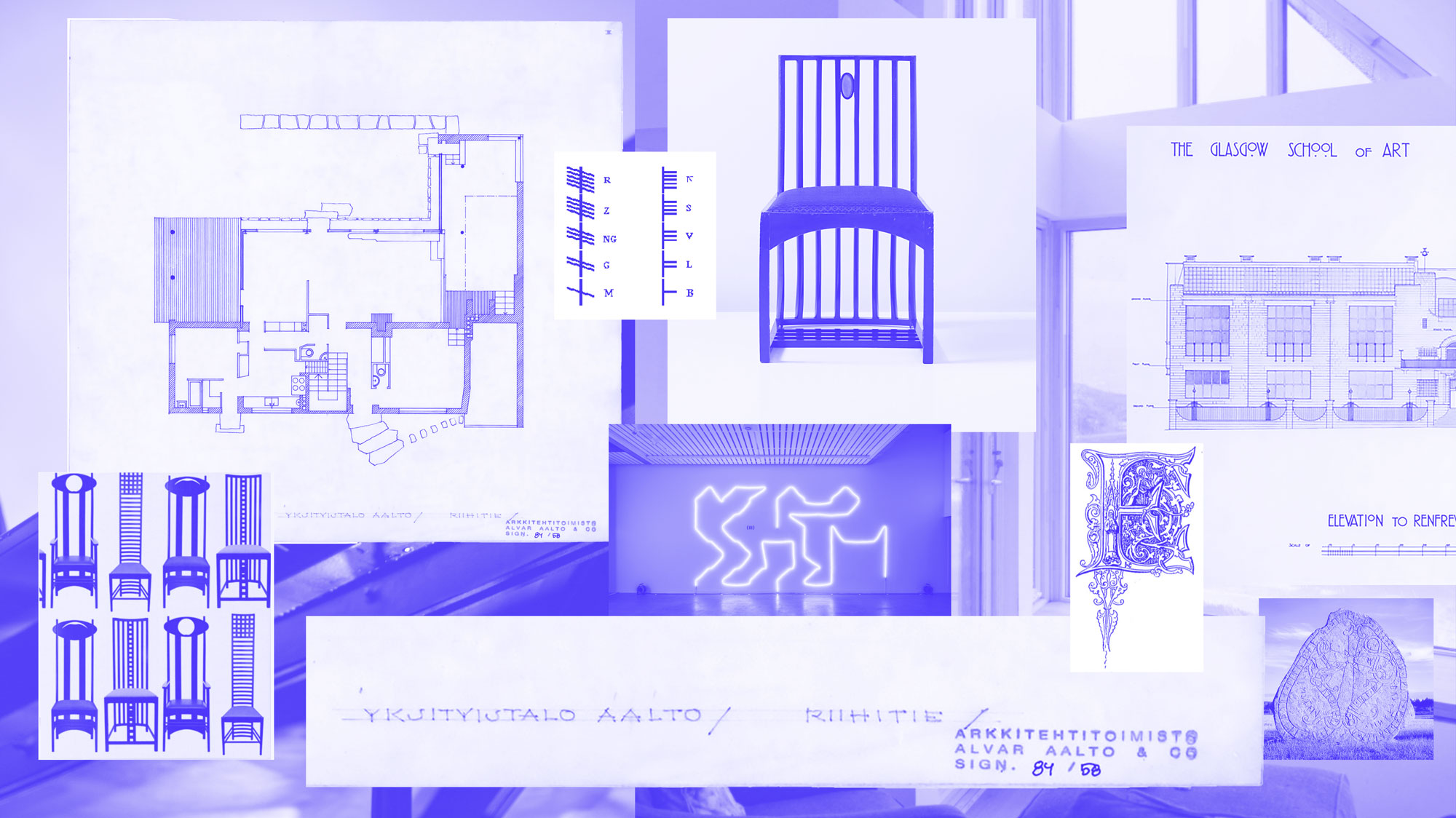
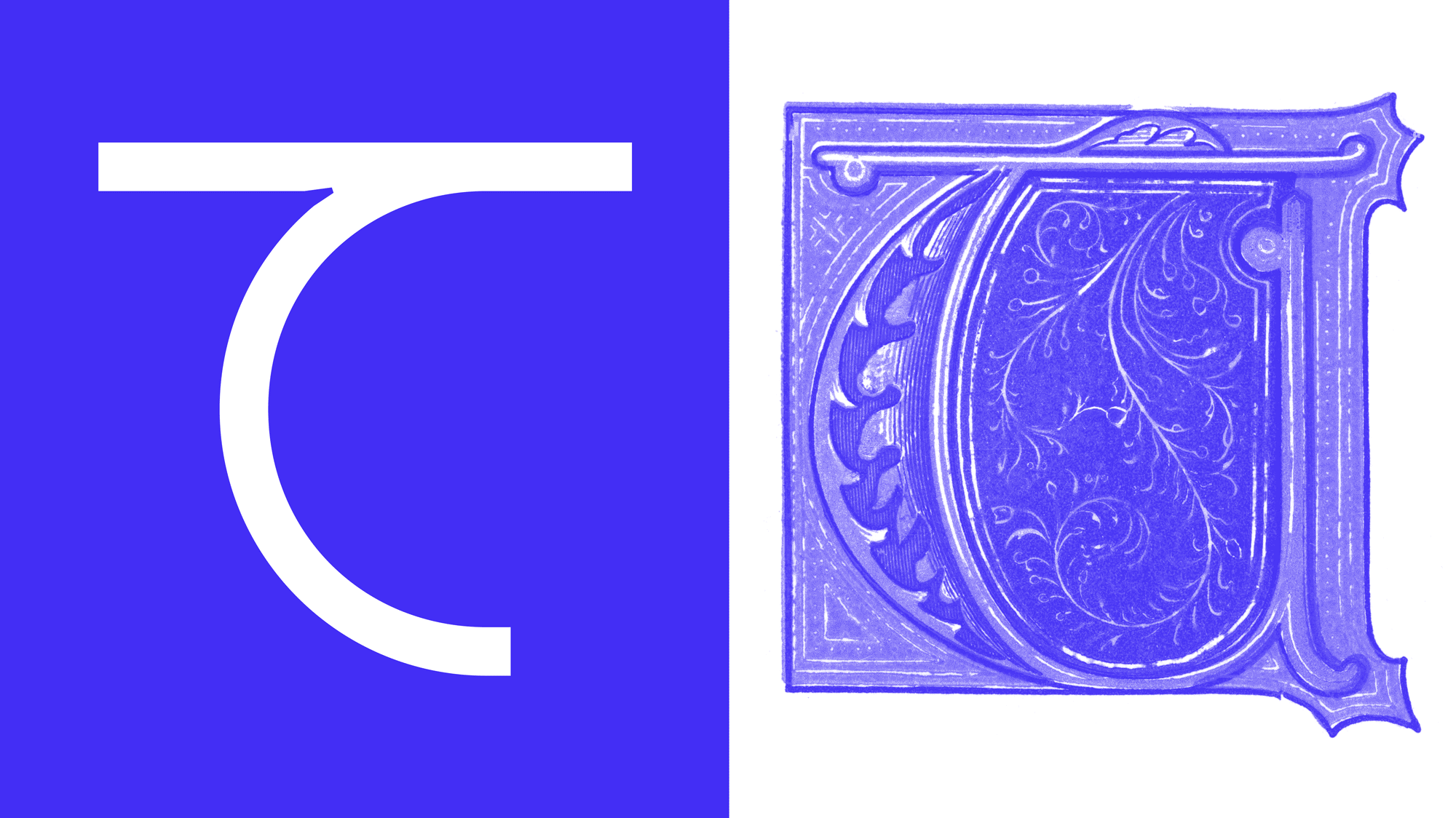
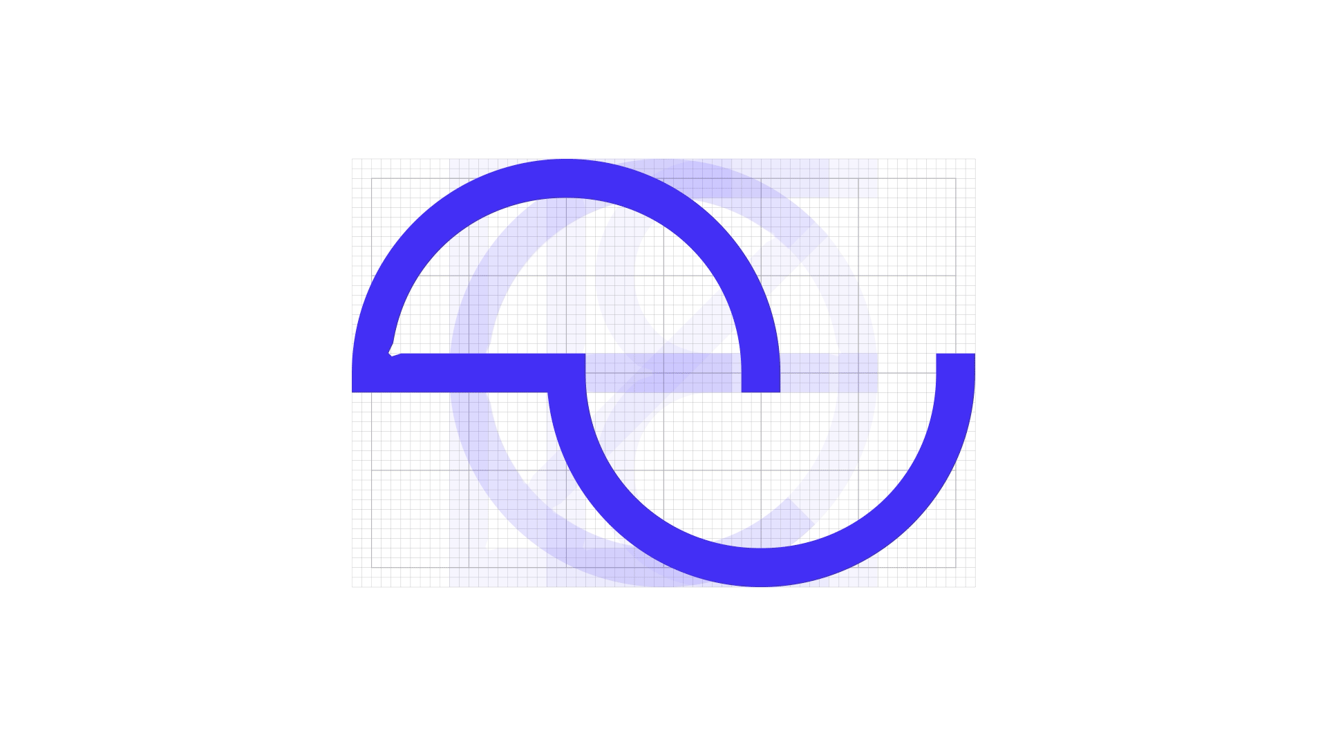
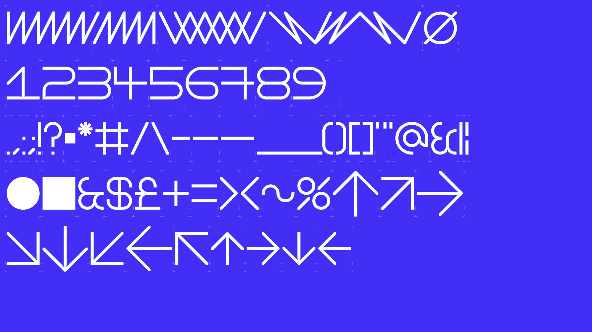
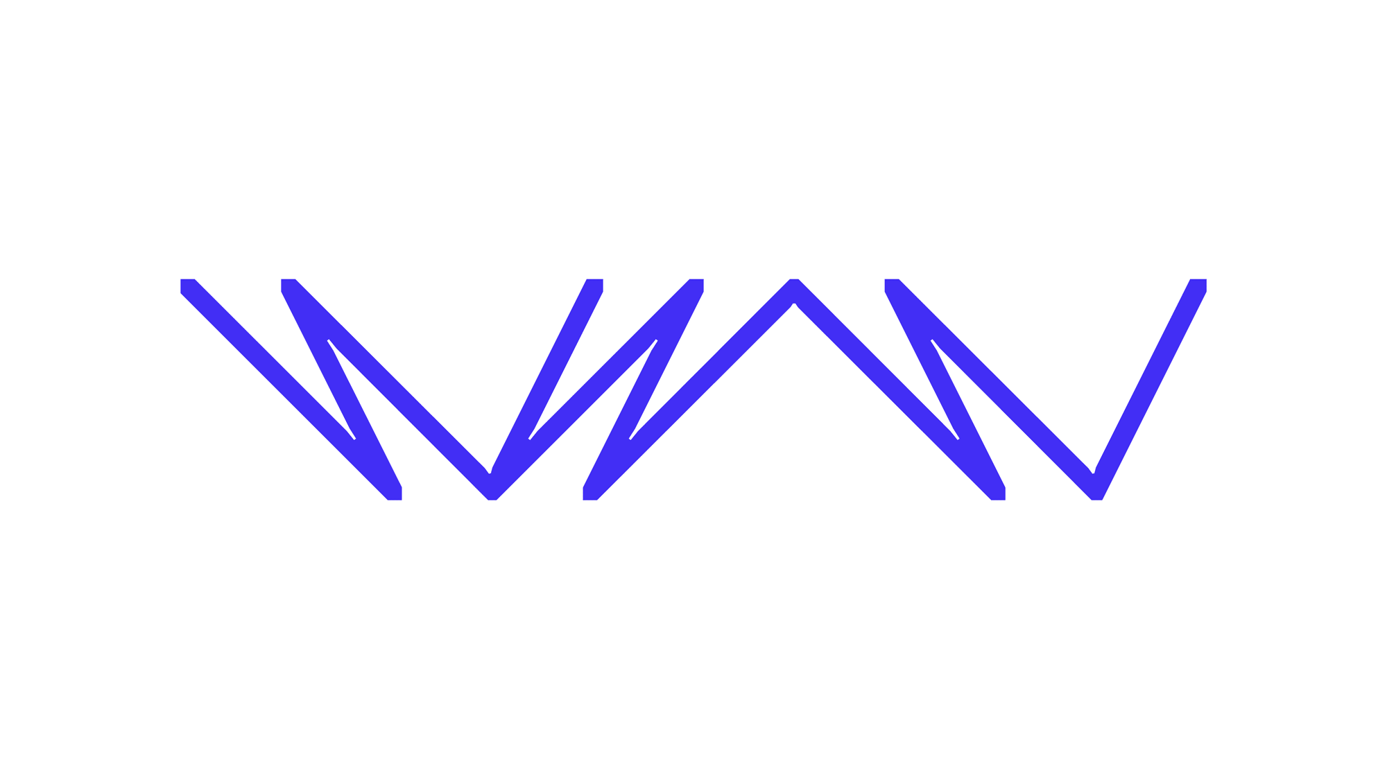
Within the letter structures we created small inktrap details, inspired by the craft of traditional printing.
The inktraps sit like architectural gussets where letter strokes meet, adding a keen level of definition at small sizes and a bounce of energy at larger sizes.
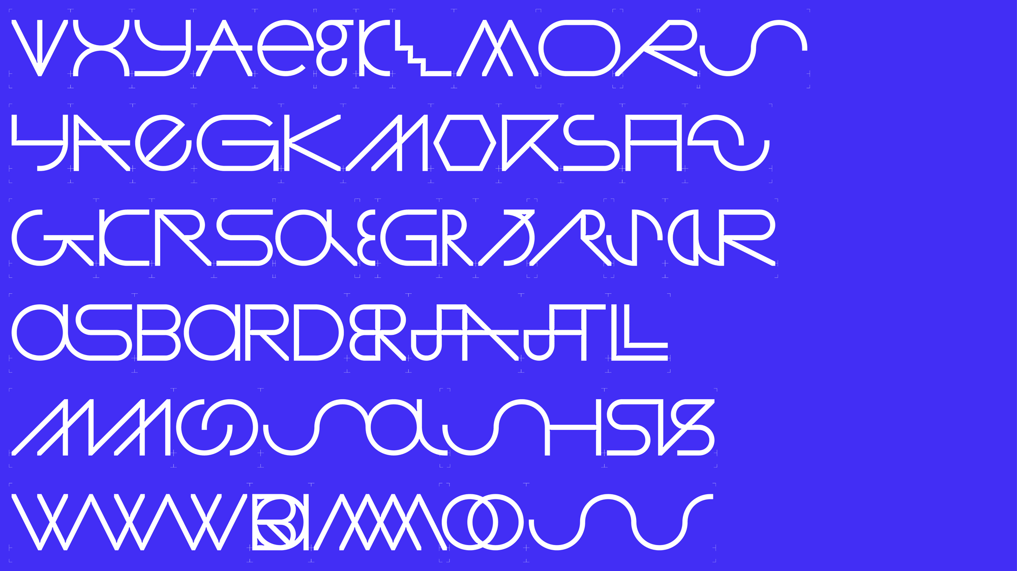
The grid represents BARD’s practical constraints within projects with the expansive character sets, obscure lettering, unexpected ligatures and infinite combinations representing BARD’s pushing of creative possibilities within these constraints.
BARD can select up to eight alternative characters when composing words, titles and sentences which allows for an infinite and surprising range of tones and possibilities.
Having a clear and functional base set of characters was important but we also designed letters which are more sculptural, poetic, obscure and artistic to reflect BARD’s poetic vision.
This balance of practicality and poetry runs through BARD's DNA and the identity.
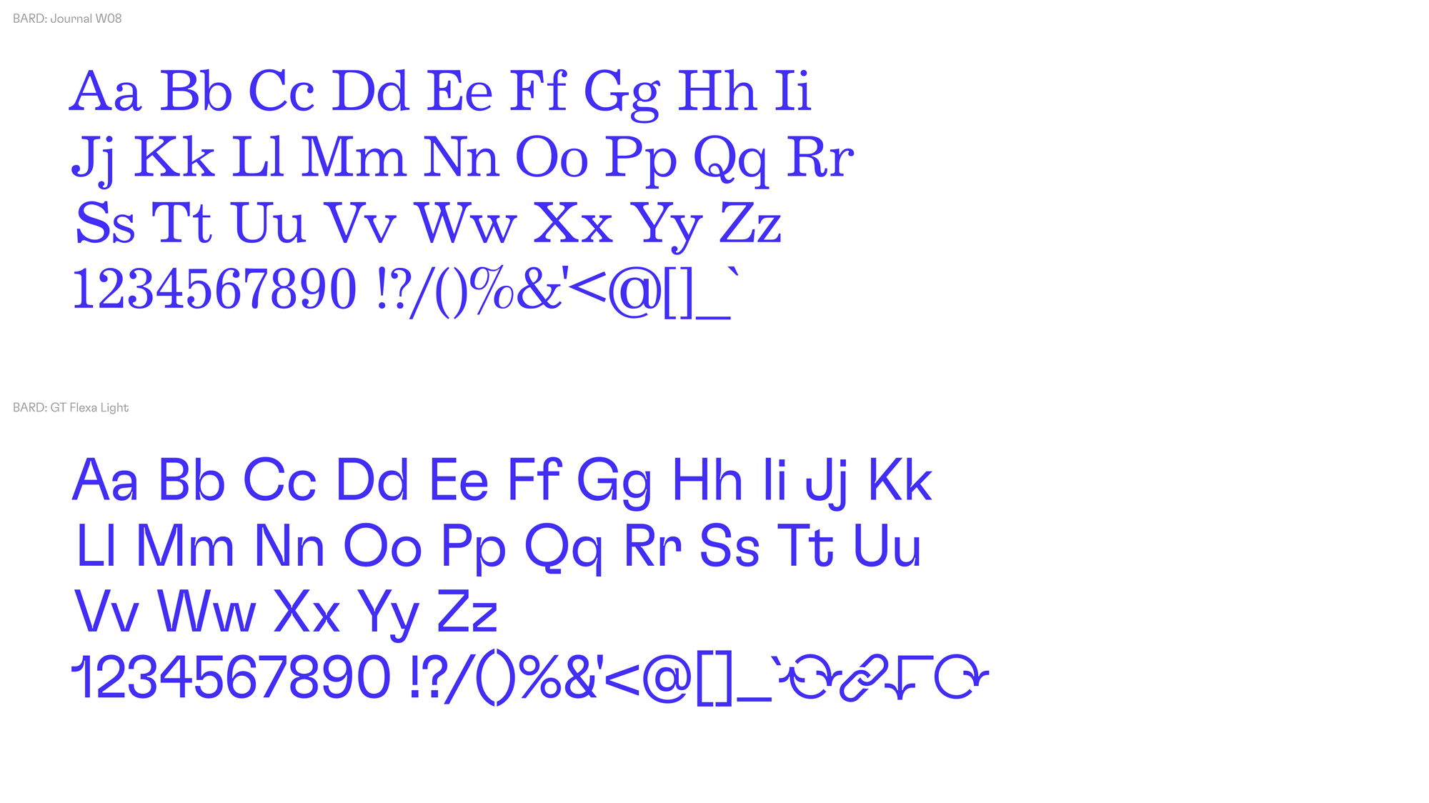
We selected three typefaces, which together carry an important tension representing BARD's contrasting qualities as a practice:
BARD Type - a unique custom display face designed especially for BARD in collaboration with Mitchell F Gillies.
Journal W08 Regular - a serif typeface inspired by and designed with writing and editorial uses in mind, acknowledging the storytelling aspect of the brand. Journal brings an academic tone and contrasts with the hard, consistent, linear forms of the other two typefaces.
Flexa Light - a flexible workhorse grotesk by Grilli Type. Flexa is packed with human character but is built with clearly constructed linear forms and ink traps which compliment BARD type. Flexa bridges the editorial serif, Journal with hyper graphic, BARD Type.
Alongside showcasing BARD’s architectural work, the website also offers a window into BARD’S collaborative process, includes a home for research, a journal and reveals BARD’s origin story.
The website layout is inspired by architectural drawings. While scrolling we wanted to create the sensation of sliding a parallel motion bar up and down on a drawing board.
Visit the website: bard.scot
“We love it, and feel a deep sense of pride when we see it and interact with it. It reflects a BARD which was not seen previously. It’s beyond what we could have imagined or hoped at the outset.
It has given us a confidence boost and demonstrates a level of maturity of where BARD has grown to through this process.
They truly got to know us, and set the foundations for everything that followed. The development of the brand identity and all outputs all addressed the vision of BARD that was to come.” Ruairidh Moir, BARD
Creative direction, brand identity & web design: Warriors Studio
Type design: Mitchell Gillies & Warriors Studio
Motion design (BARD Type): Mitchell Gillies
Motion design (Logo): Tiernan Crilley
Web development: Infinite Eye
Client and collaborator: BARD