Millemont Institute
- identity
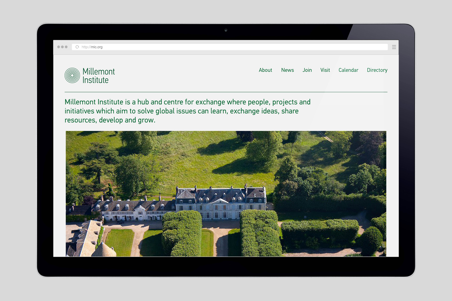
- web
- brand development
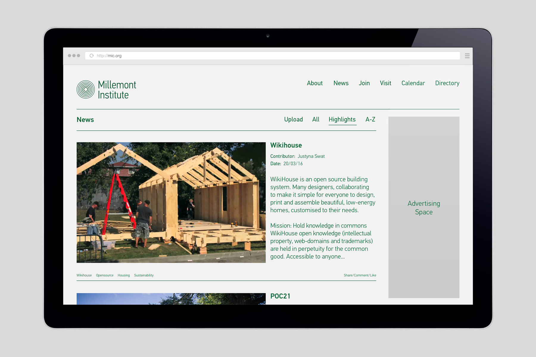
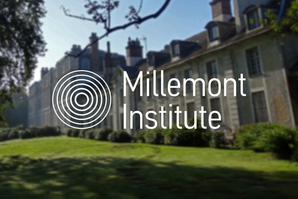
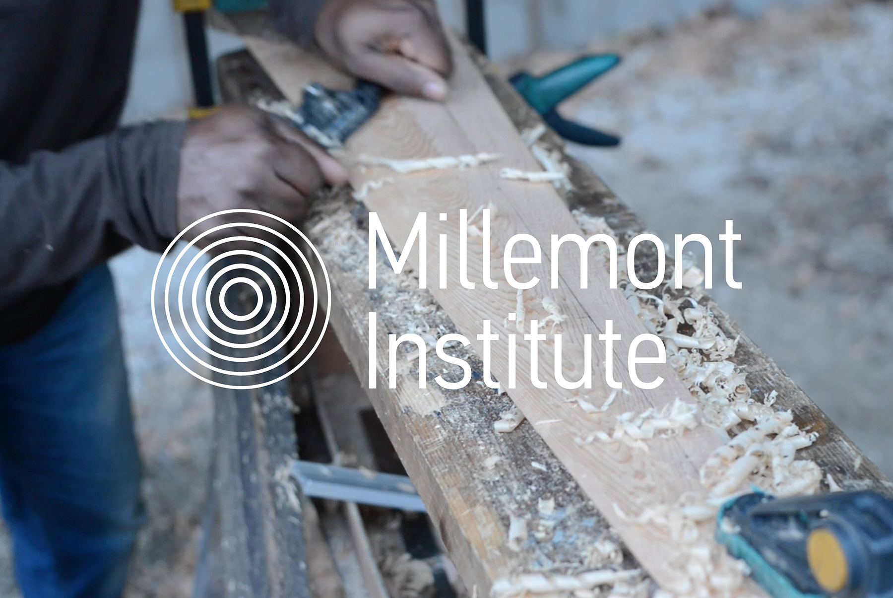
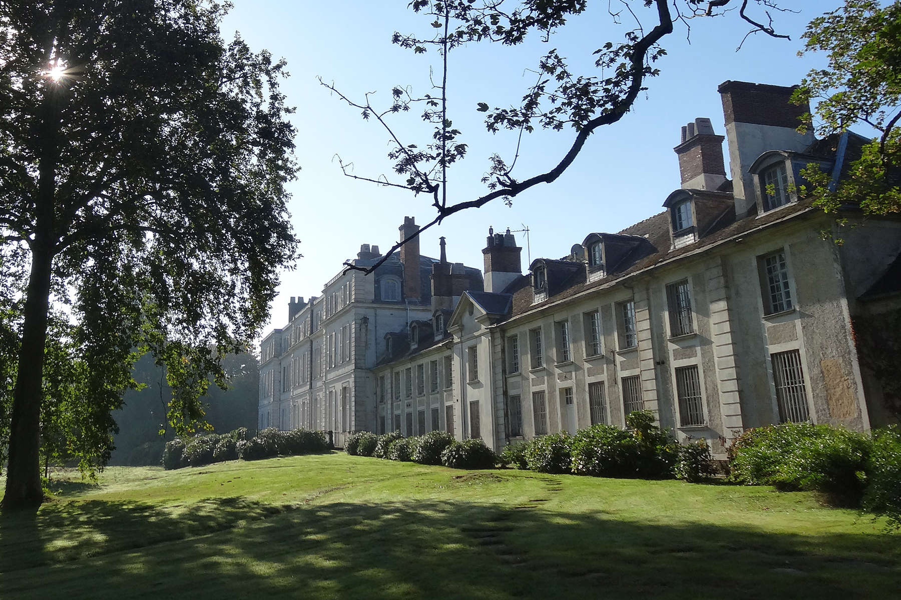
Millemont Institute is a hub and centre of exchange, West of Paris, where people, projects and initiatives aiming to solve social and ecological issues can learn, share ideas, develop and grow.
Our challenge was to articulate the Institute's mission, ethos and persona through written and visual forms of communication.
A written document detailing the context of the Institute, strategy for growth, impact of work, planning, operations, budget and the people involved was also produced in line with the Buckminster Fuller Institute's Fuller Challenge.
As featured on Design Week popup: yes.
-
-
-

-
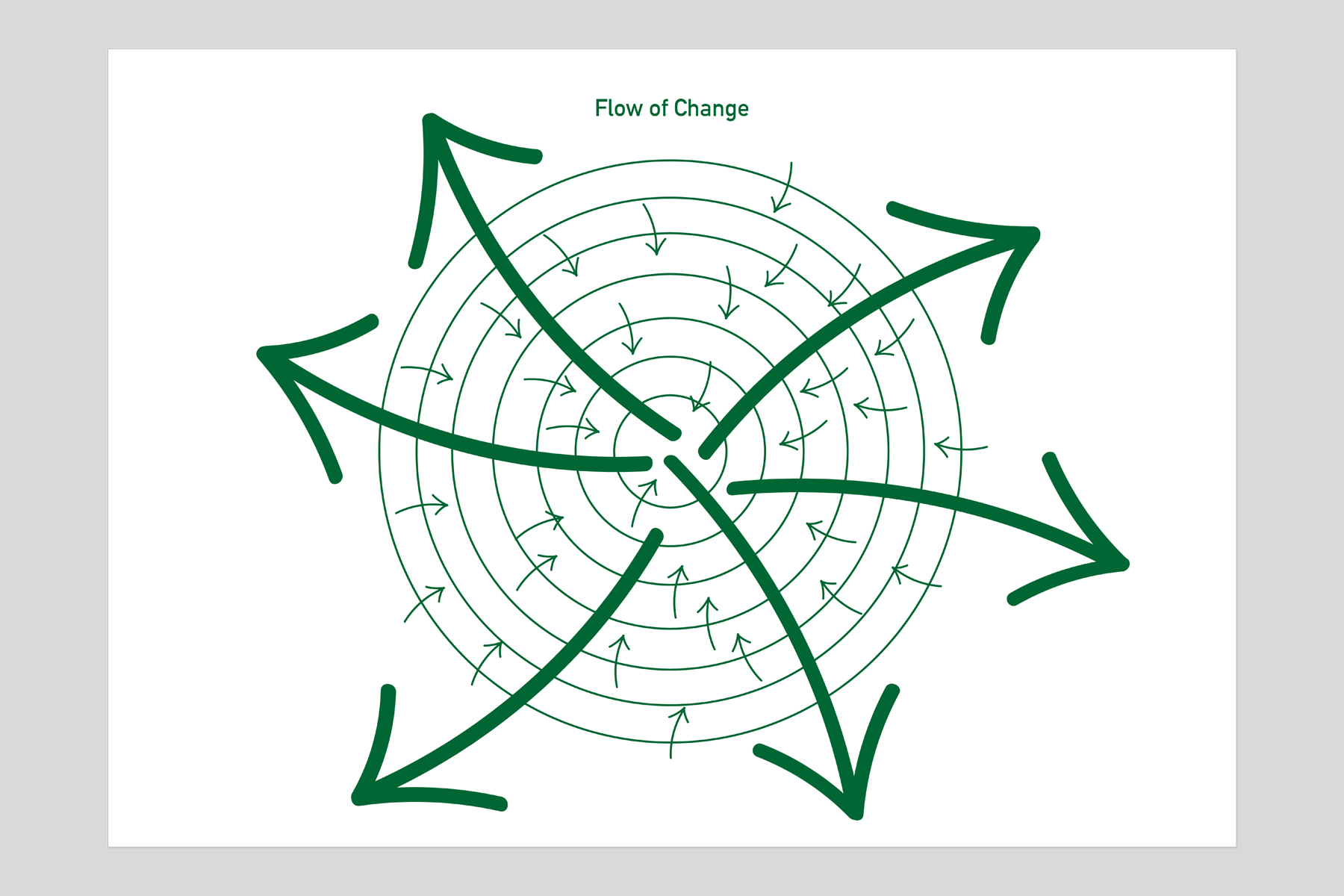
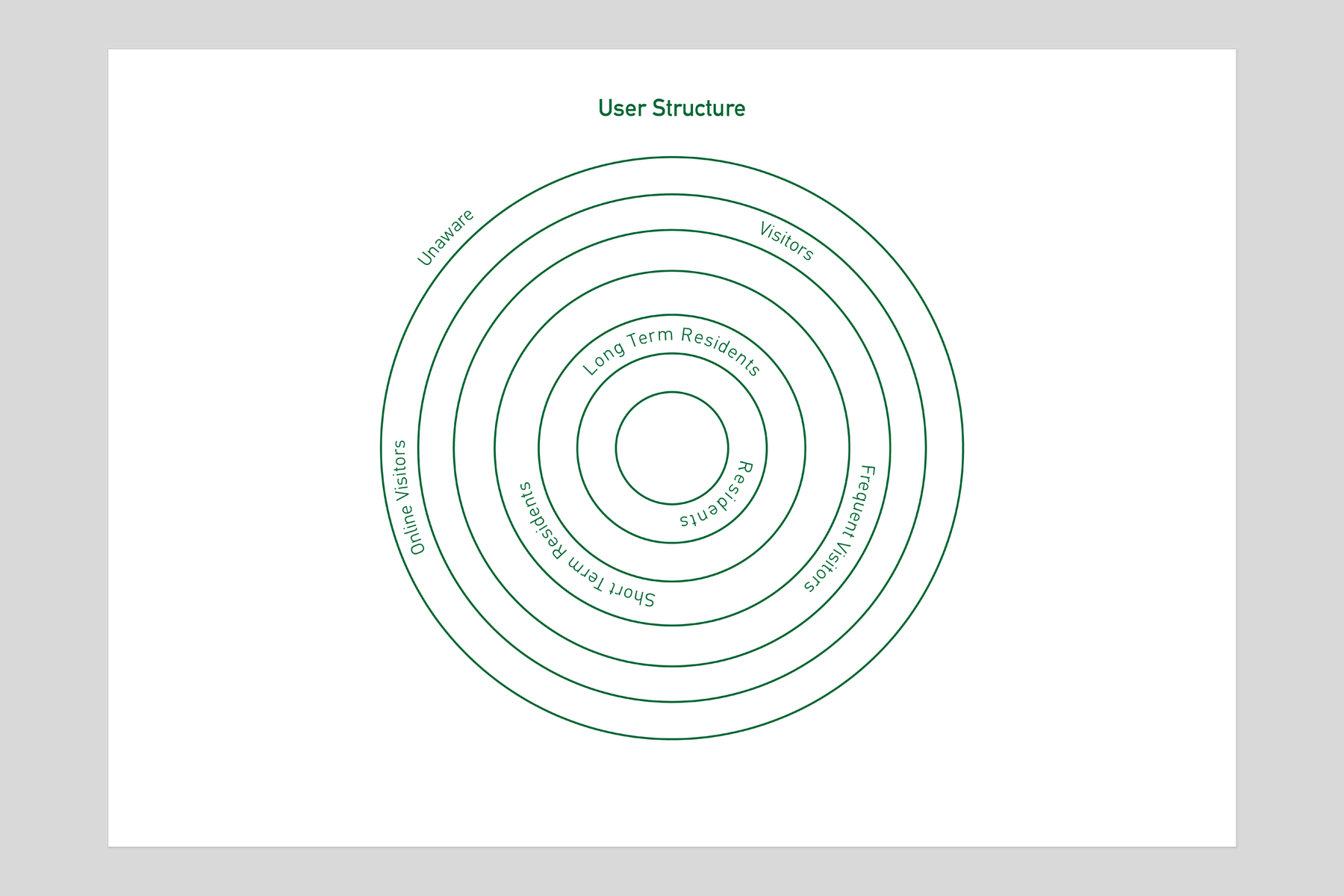
The Institute is centred around innovation, sustainability and creativity.
The ethos and strategy are based on the principles of nature and permaculture – an area of sustainable and self-sufficient agricultural practice.
This informed our approach and visualisation process.
Permaculture systems are often visualised through "zones" which can be both physical and theoretical - something we felt was in tune with the concept of the Institute as a "hub".
"Zones are a way of intelligently organizing elements in a human environment on the basis of the frequency of use." – Braise, White. Agriculture
-
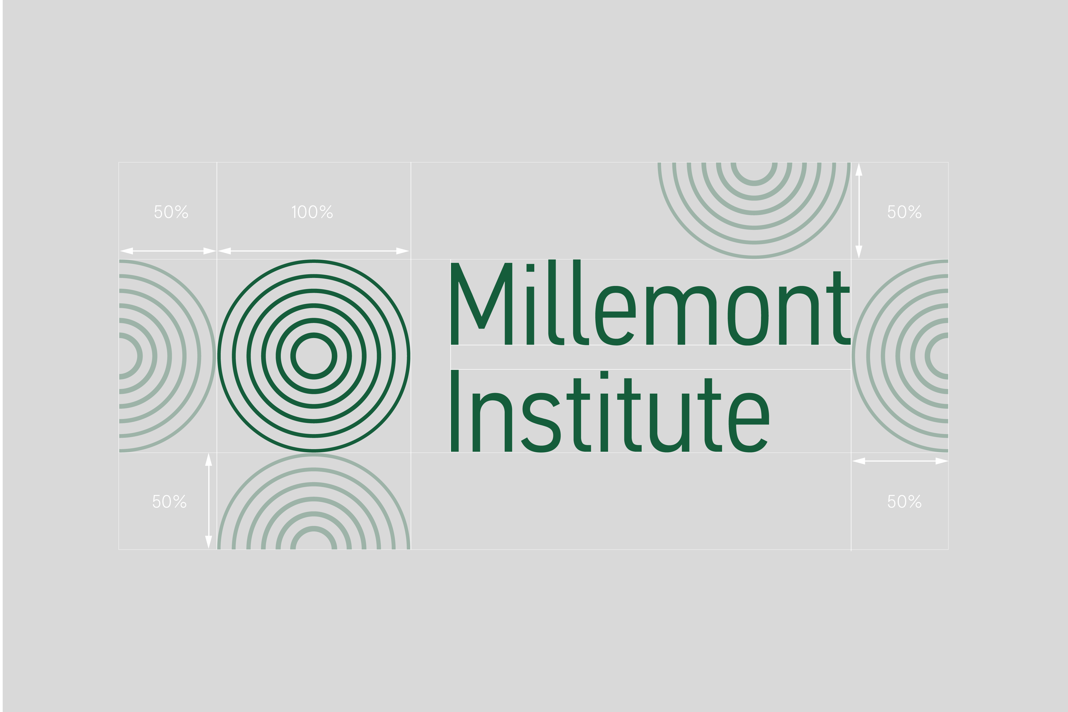
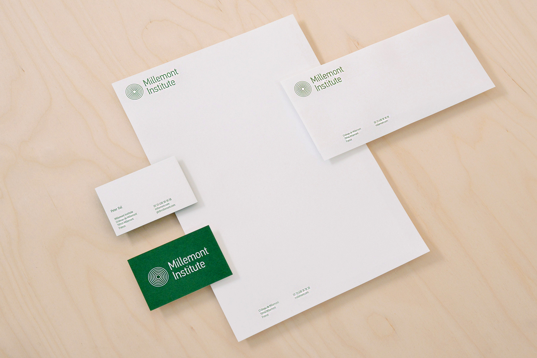
We selected Din, a realist sans-serif typeface for the Institute.
Using a sans-serif communicates the modern and forward thinking aspect. The geometric rectangular base form of the letter communicates functionality with a robust attitude. The rounded corners, however add a softer human element.
All of these elements combined encompass the ethos of Millemont Institute.
-
Using a circle as the base structure of the logo communicates unity and focus. The simplicity of the overall form is primitive yet profound.
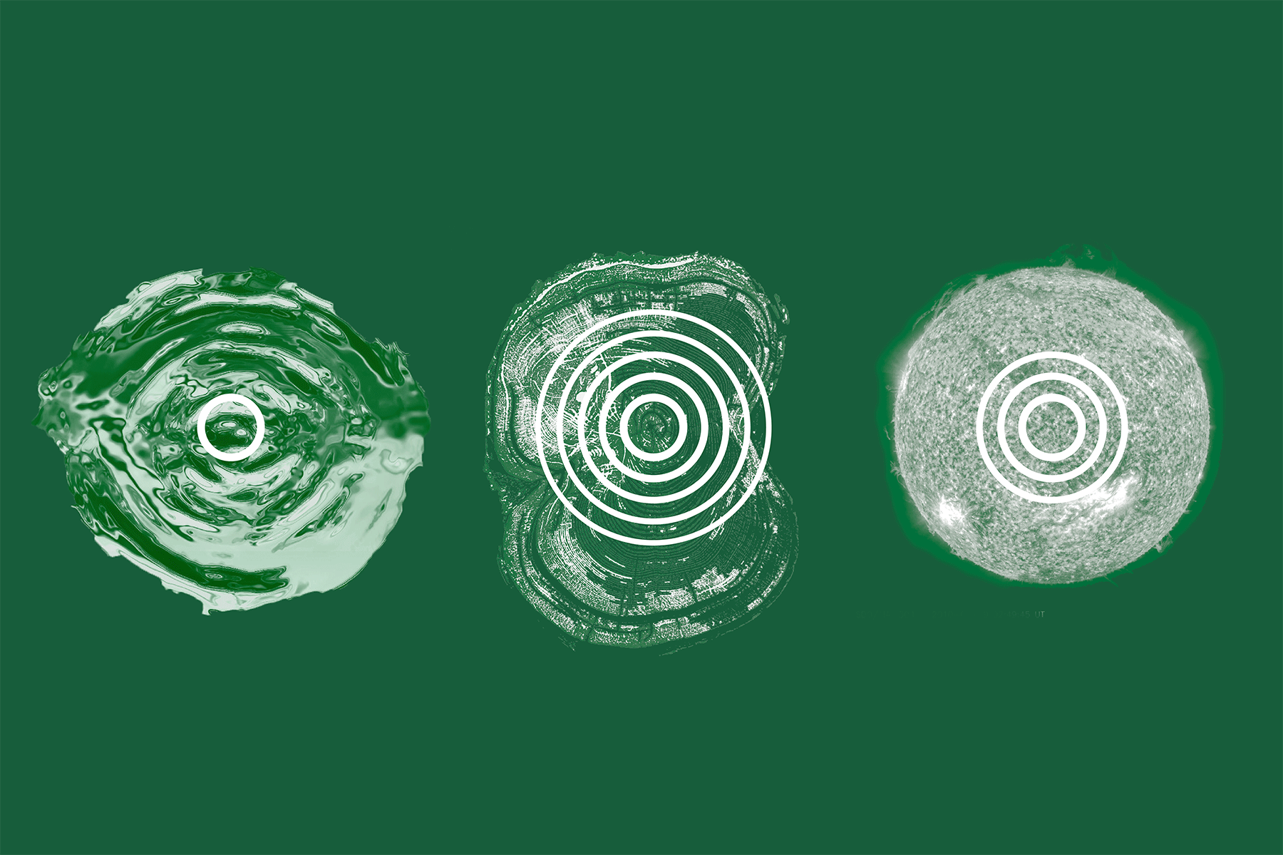
The inner circle represents the Institute, holding the most weight as the centre point, core and focus. The outer rings represent growth and the movement of energy from the core.
The symbol and movement of energy within the logo also felt strongly connected to growth and the movement of energy in nature. In particular; the ripple of water, the growth in rings of a tree or the form and heat of the sun.
-
-
-
-