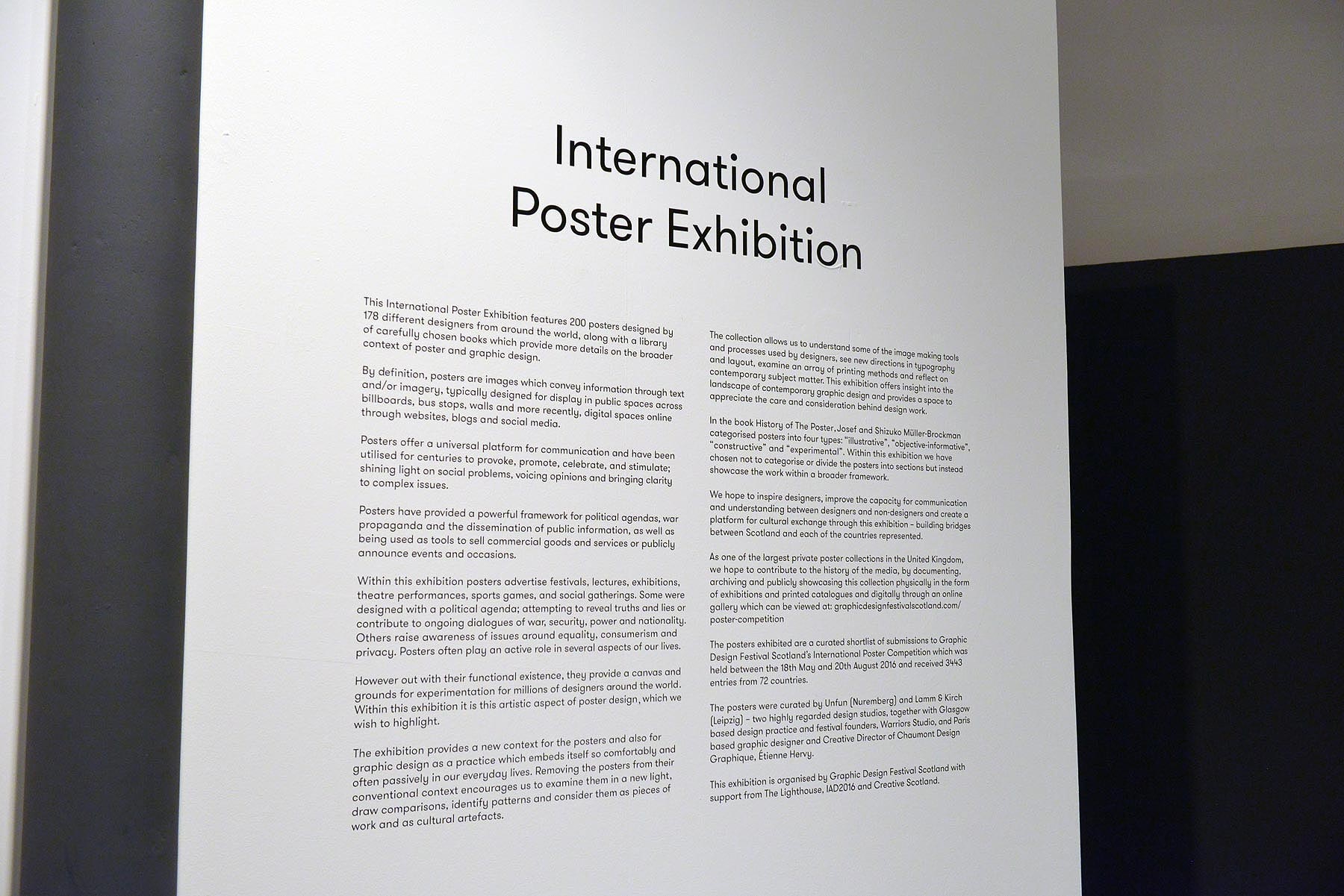
International Poster Exhibition
- identity
- curation
Exhibition design, identity, catalogue and reading list for Graphic Design Festival Scotland's International Poster Exhibition, which welcomed more than 8000 visitors throughout the month it was open.
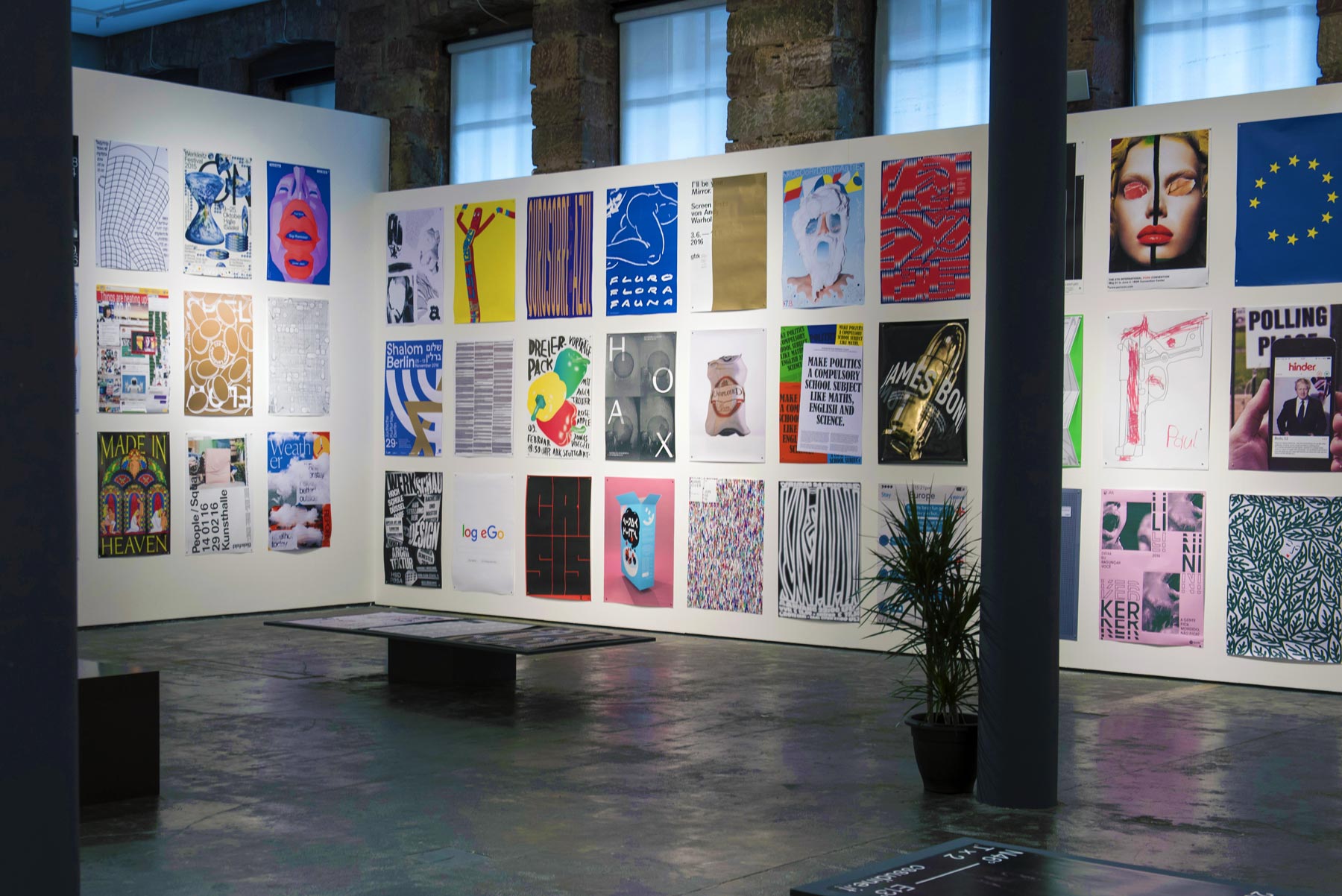
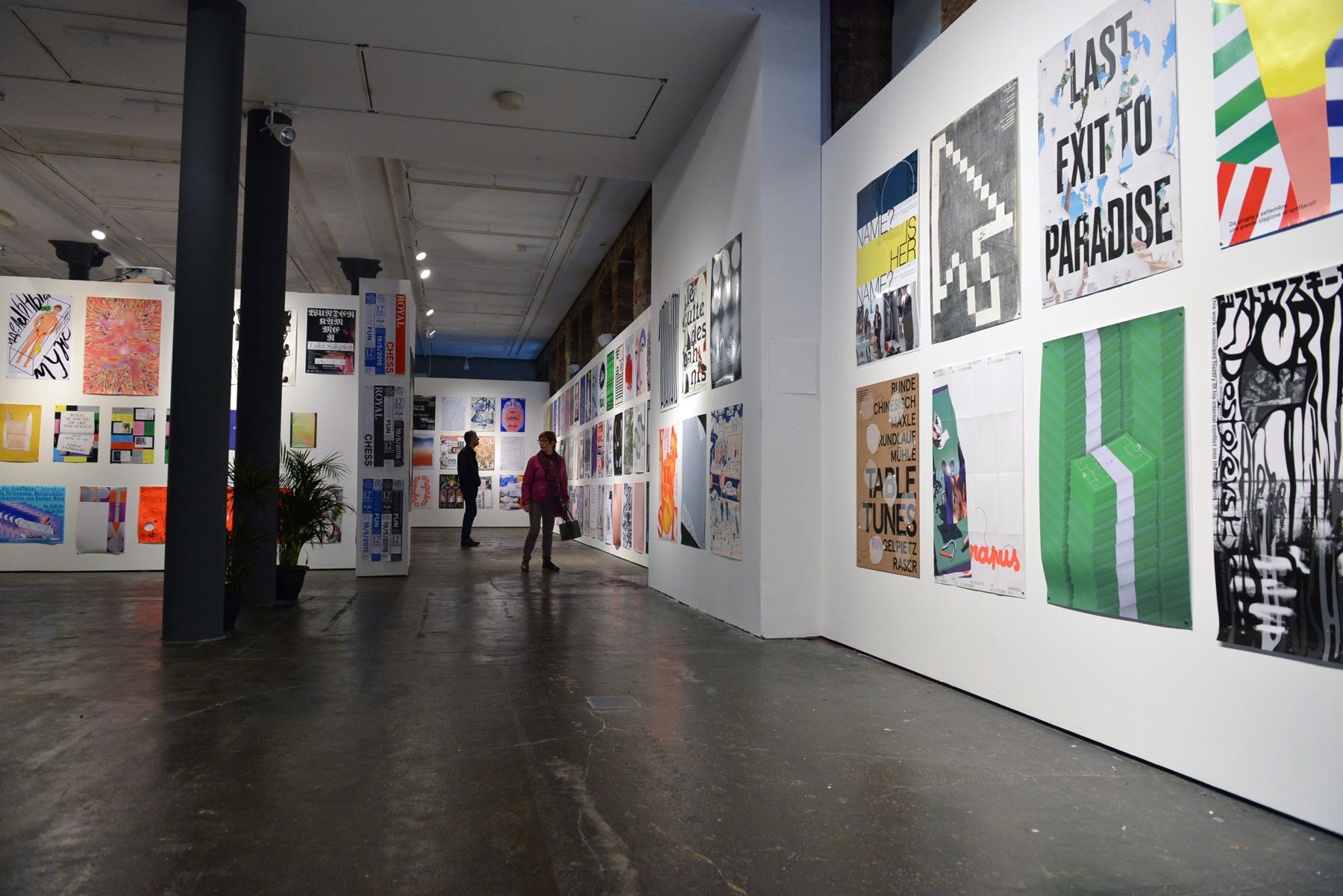
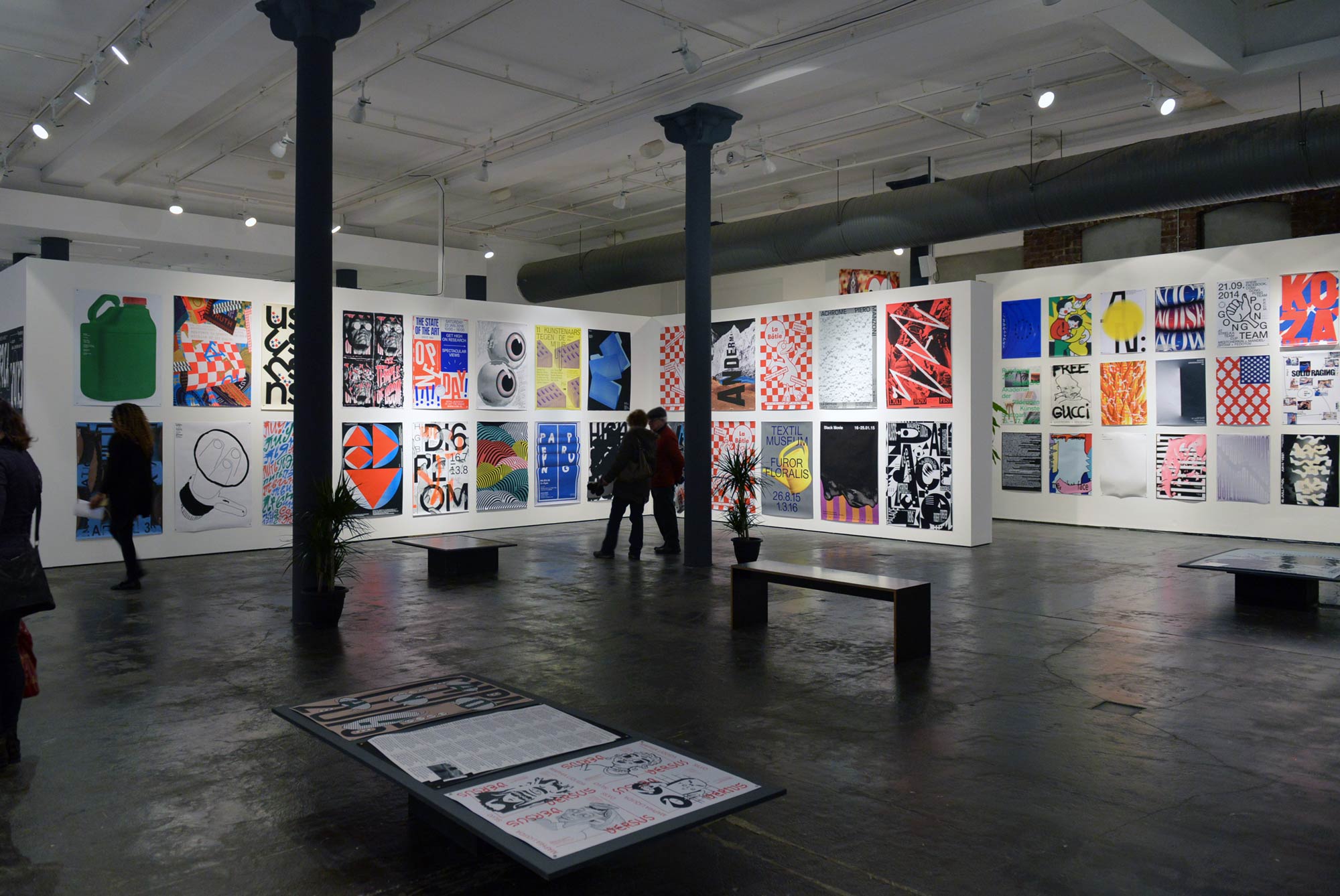
The exhibition is an annual showcase of some of the highest quality international graphic design work. The 2016 exhibition included 200 posters designed by 178 different designers – a curated shortlist from 3443 submissions to Graphic Design Festival Scotland’s International Poster Competition which were received from 72 countries.
As the posters within the exhibition were bold and visually striking we developed a refined, stripped back identity to provide an understated framework which showcased the work and put the exhibition content at the forefront.
Featured on: Creative Review, British Council and The Skinny.
-
-
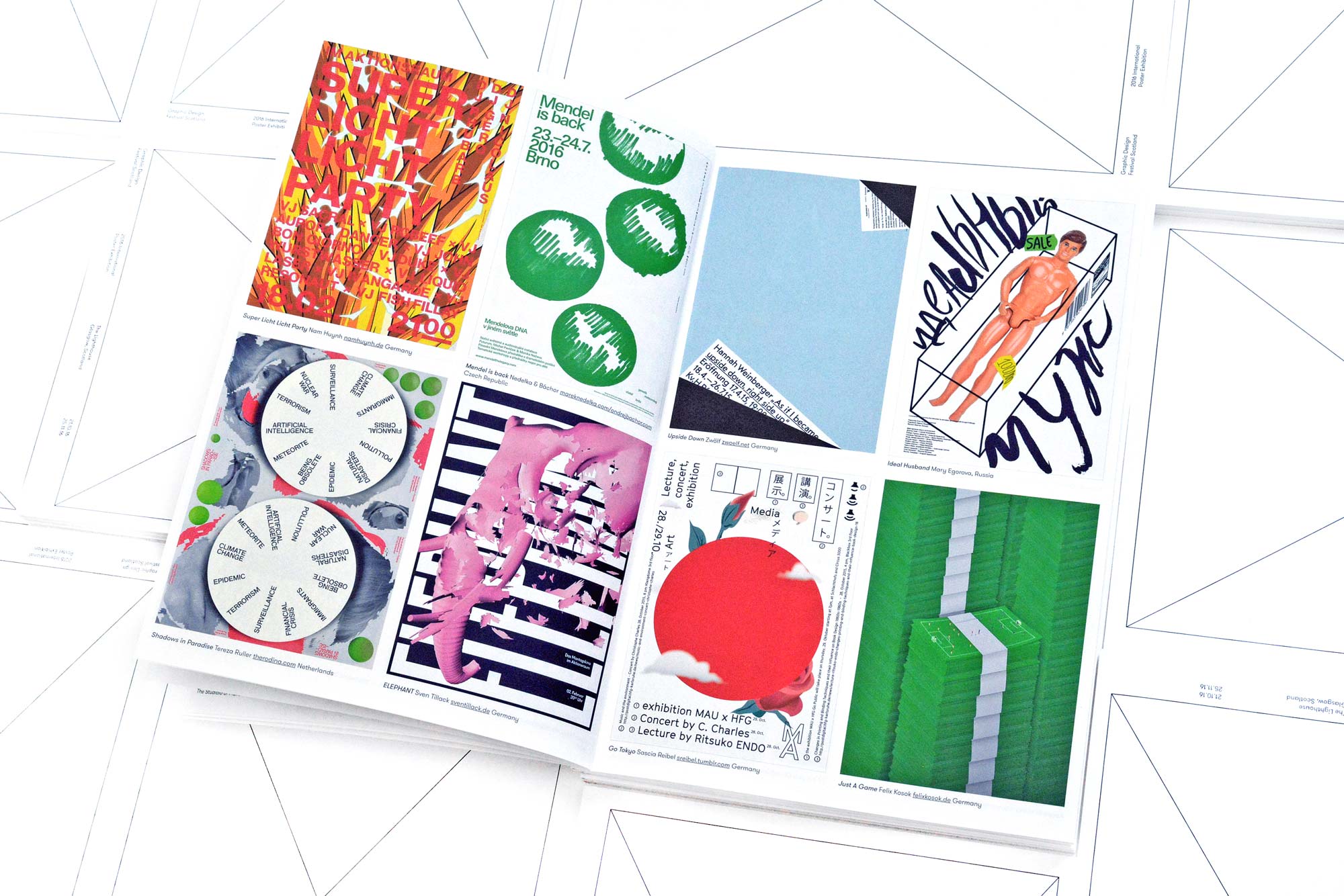
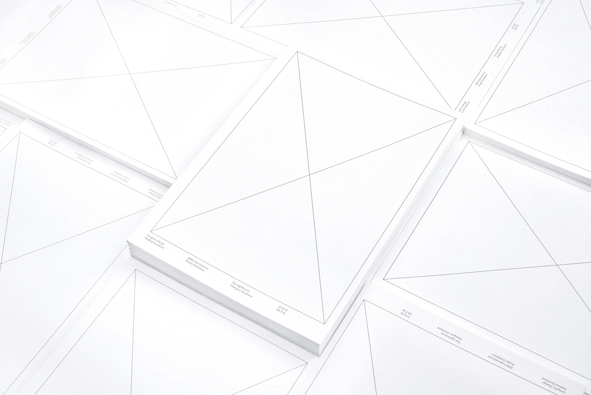
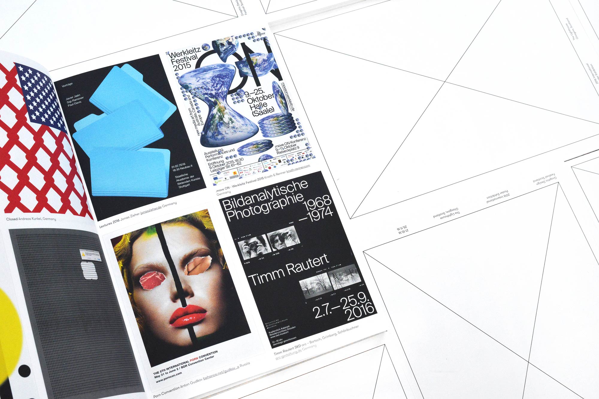
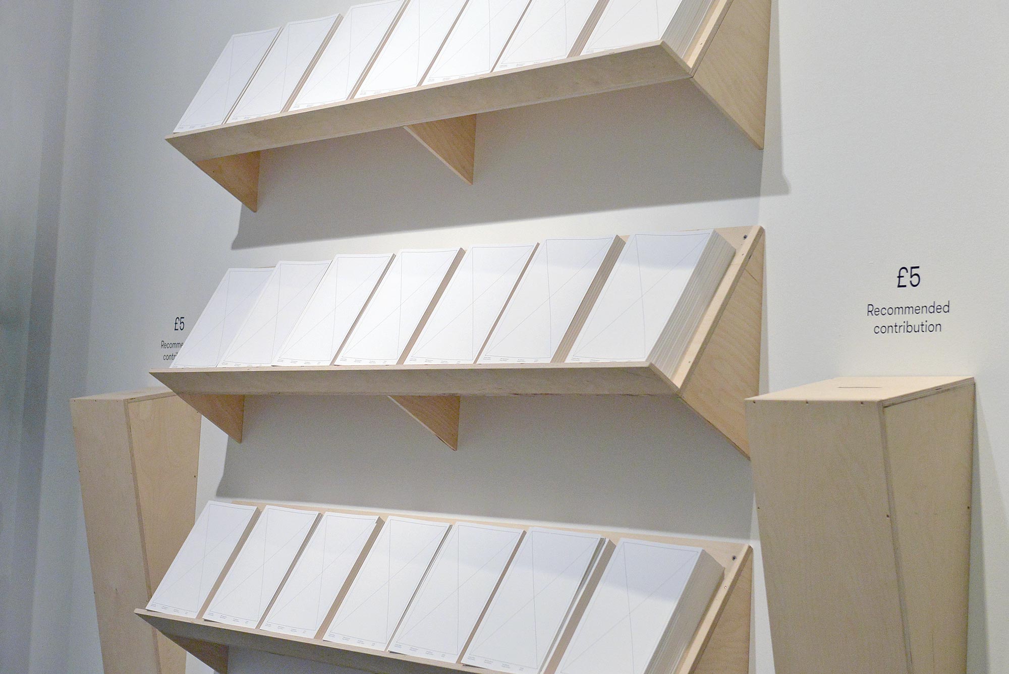
To provide a reference and take-away for visitors and extend the reach of the exhibition content internationally, we designed a 52 page catalogue featuring the 200 posters in the exhibition.
Printed and perfect bound by J Thomson on Mohawk Superfine Ultra White Eggshell, Cover 270 gsm, inside 118gsm provided by Mohawk.
You can purchase the catalogue here.
-
-
Using a black and white colour palette, modestly sized typography and lightweight line work in the identity, the expressive and colourful collection of work within the exhibition was accentuated.
-
-
-
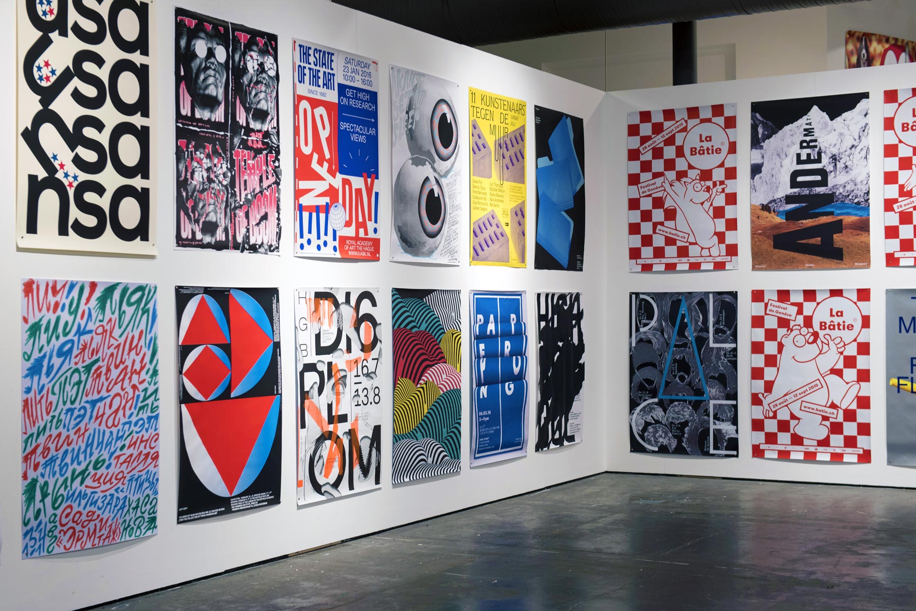
As the poster formats and the wall heights and lengths varied significantly, grid systems were developed for each surface and poster size.
Uniform spacing between the work added consistency and a level of structure to a visually eclectic collection of work and maximised effective use of wall space.
-
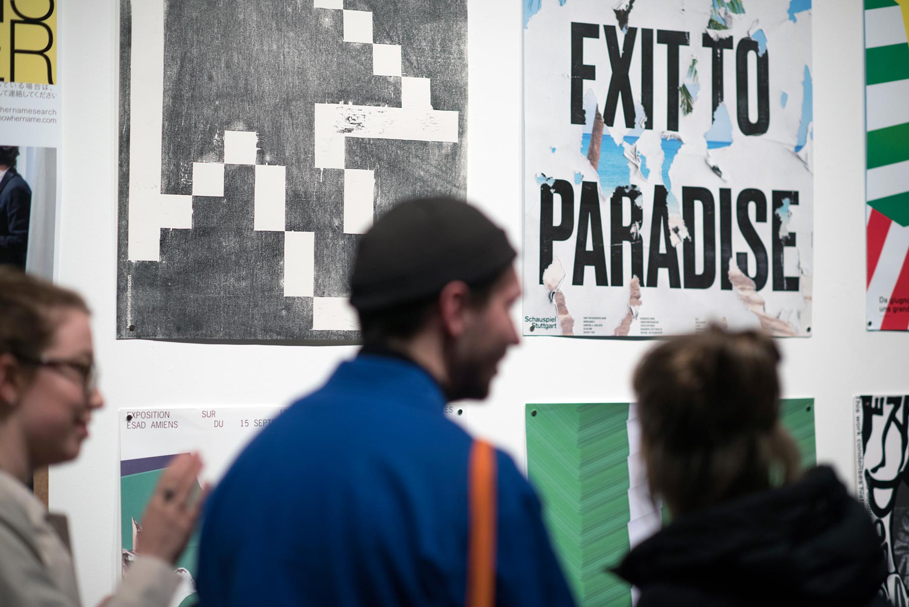
Many of the posters used tactile papers, printing processes and finishes so were displayed without a frame or glass, meaning visitors could enjoy the work without obstruction or distraction.
For the hanging system the posters were held in place with small neodymium magnets, meaning that the condition of the work was not affected by the exhibition and the placement of the posters could be adjusted easily.
-
-
-
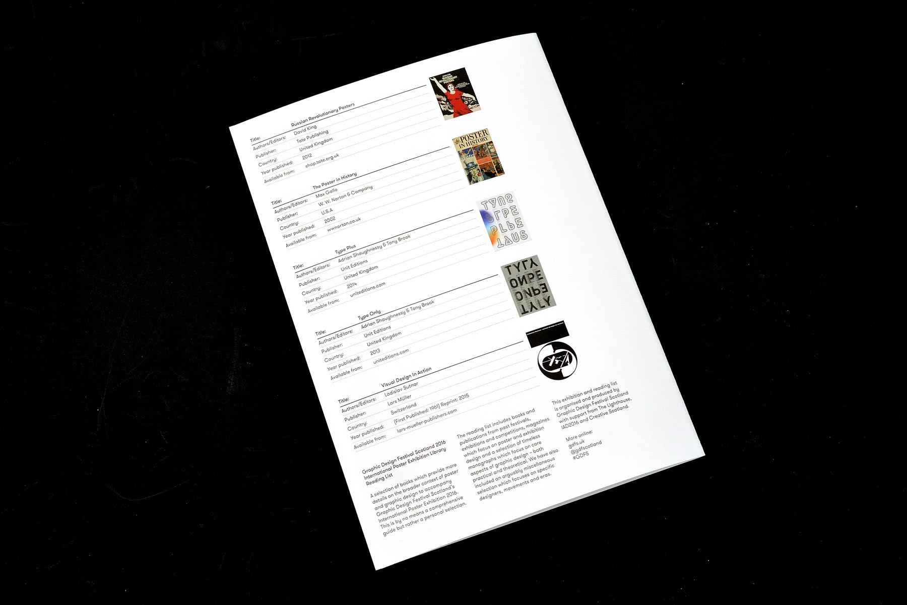
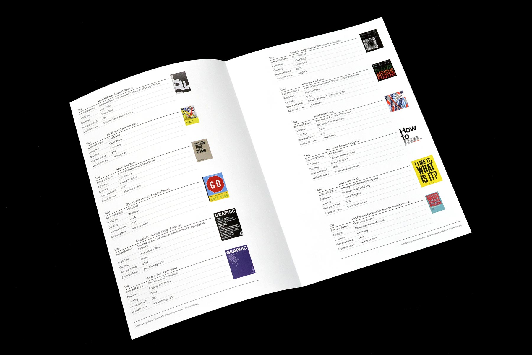
To offer a richer experience for visitors and provide more context for the exhibition, we created a research area with a physical library of curated books providing more details on the broader context of poster and graphic design.
-
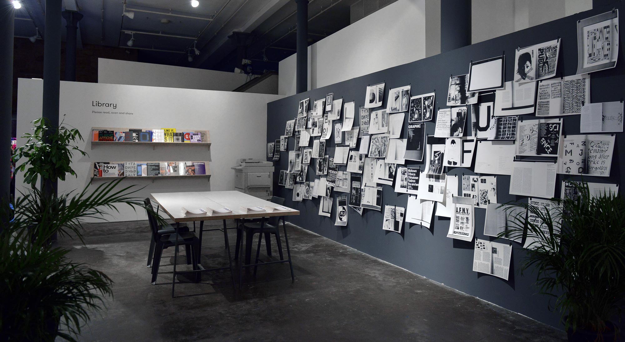
In the library area, we encouraged visitors to read, scan and share with a black and white copier and a wall for pinning up and sharing.
This also provided a place for visitors to sit, work, speak with staff and offer feedback.