Graphic Design Festival Scotland
- identity
- web
- campaign
- strategy
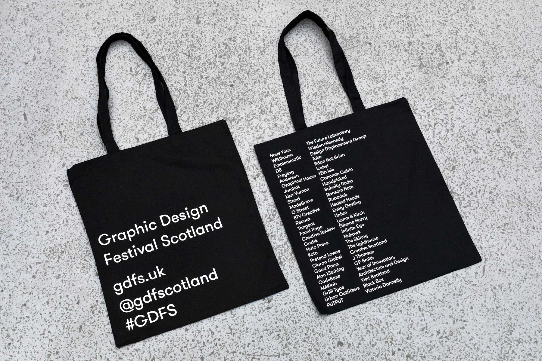
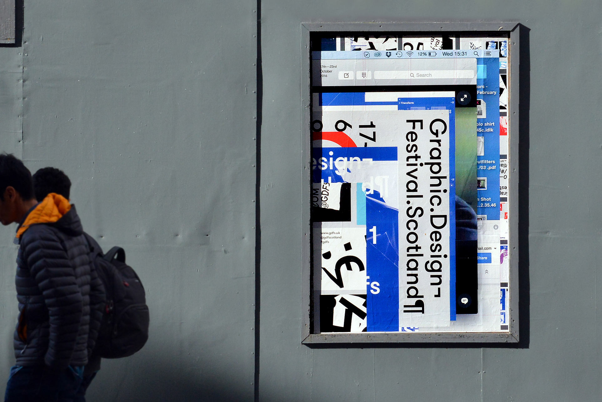
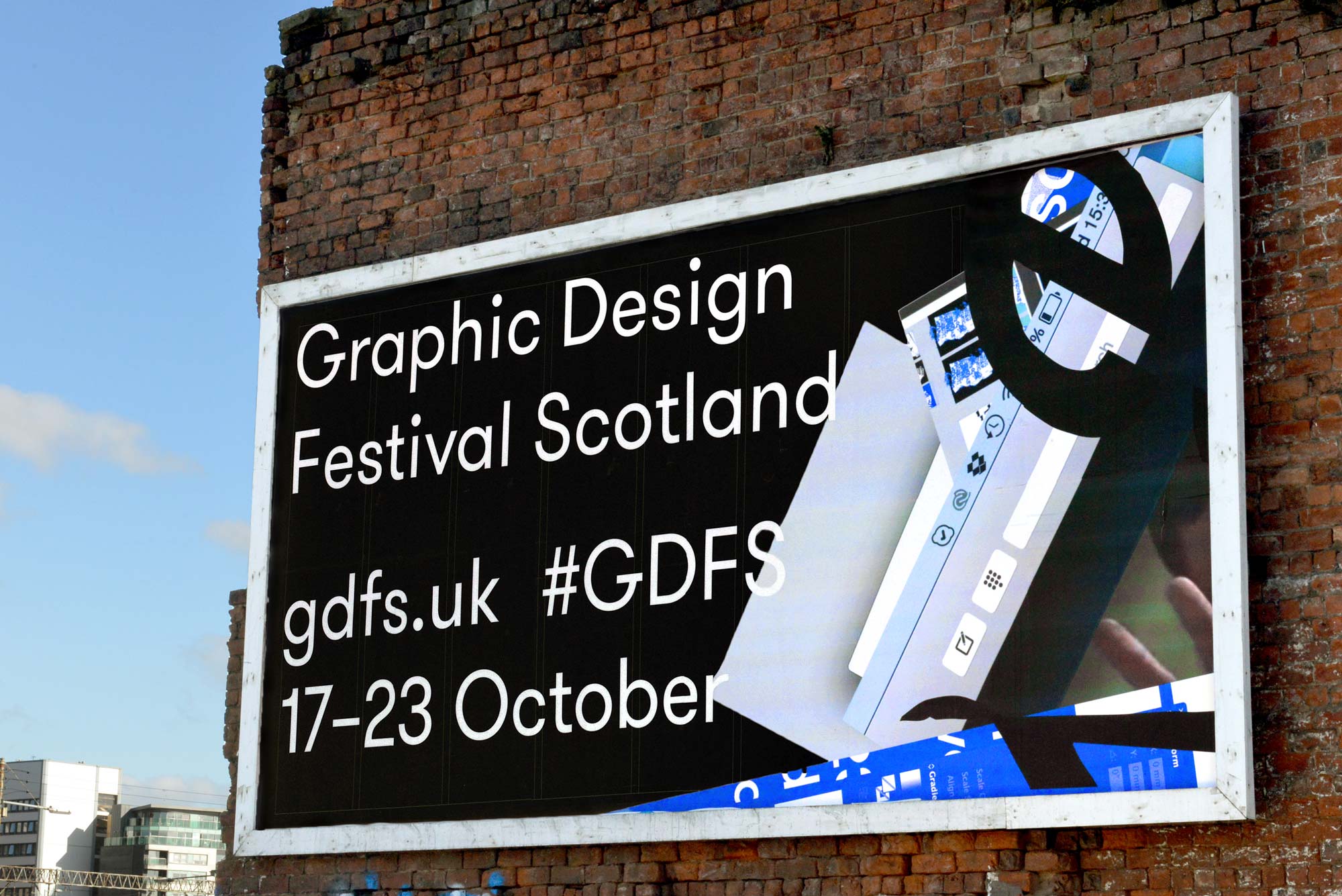
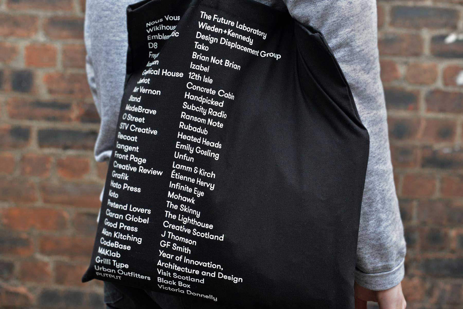
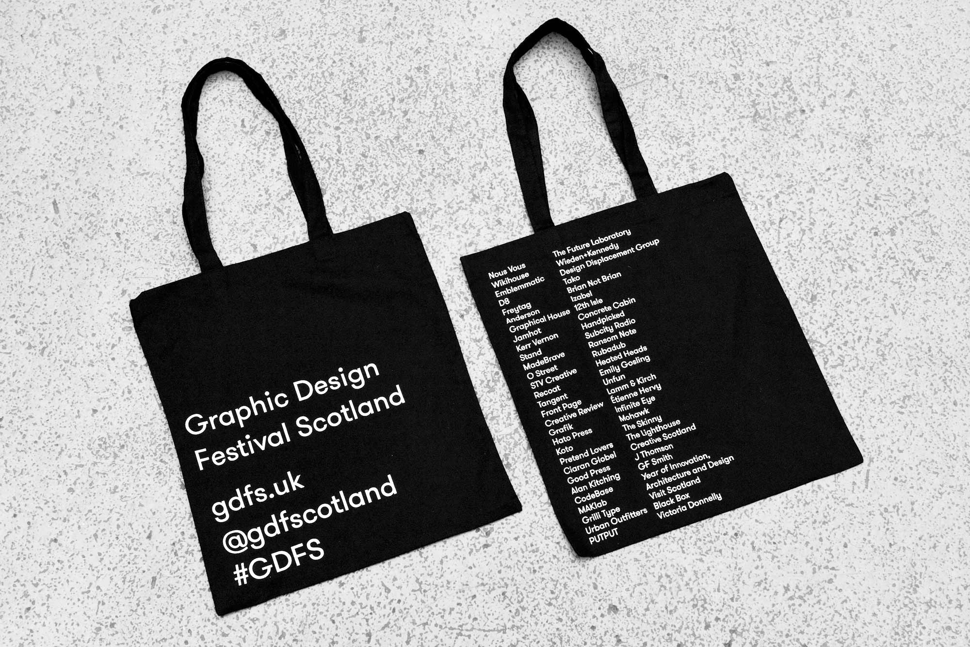
Full brand identity for Graphic Design Festival Scotland implemented across print, digital and environment in collaboration with Freytag Anderson.
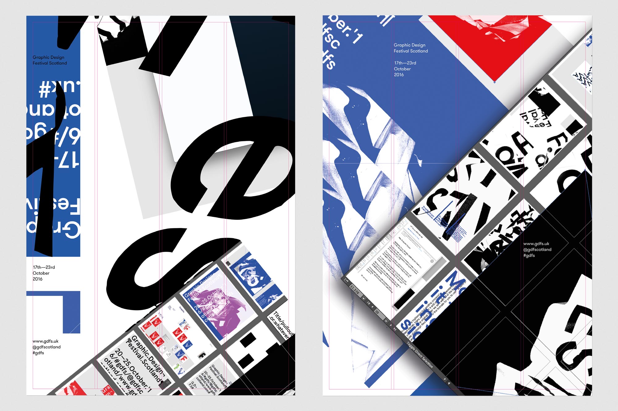
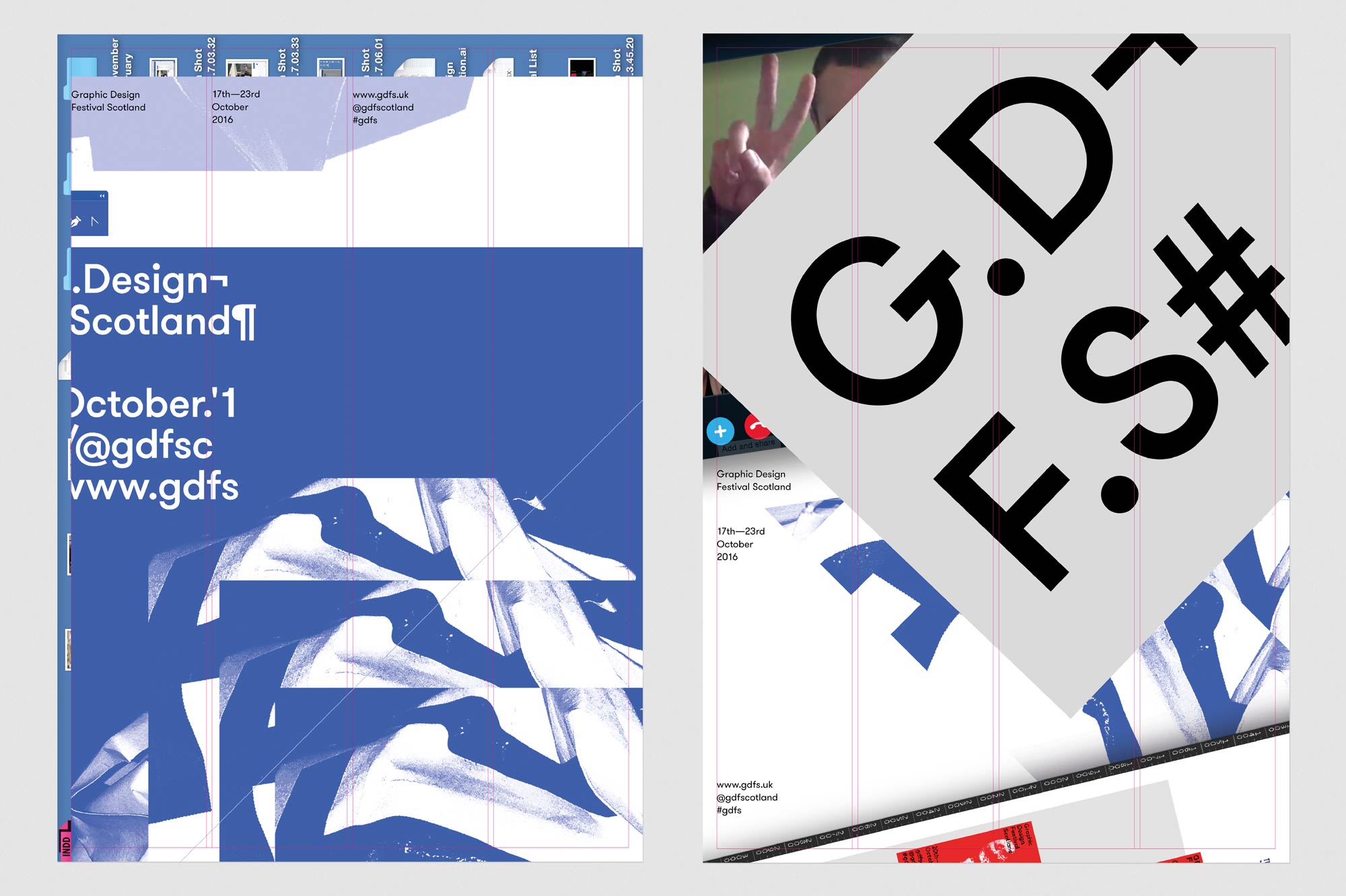
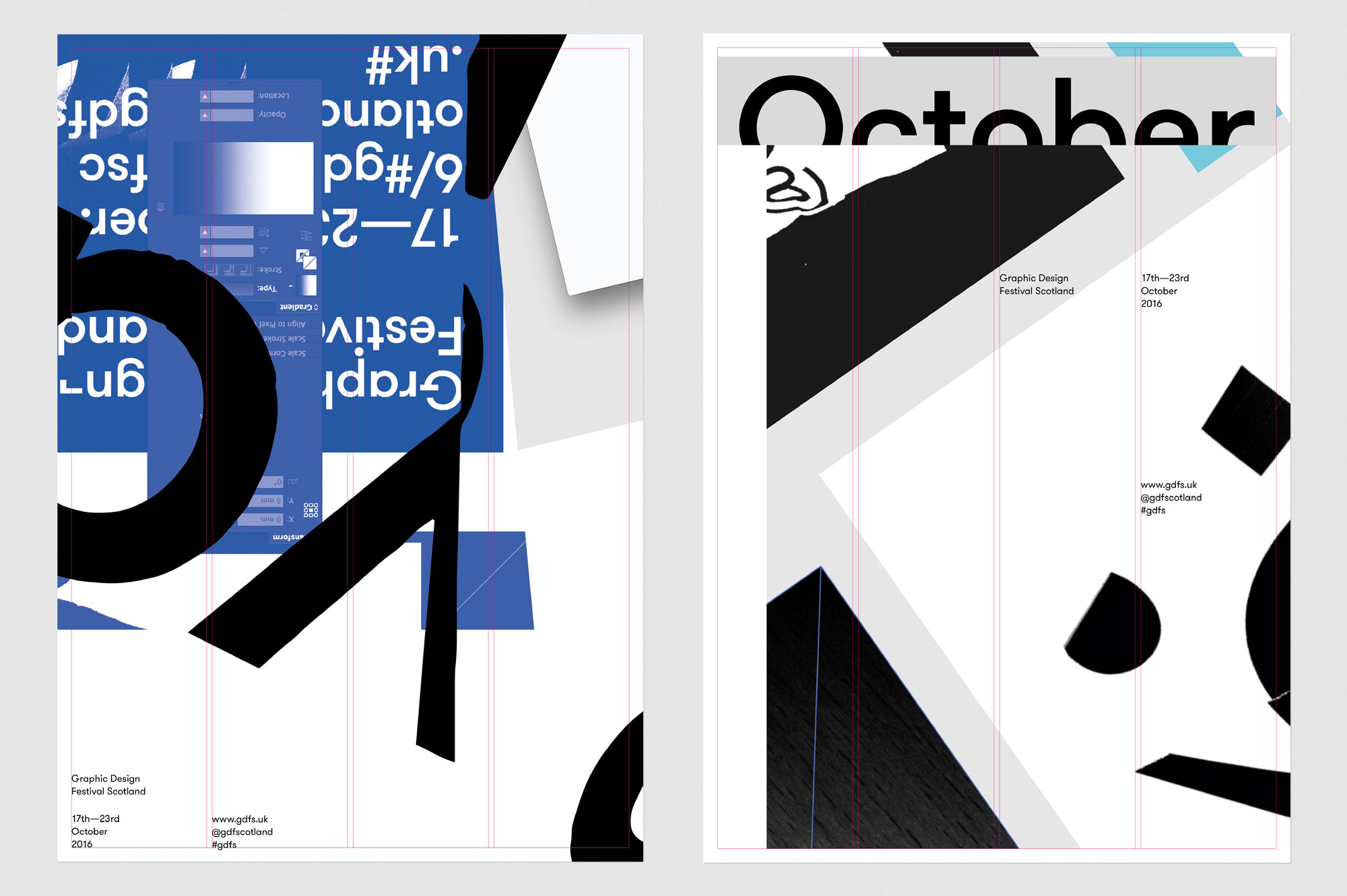
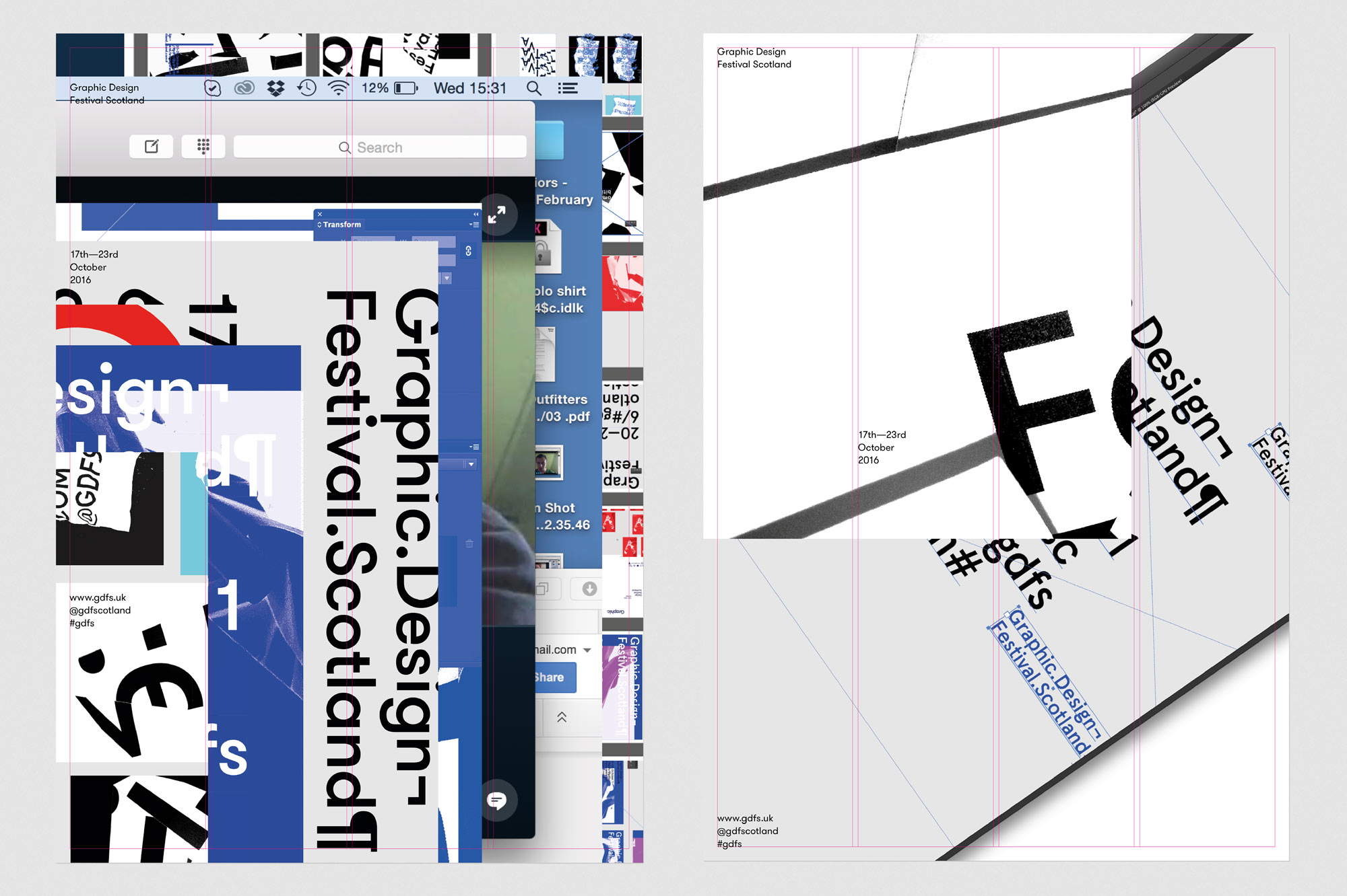
The identity explores the process and dialogue which unfolds as ideas are developed, visualised and explored.
We're very aware of designers’ tendencies to present polished resolved work all of the time, but the journey and process are equally as important and can also be equally as interesting. This identity is about the journey as opposed to the destination.
The identity generated considerable media attention and played an instrumental role in raising the profile of the 2016 festival which welcomed 30,000+ visitors.
Featured on: It's Nice That, Grafik, Creative Review, Idn World and British Council.
Awarded GOLD at Graphis Awards, New York.
Scottish Design Award, Poster Category, Winner.

-
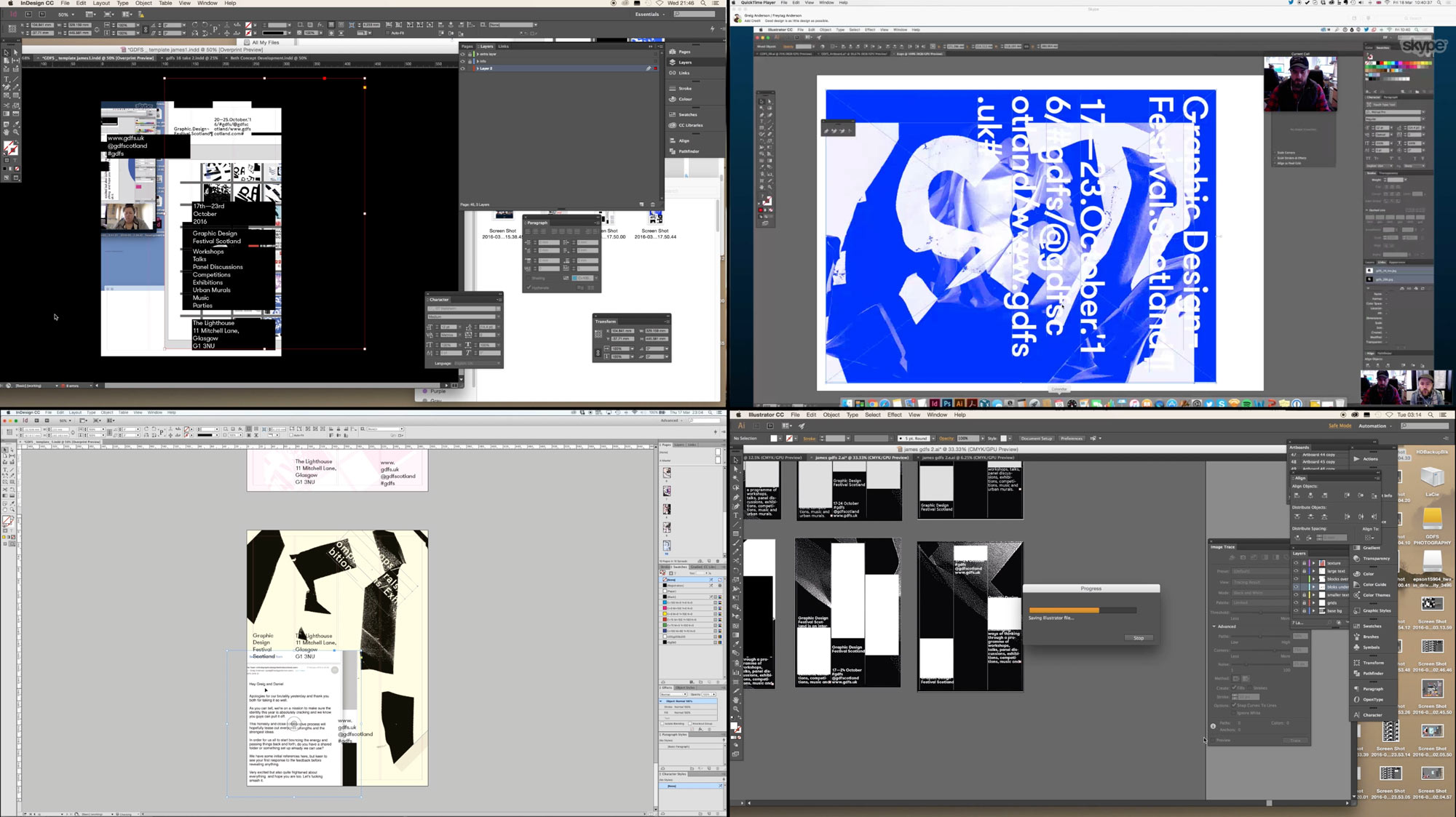
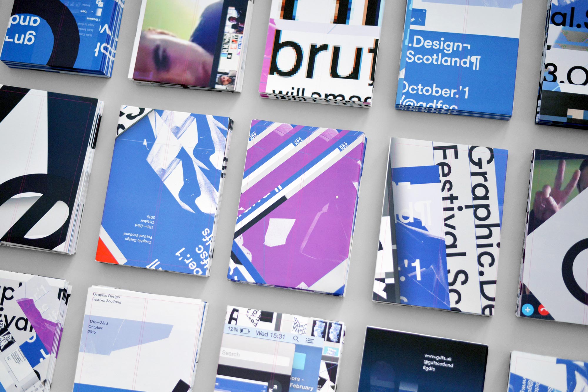
As the identity focused on process we documented everything we created; initial ideas, sketches, unfinished artwork, Skype conversations, email transcripts and even screen records as the work was physically designed.
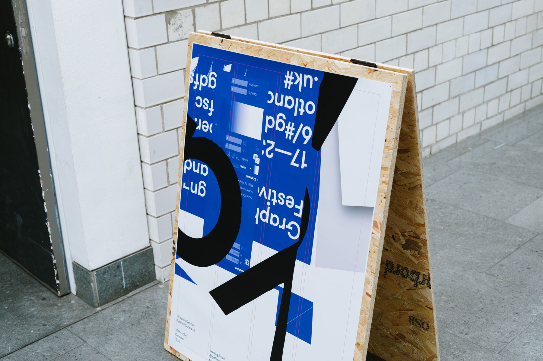
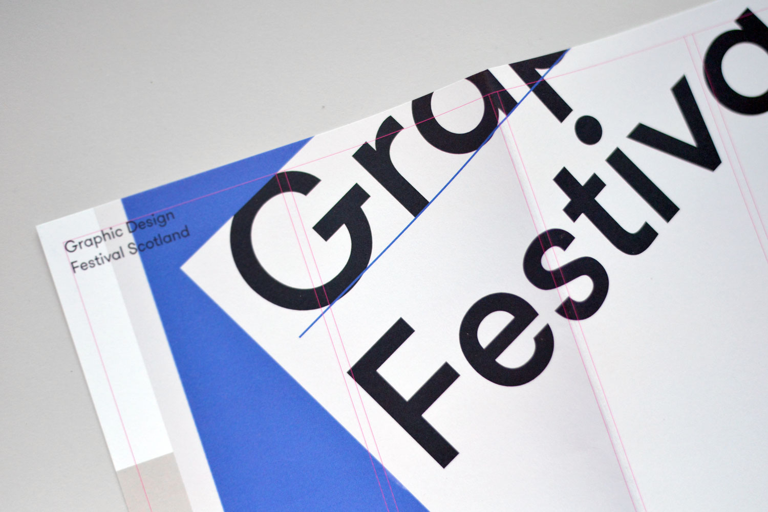
These then became the assets for the poster executions accented with a deliberately exposed grid system to offer some structure and calm amongst the chaos.
-
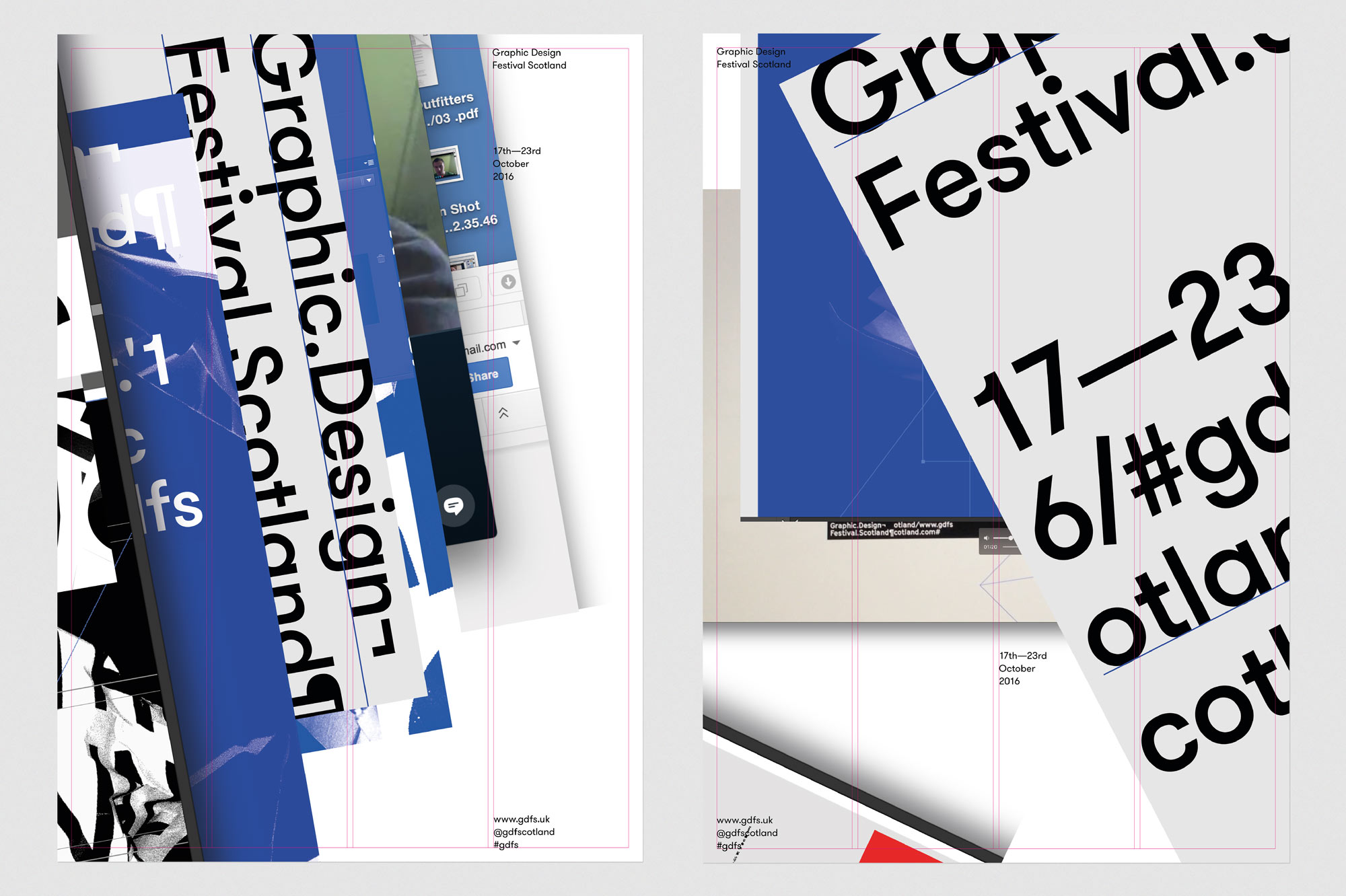
The festival is a platform for creative expression and experimentation, so we recognised that the identity should capture those same processes.
We wanted to create something which is more than a functional identification tool for the festival, but create something something which is living, evolving represents the raw energy and creativity that the festival provides.
-
-
-
-
-
-
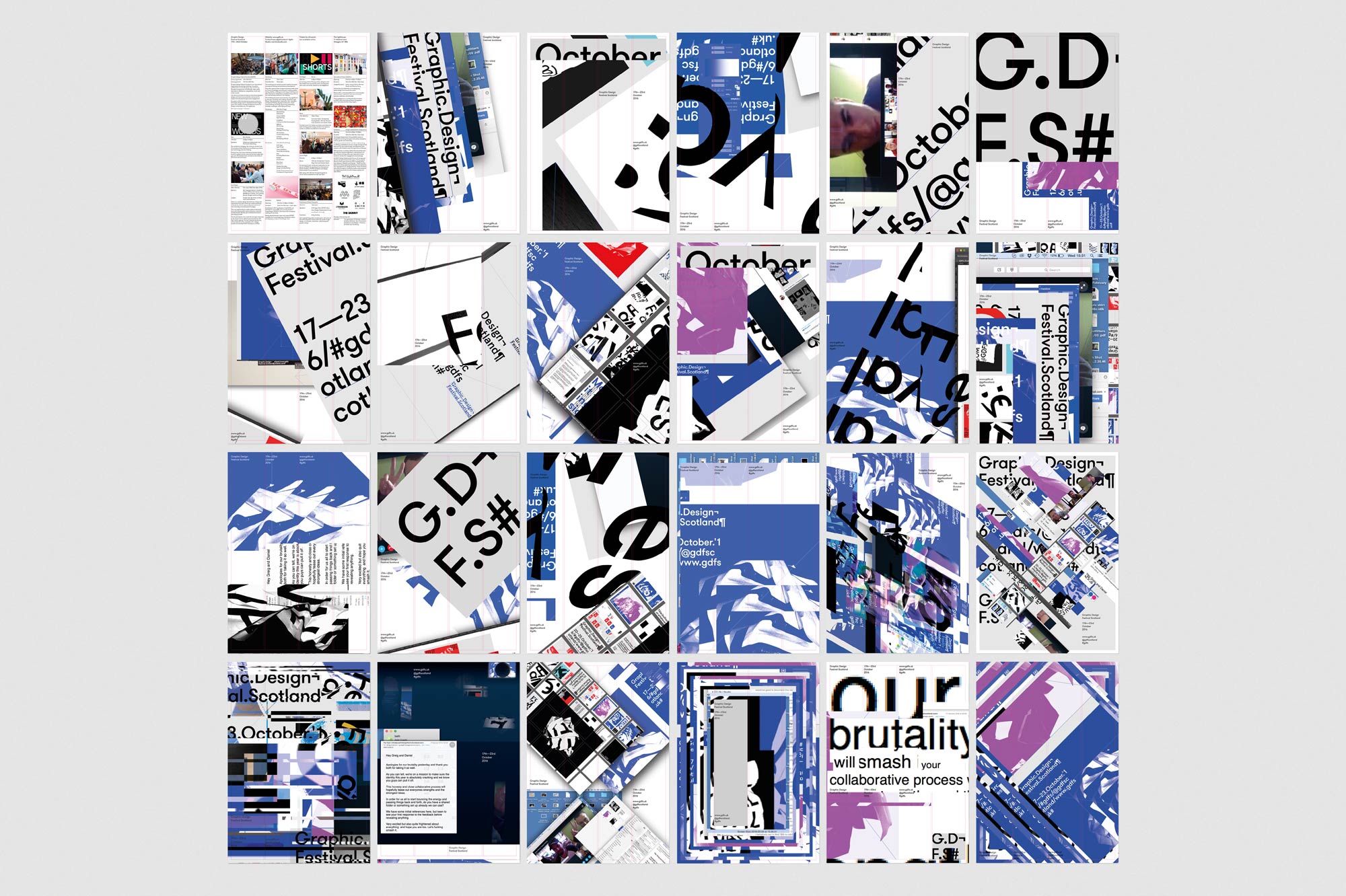
The collaboration initially produced 20 posters, a number which grew as the project developed.
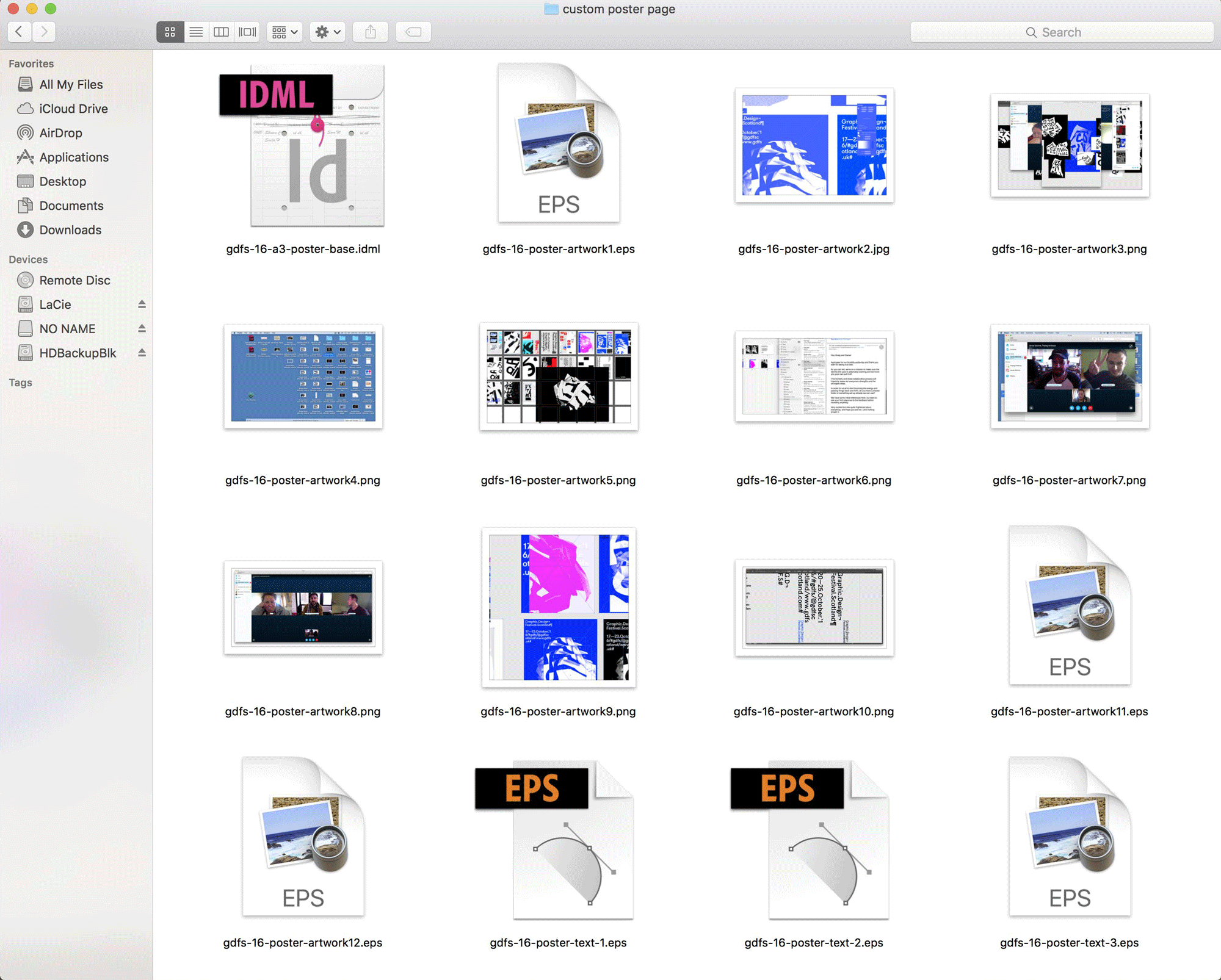
To expand the collaborative aspect of the identity, we made the source files public, inviting designers around the world to download them, reimagine the concept themselves and contribute to the on-going dialogue.
An area on the festival website allowed visitors to download the files and then submit the posters they produce back onto the website to be considered for inclusion in the final print run.
We encouraged participants to explore the key themes of the identity and visualise the notions of disruption, collaboration, friction and the marriage of new ideas.
-
-
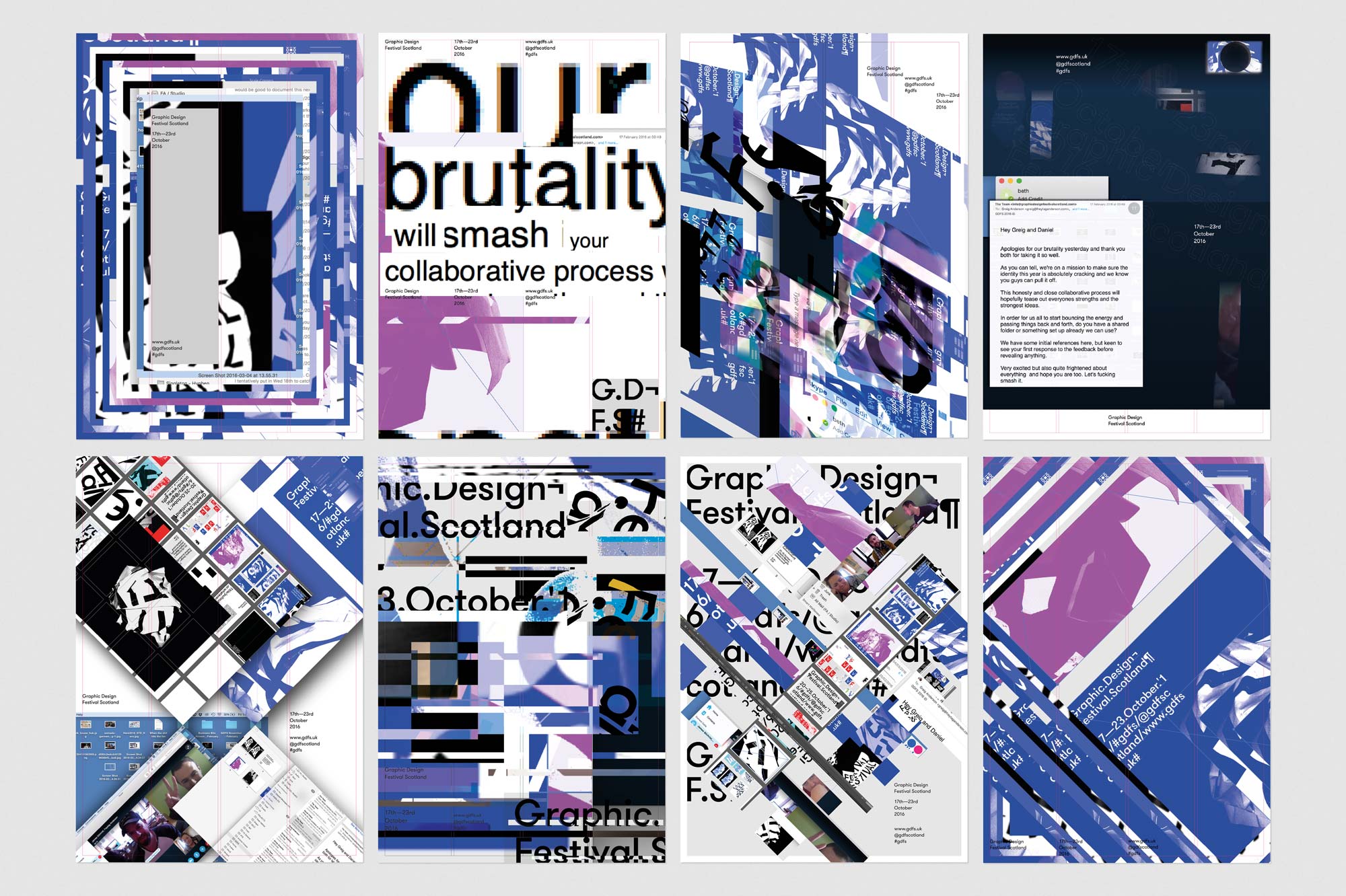
83 different designers from 15 countries including Australia, Denmark and Canada submitted their work to the online gallery which you can see here.
The 8 posters above were selected and included in the final print run. Designed by Ashley Moye, Burcu Salıcı, Nicola Narbone, Laurine Félicité, Mathias Skafte Andersen, Sam Longmire and Stephan Idé.
-
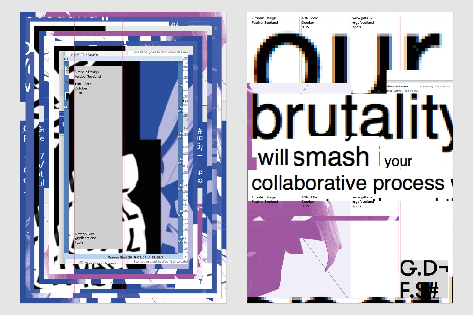
Posters designed by Nicola Narbone (l) and Sam Longmire (r) were amongst 8 selected for inclusion in the final print of promotional material.
-
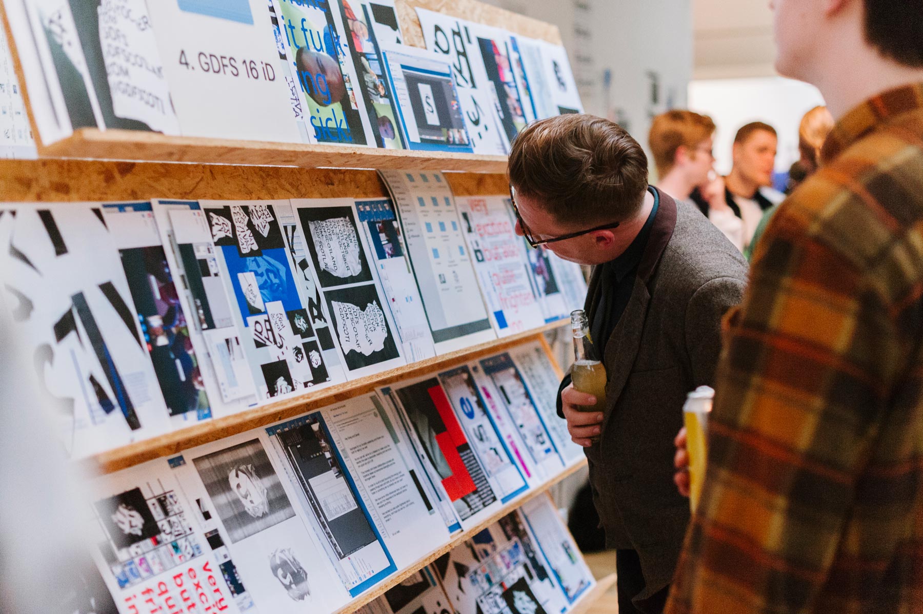
Festival attendees were offered the chance to physically browse through the development work and documentation from the identity giving more insight into the collaborative process.
-
-
-
-
-
-
-
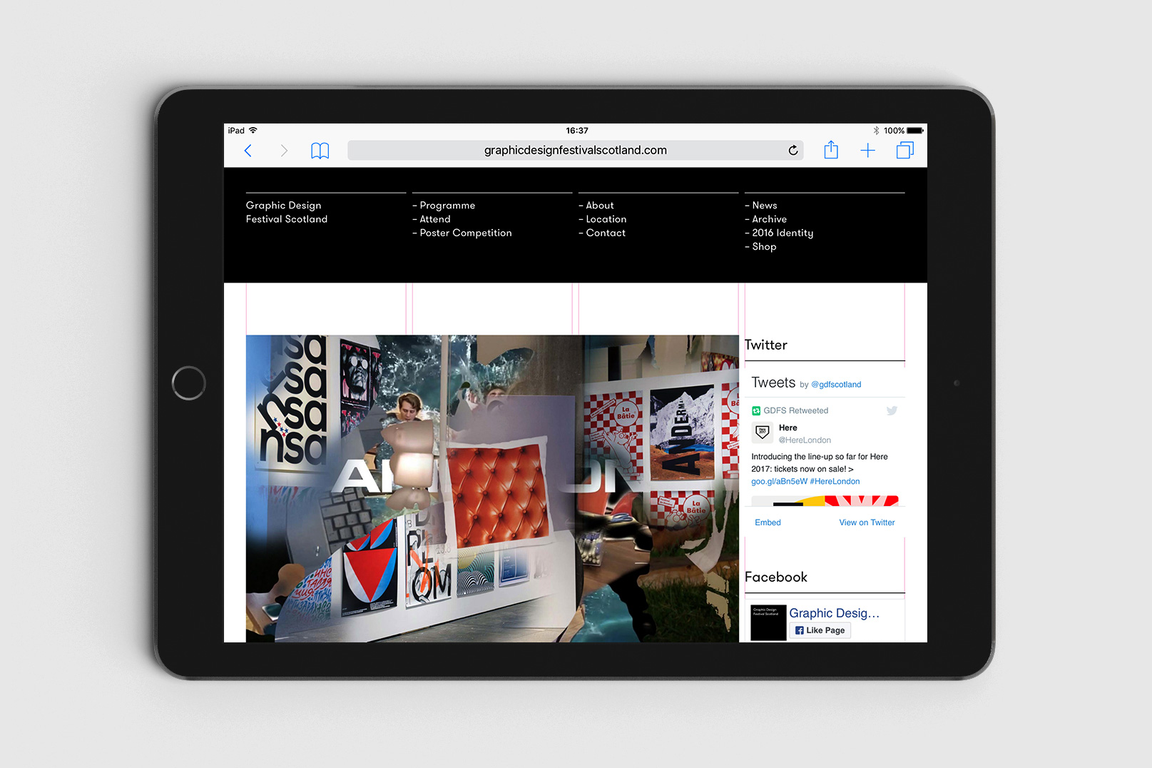
The identity concept and visual style was carried through to the website where visitors can find out more information, discover the programme, purchase tickets, submit to the poster competition, contribute to the identity and keep up to date with festival activities.
The website has been featured on Site Inspire and Httpster which "showcase the finest web and interactive design".
-
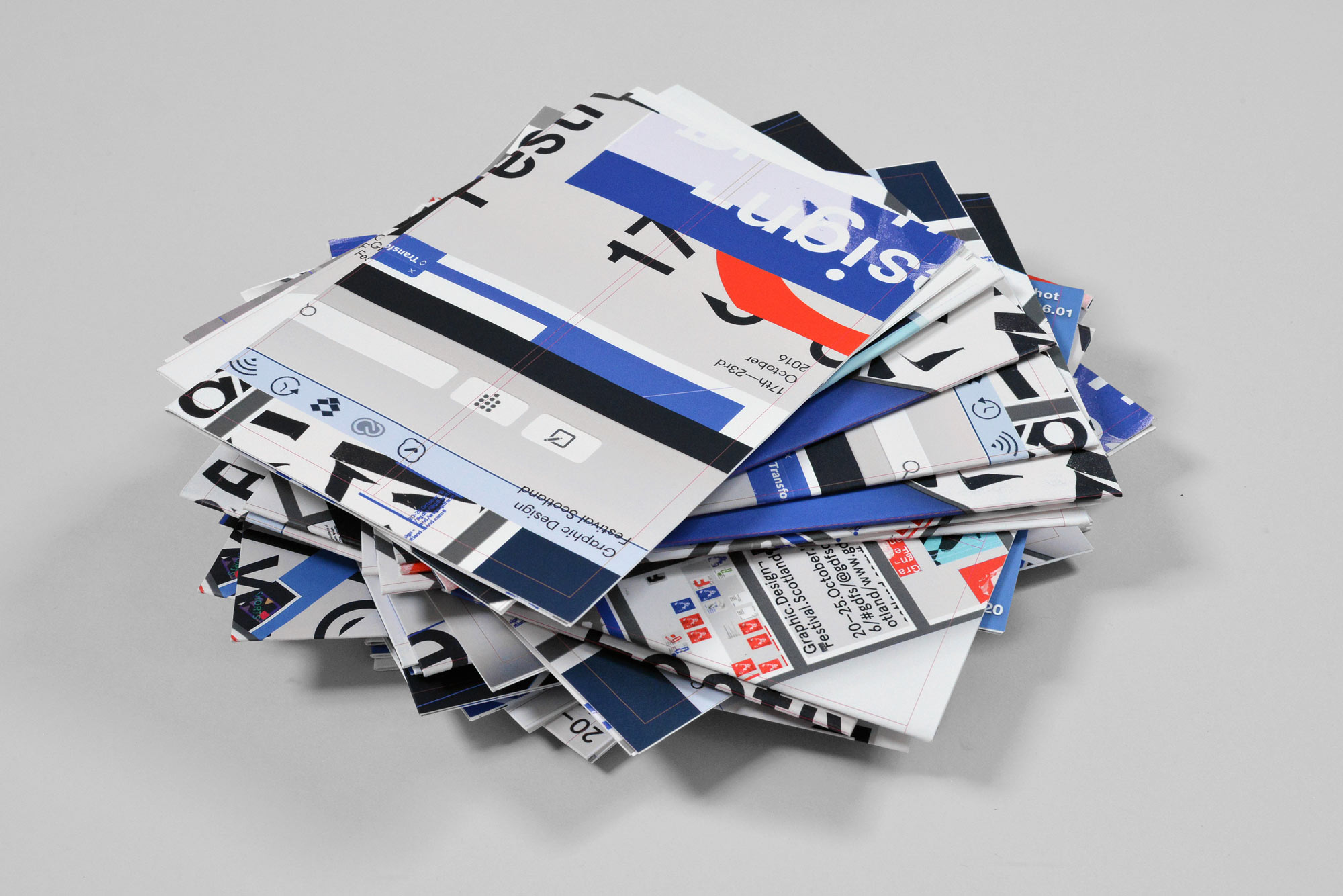
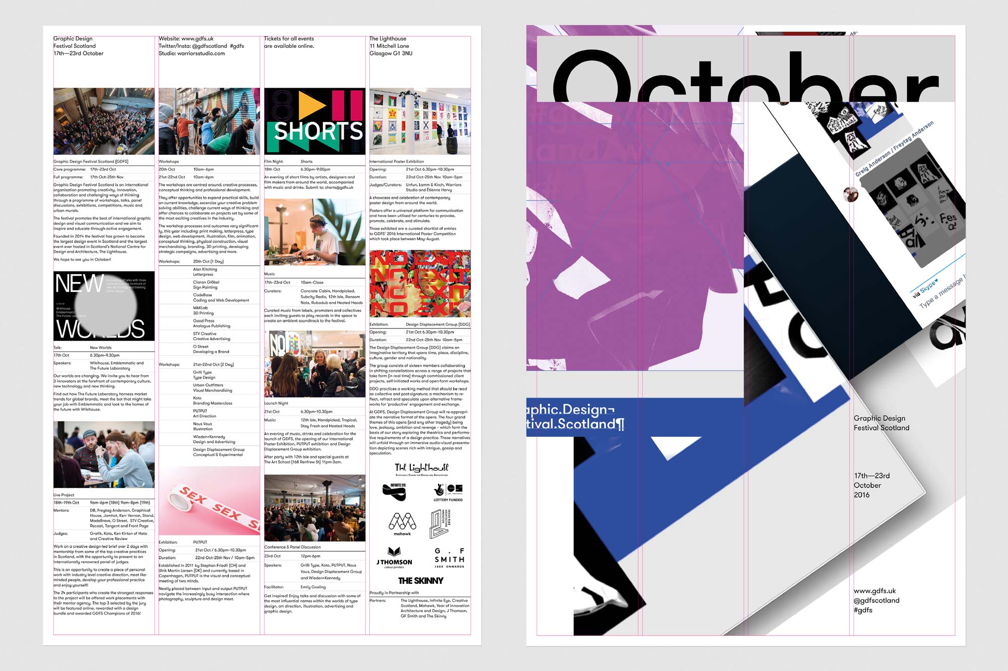
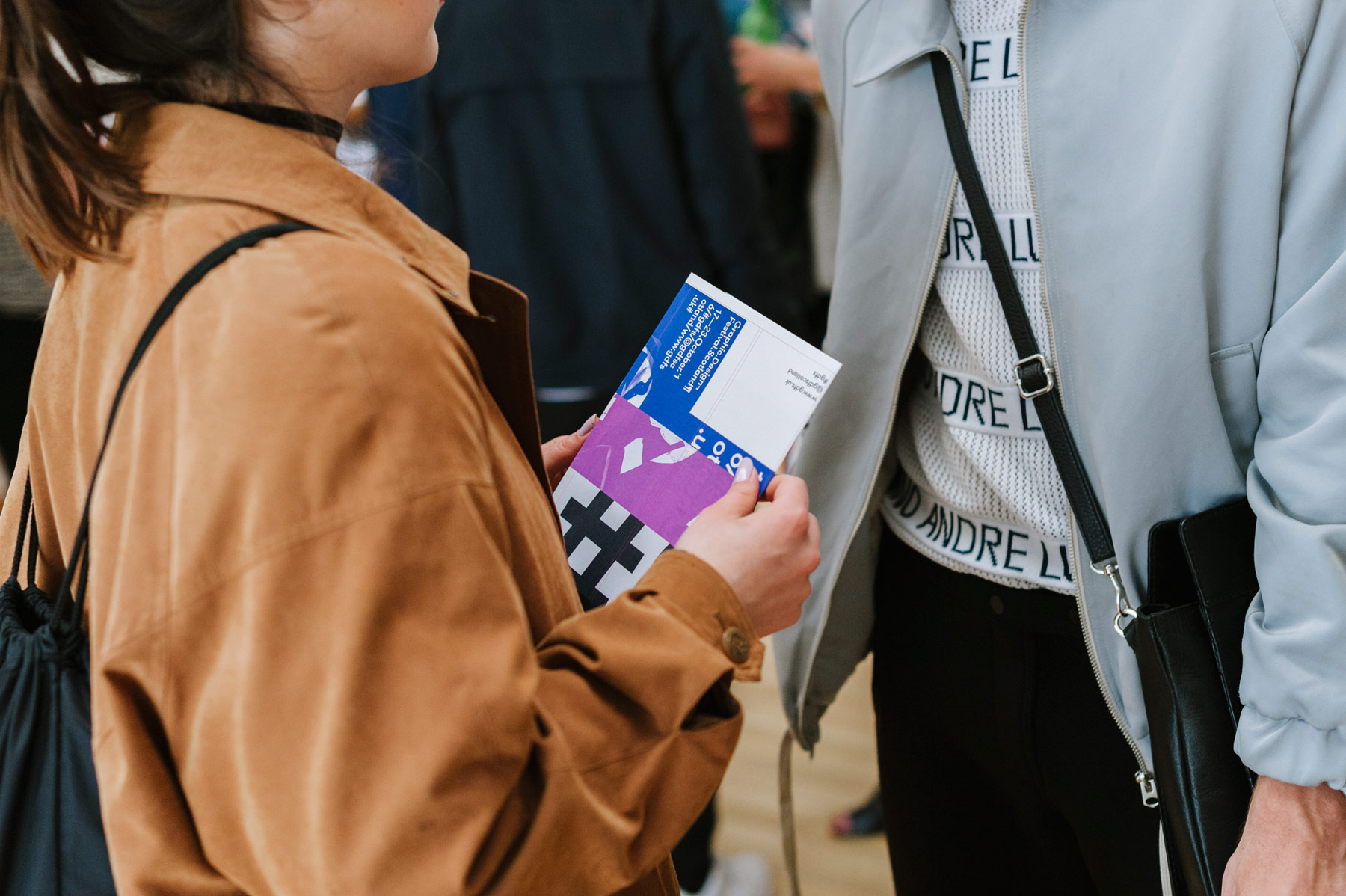
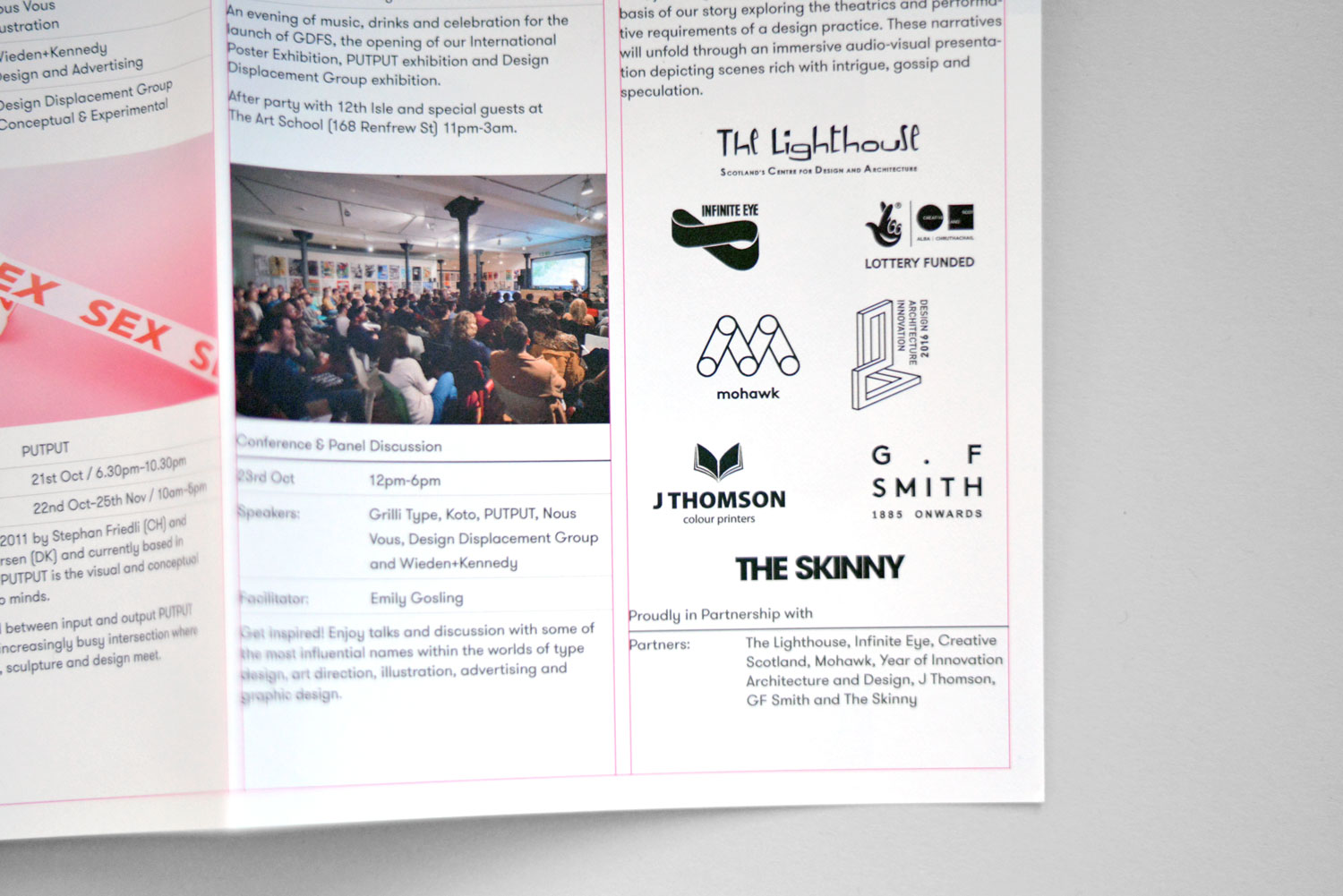
Double sided A3 poster programmes were printed to promote the festival, each with one of 24 different poster designs on the front and the programme on the back.
Digitally printed by J Thomson on a thick uncoated white stock provided by GF Smith – 140gsm Naturalis Absolute White Matt paper .
-
-
-
-
-
