Peach
Helping Peach hit the ground running with branding, creative direction, artwork and motion design, since featured on Radio 1, Dazed, Kiss FM and Foundation FM
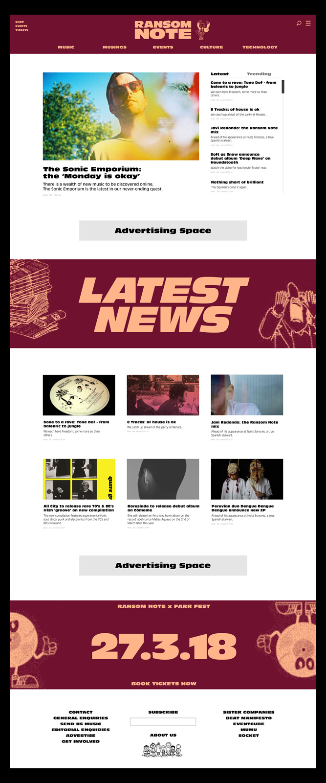
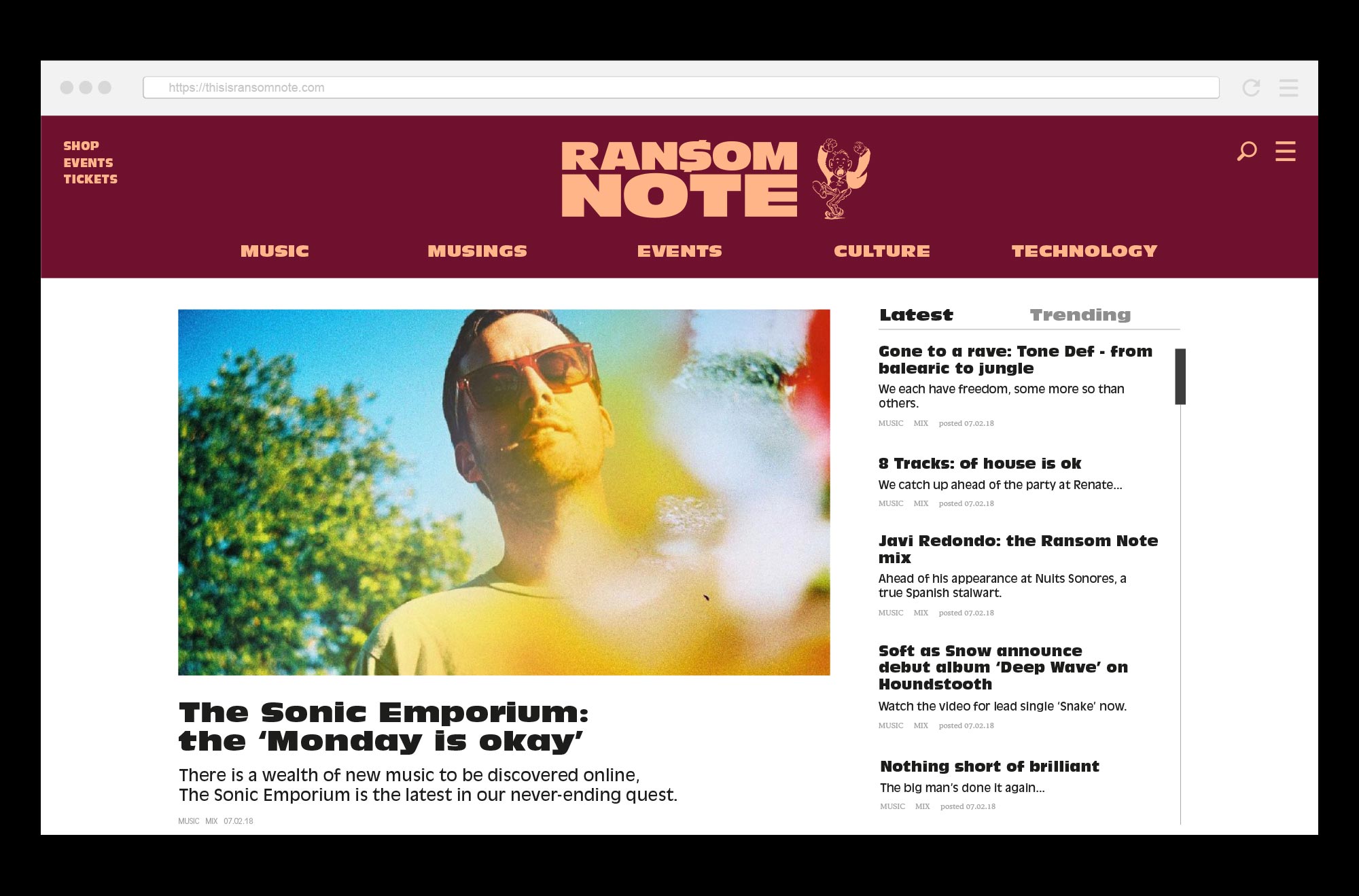
Bringing a fresh perspective to an established music media platform with a communication strategy, brand development and assets for online promotion
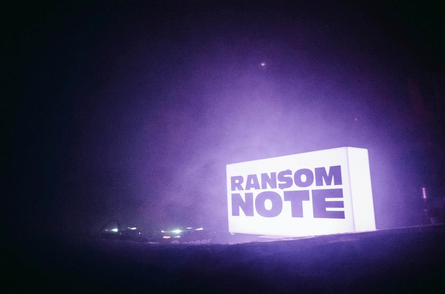
Ransom Note is an online music, arts and culture magazine.
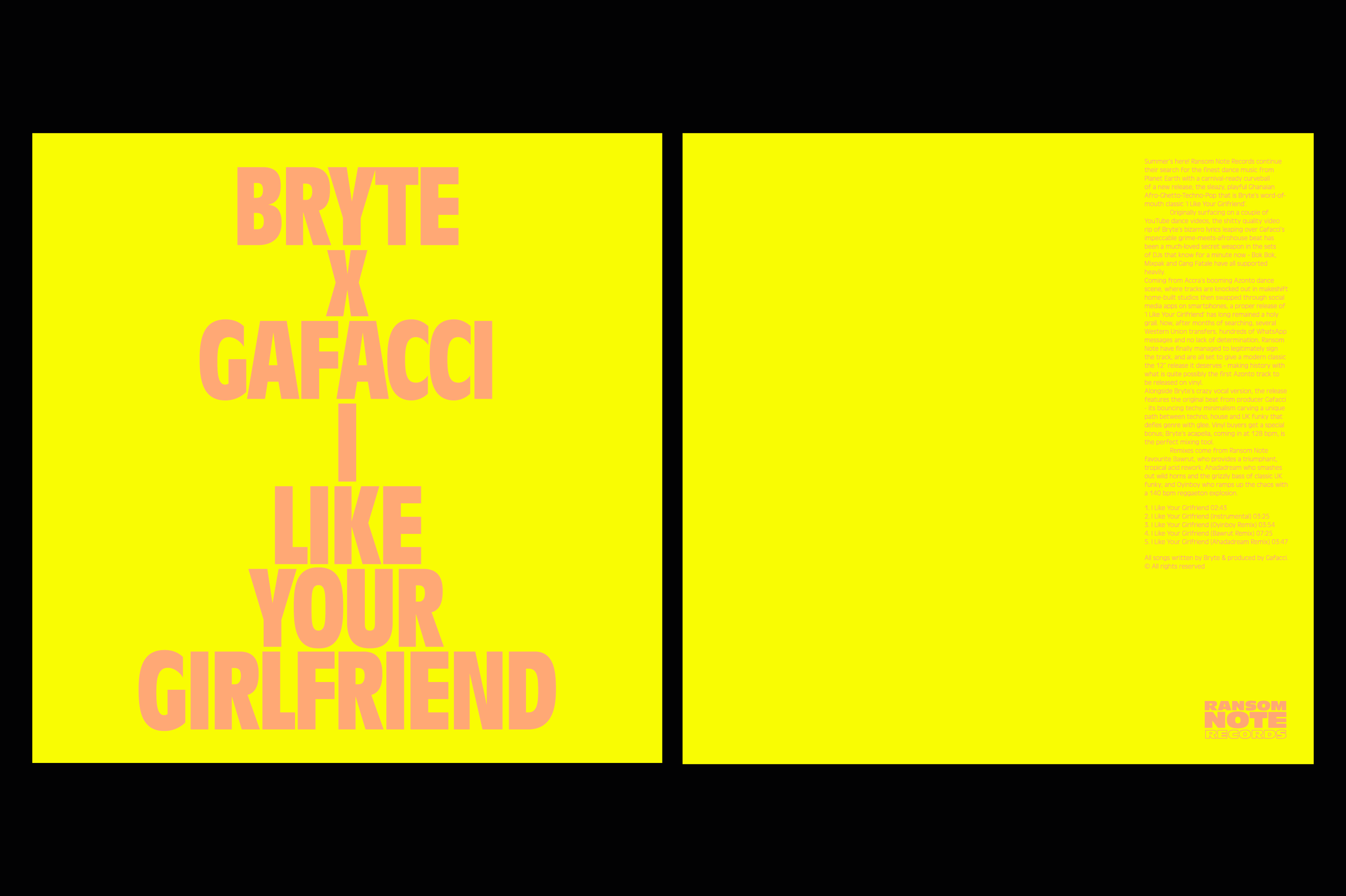
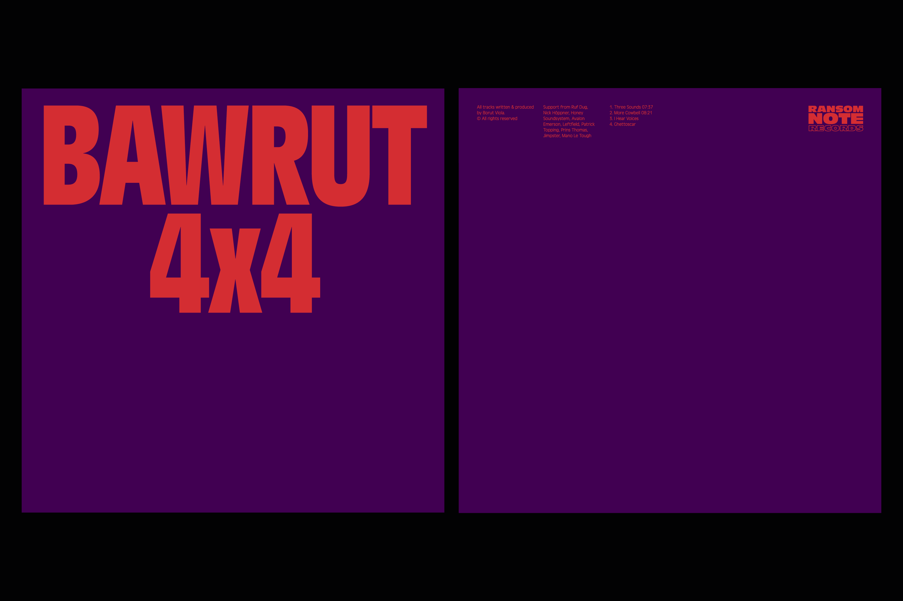
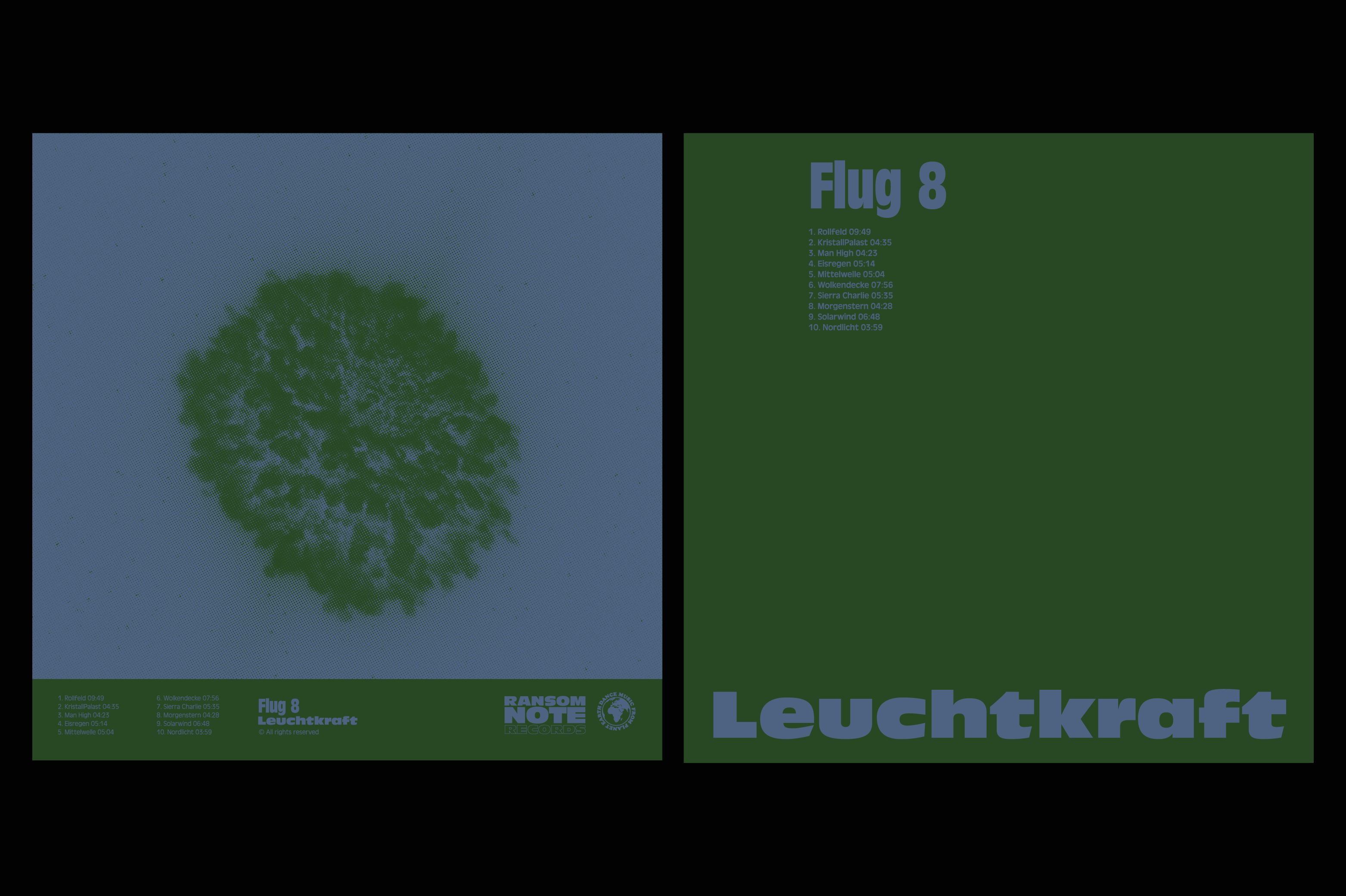
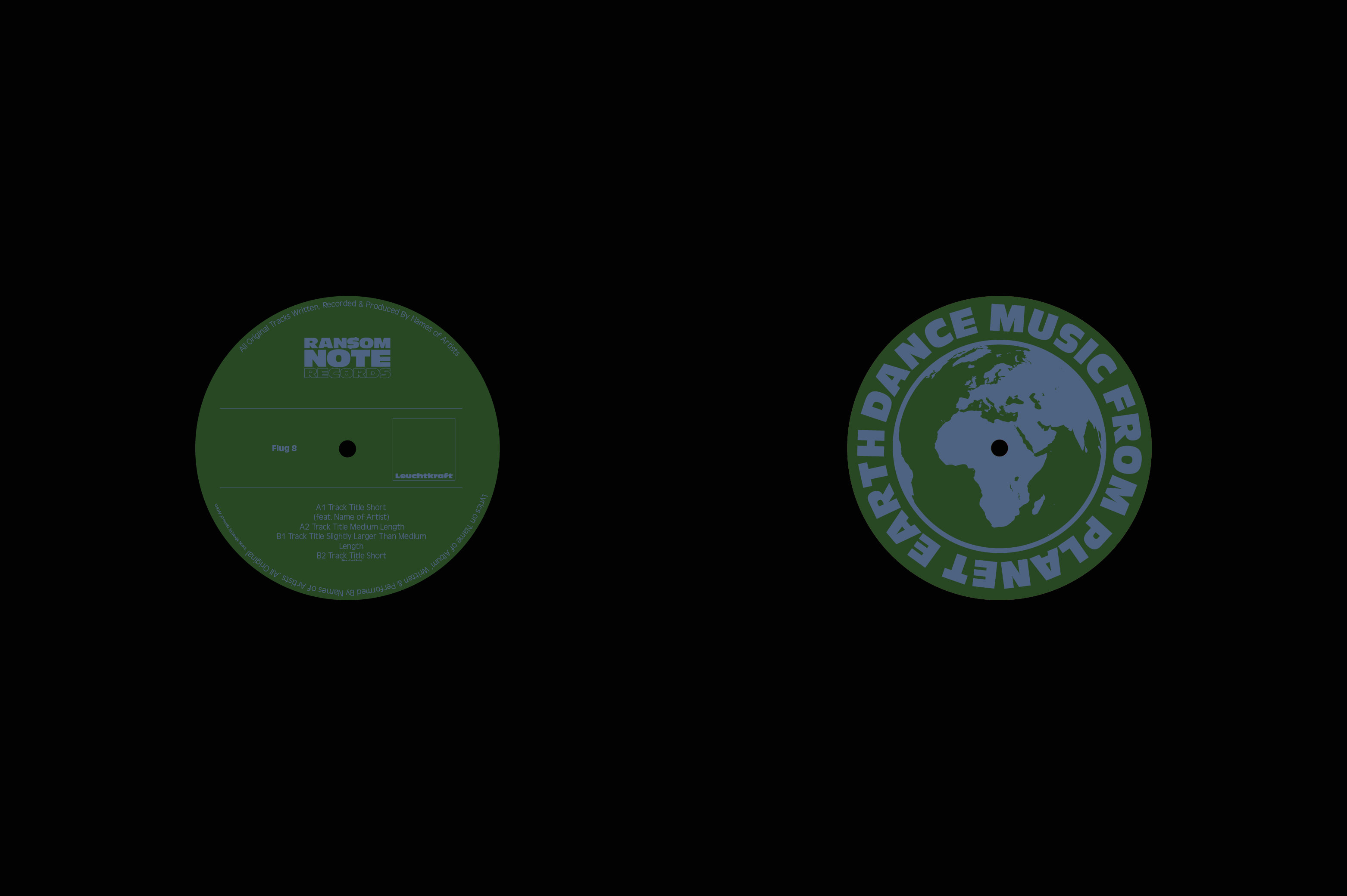
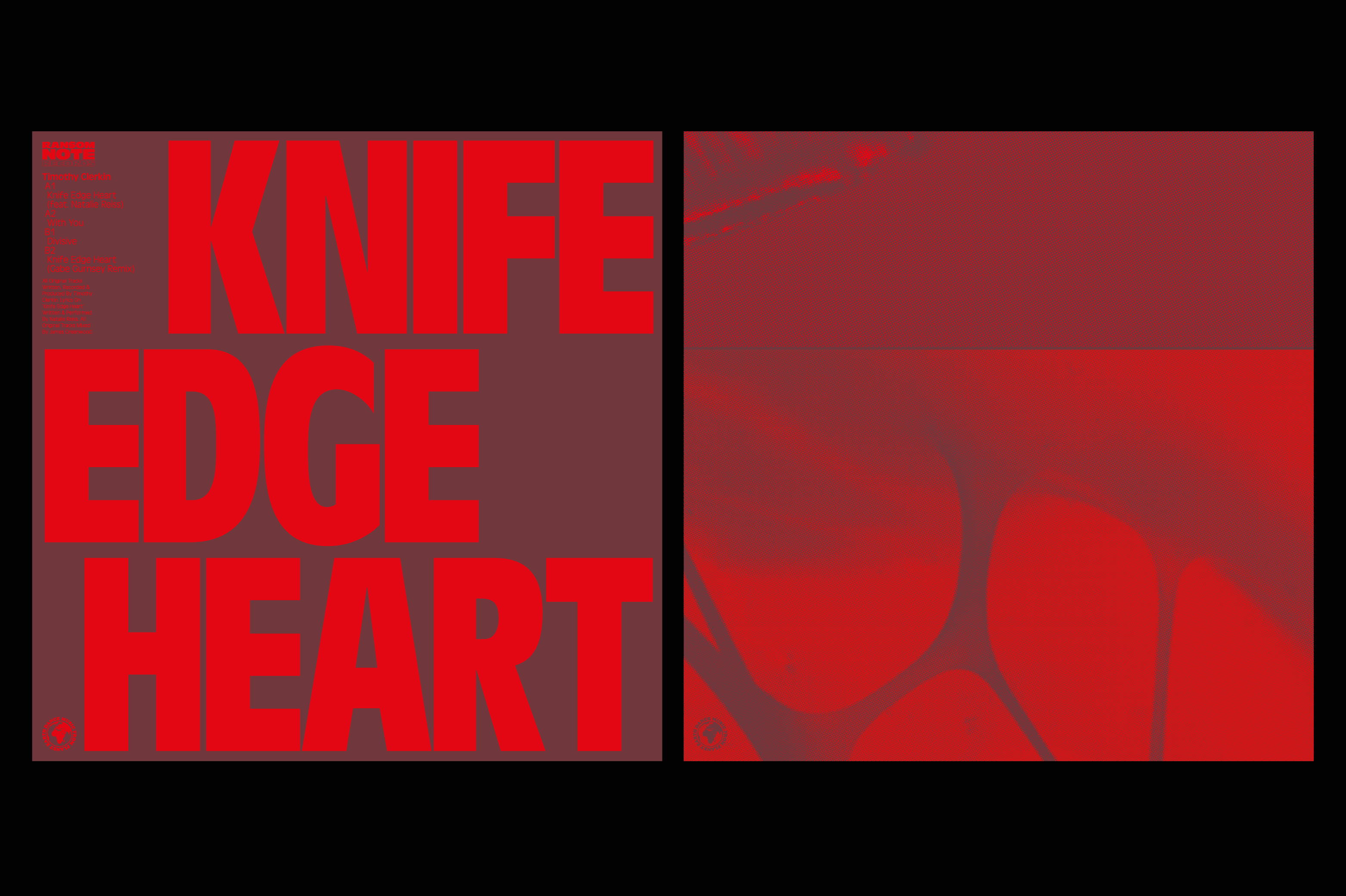
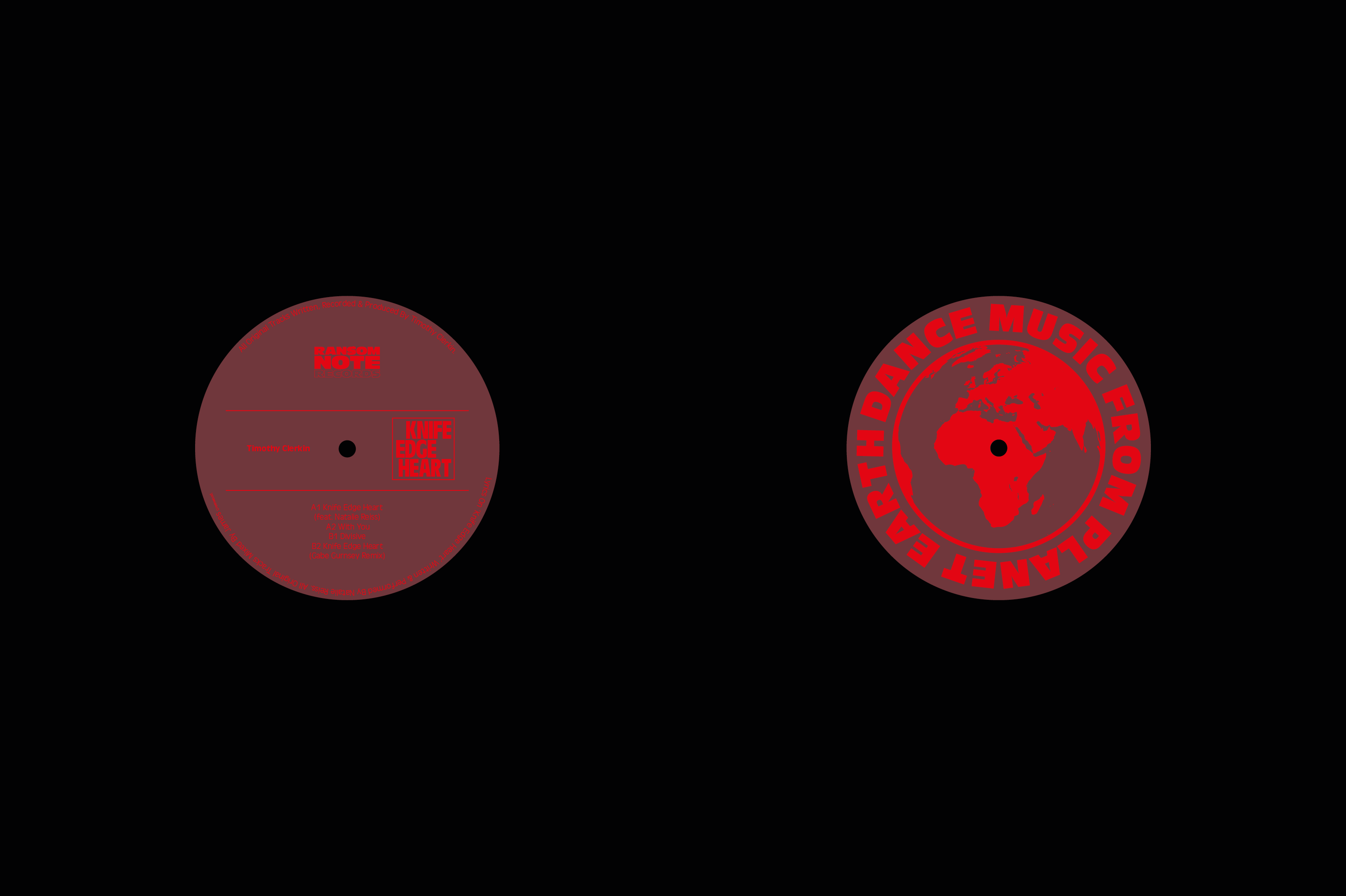
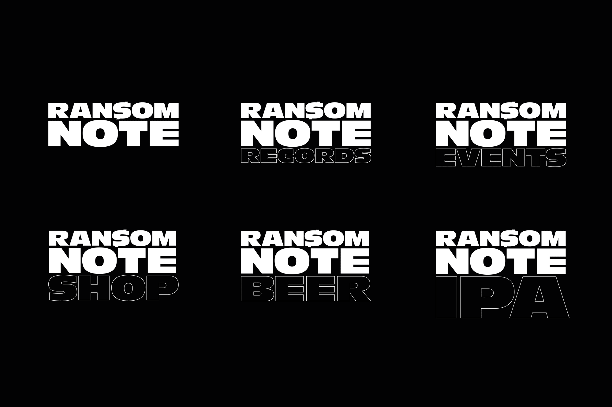
Ransom Note also run a record label, record store, organise events, curate music programmes and deliver brand partnerships.
With such a varied offering Ransom Note identified confusion in the brand's communication and brought us on board to help with coherence, clarity and uniting the brand's visual language.
Working together offered Ransom Note's team clarity on the brand's current communication, identified areas to improve, offered a strategy, creative direction and cohesive route for moving forward.
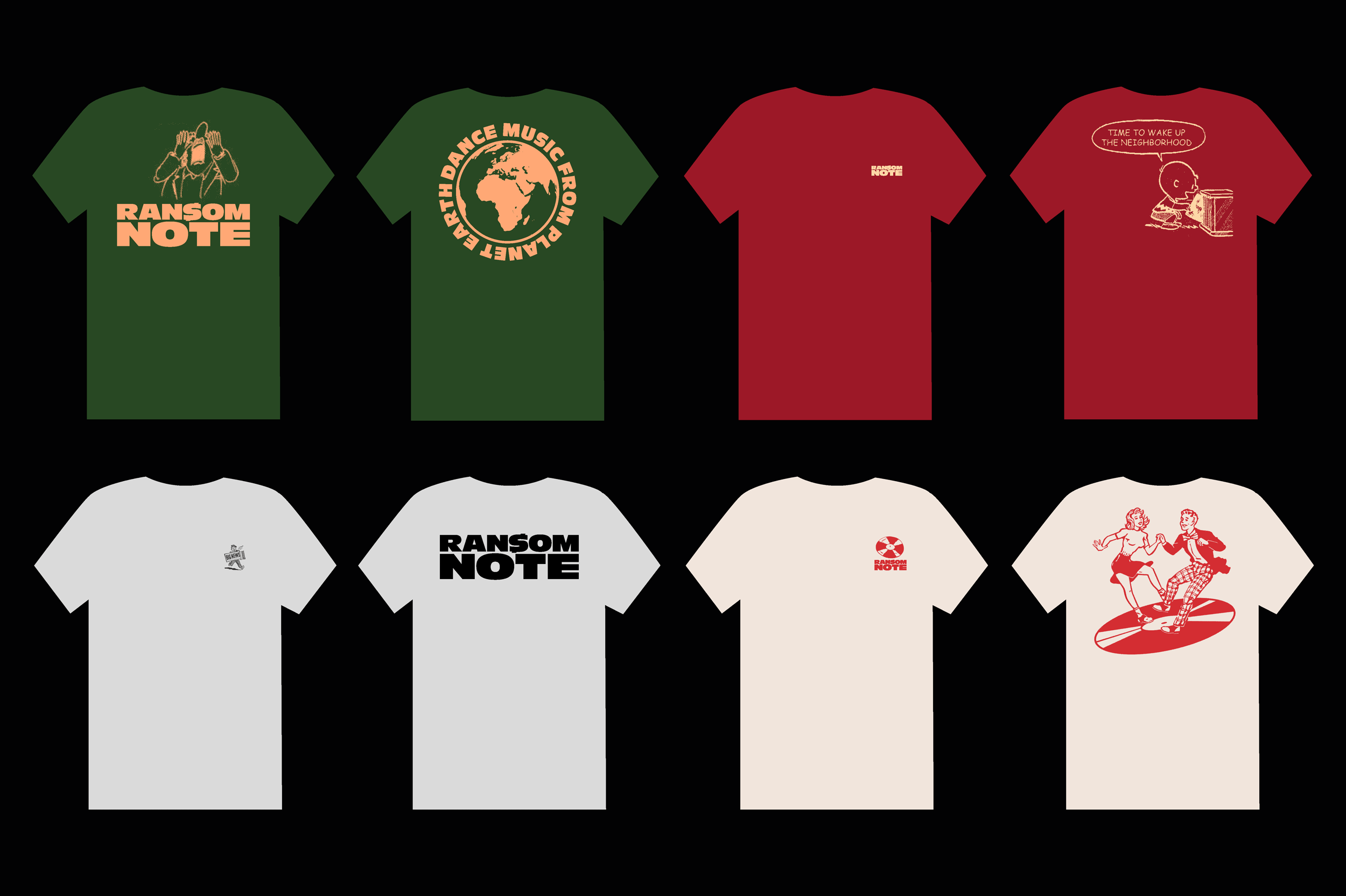
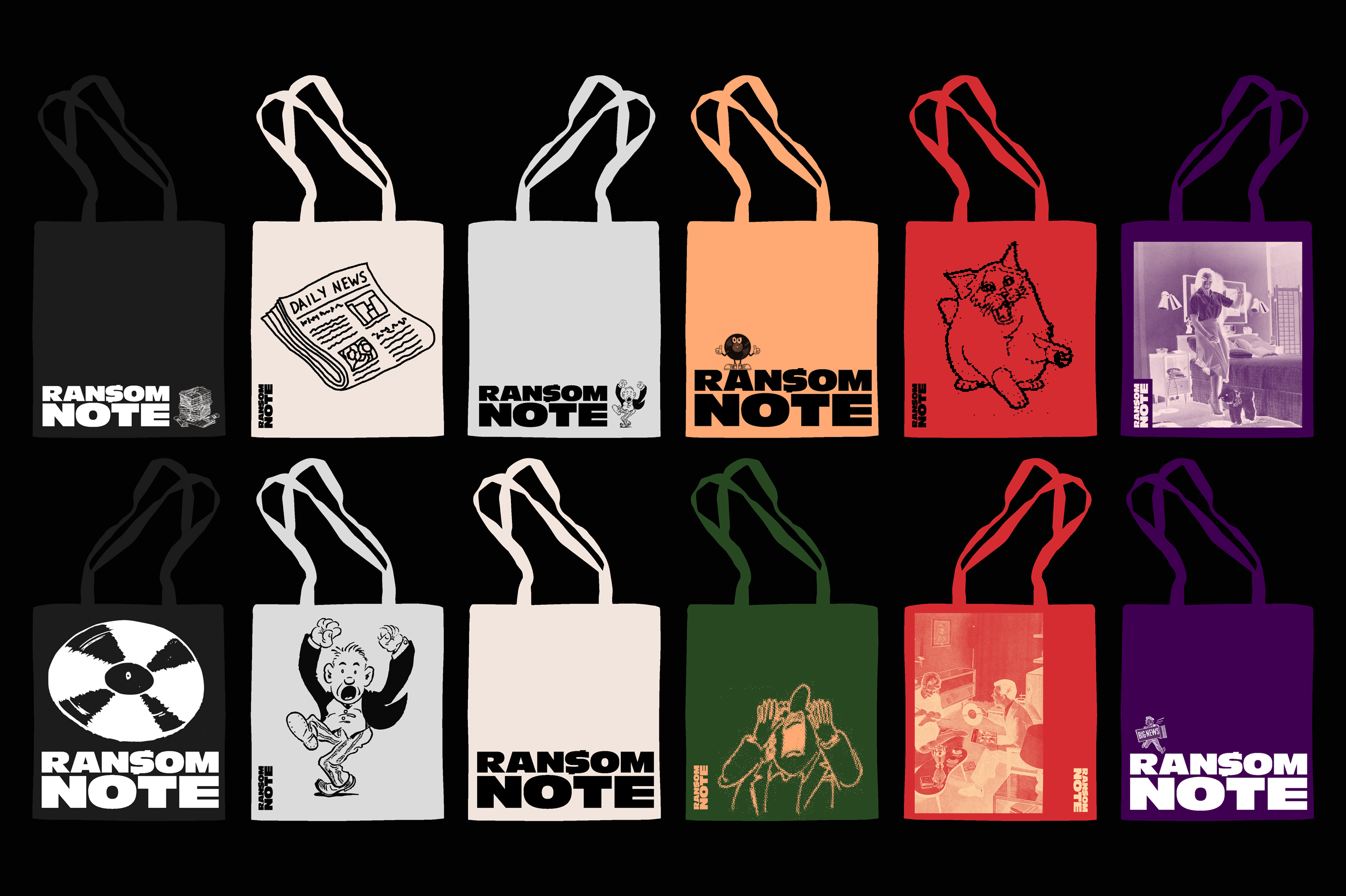
The new logo is live and merchandise is now being sold to music lovers across the world. Some elements are rolled out across Ransom Note's platforms. Some were not used and the templates are now in the safe hands of Ransom Note's in-house team.
The key objectives for working together included:
Part of our challenge was to retain the character of the brand which the team had built up organically while introducing a new level of coherence and consideration.
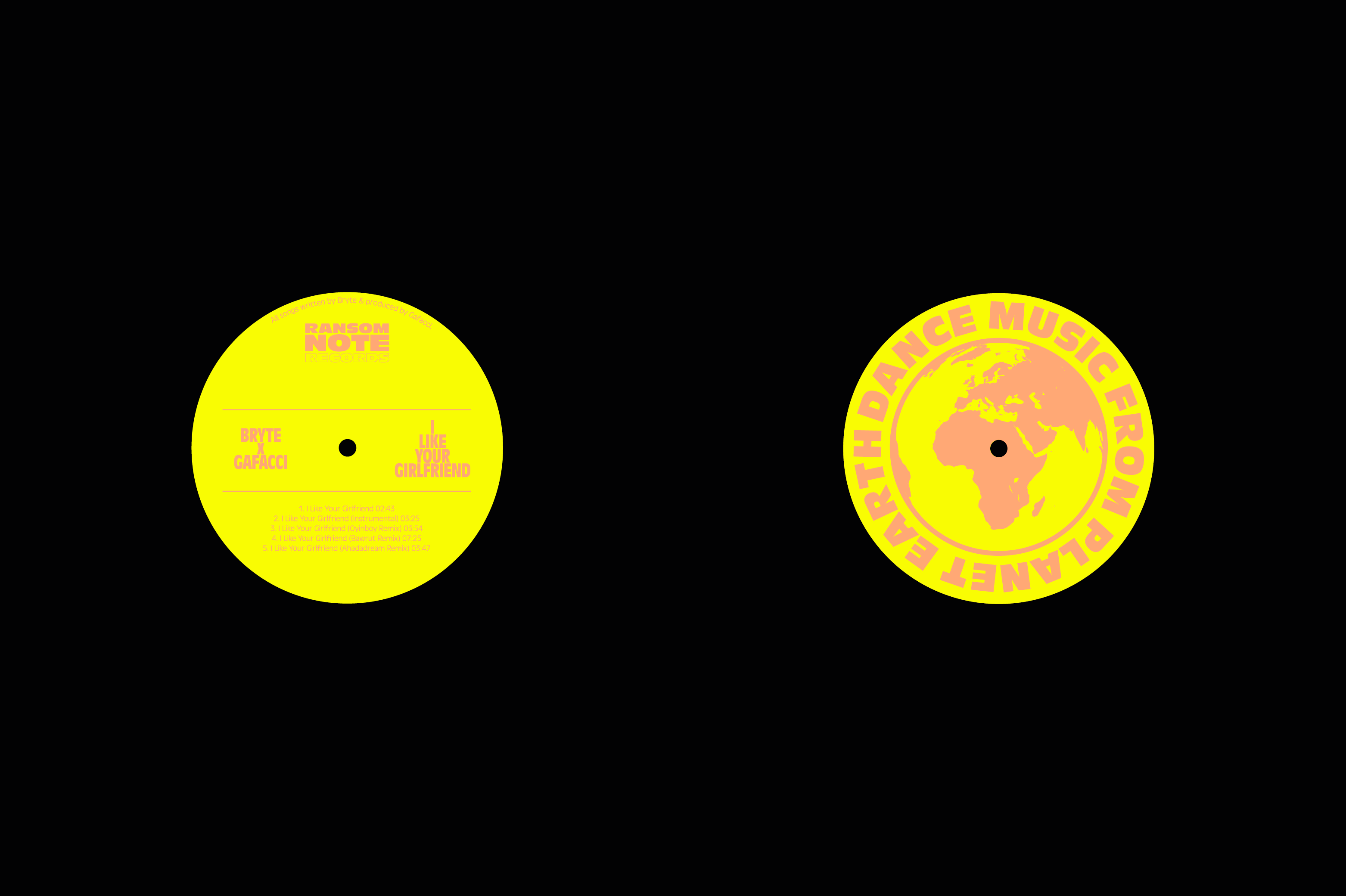
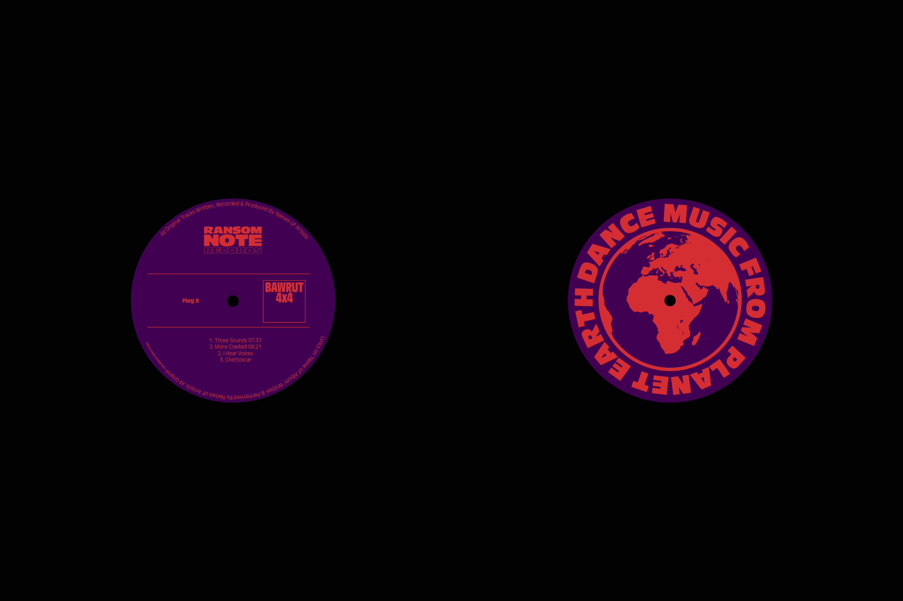
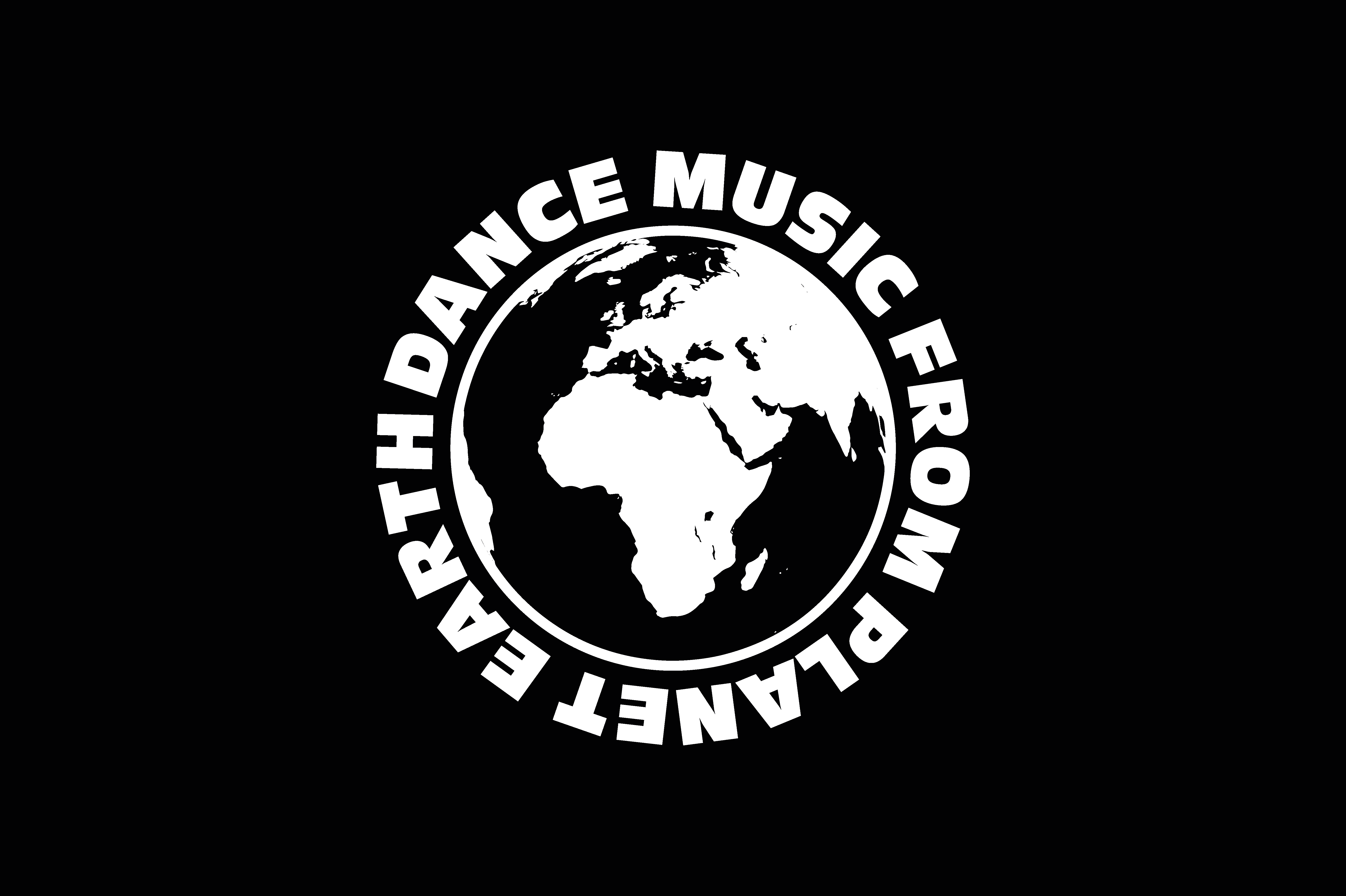
Elements were highlighted by the team as being integral to the brand including the globe icon logo, the dollar stroke S of their logo and the tone of voice so these elements were carried forward.
Introducing a new brand typeface which balances a personal tone with the values of the platform was introduced to offer more flexibility and continuity. All branded assets from bold record sleeve artwork to large-scale dynamic posters through to small detailed social media posts could be visually connected through the typography.
Through in-depth research and workshops with the Ransom Note team we delved into the core of what the brand is all about:
“The Private Eye of dance music”
“Electronic music with personality.”
All design and creative work was then informed by this research.
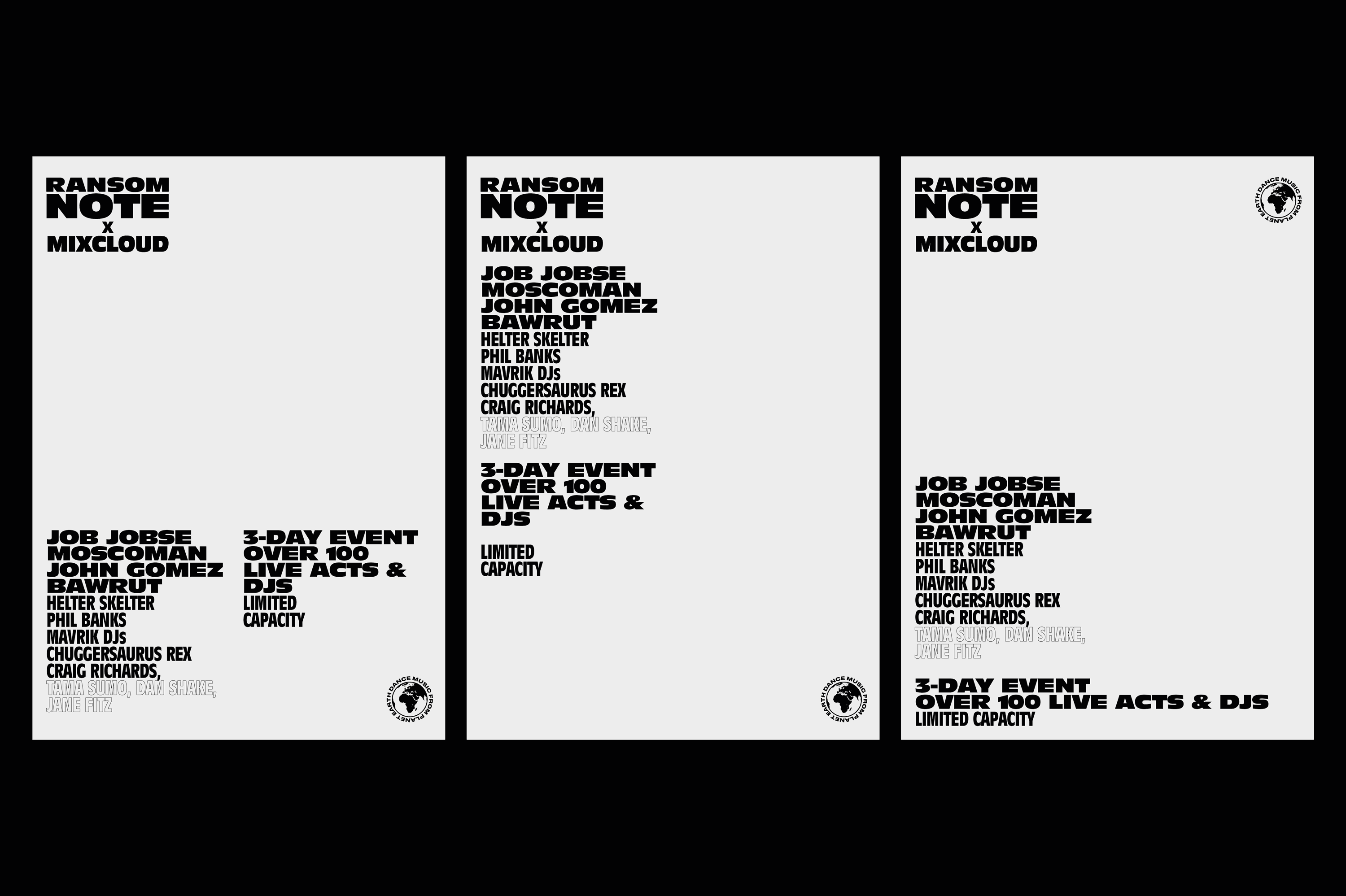
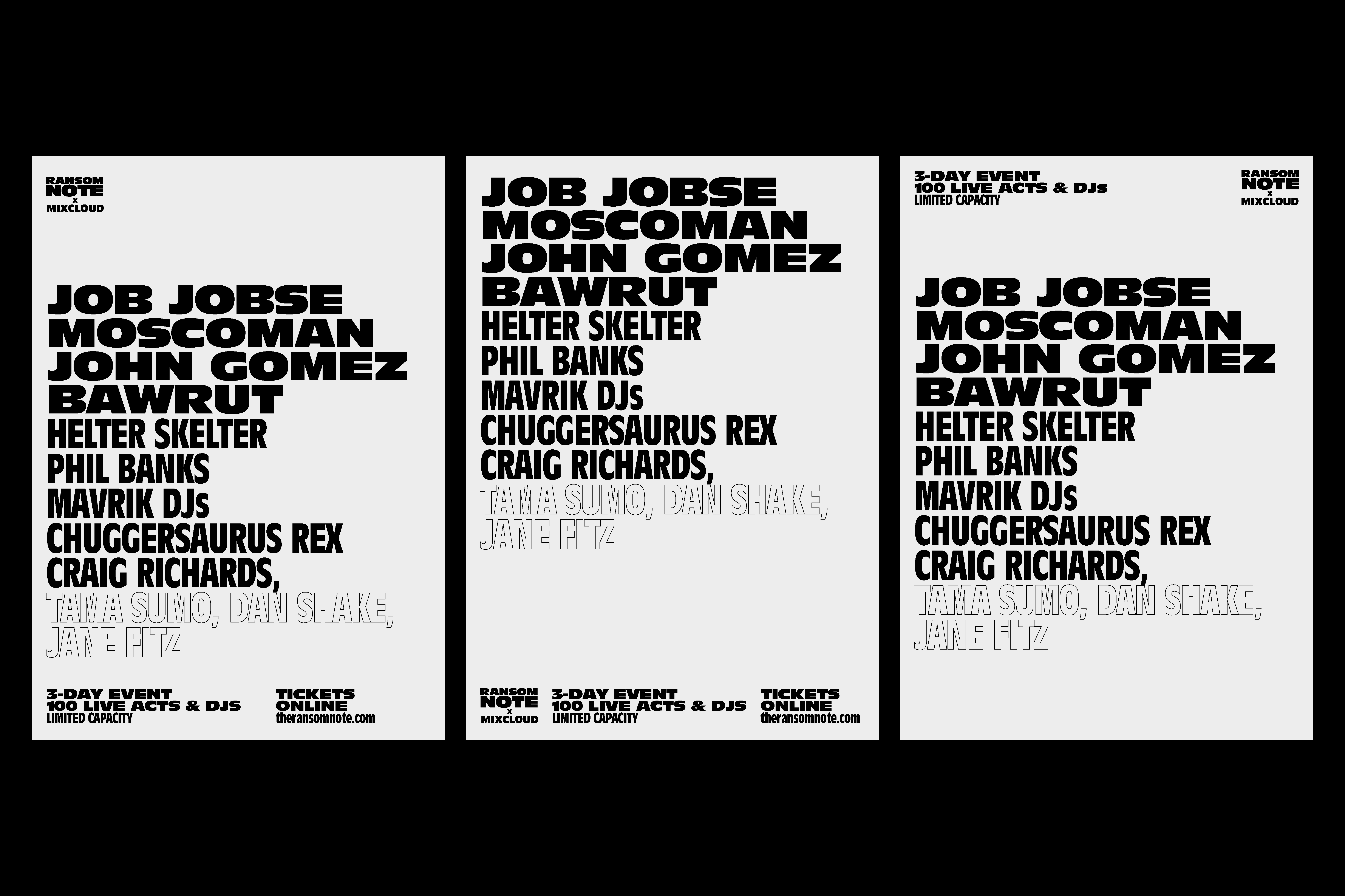
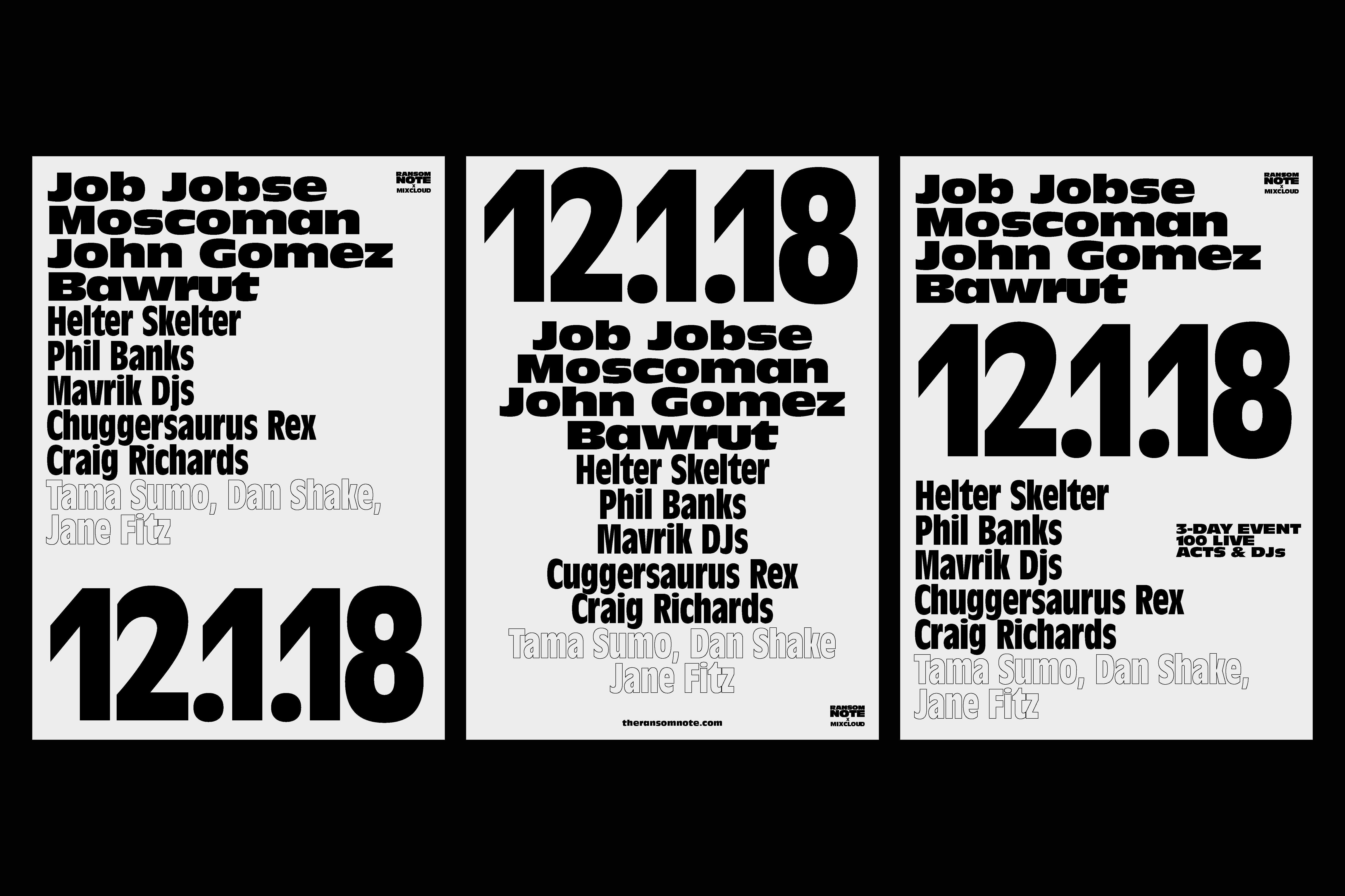
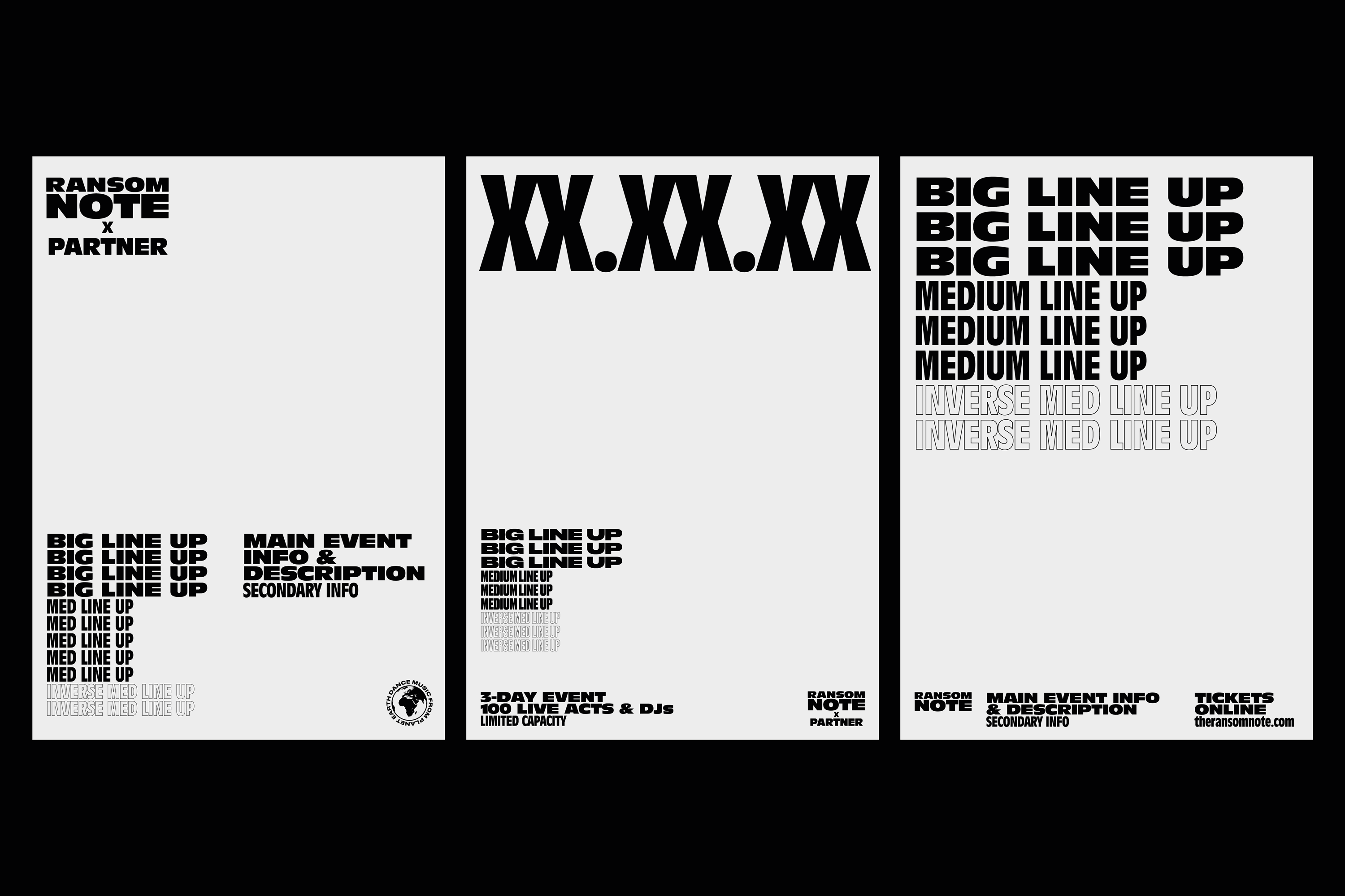
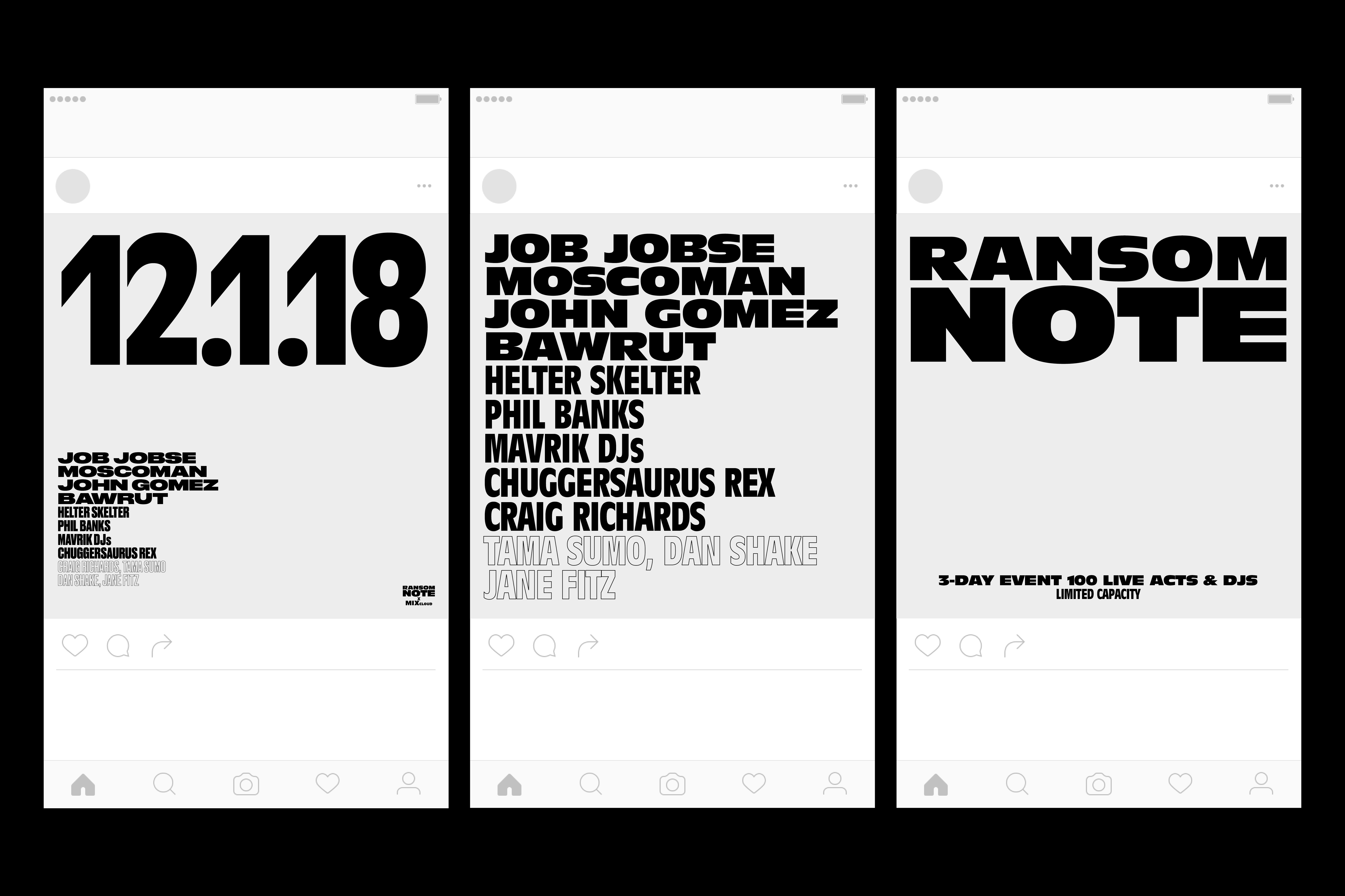
Once the visual language and identity had been established, the brand assets designed include: