THYPE
- identity
- campaign
- event
A bold identity for an exhibition of artists and designers, from across the world.
Inline with Graphic Design Festival Scotland 2015, we partnered with Recoat to organise an exhibition of artists and designers who explore letterforms through their work.
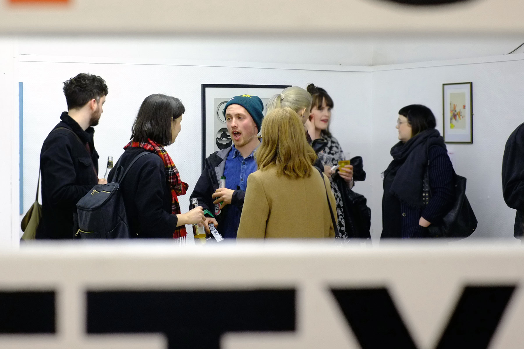
THYPE was open to the public for 15 days, welcoming more than 1000 visitors through the doors of a previously disused space in the East end of Glasgow – thanks again to On the Corner for their support.
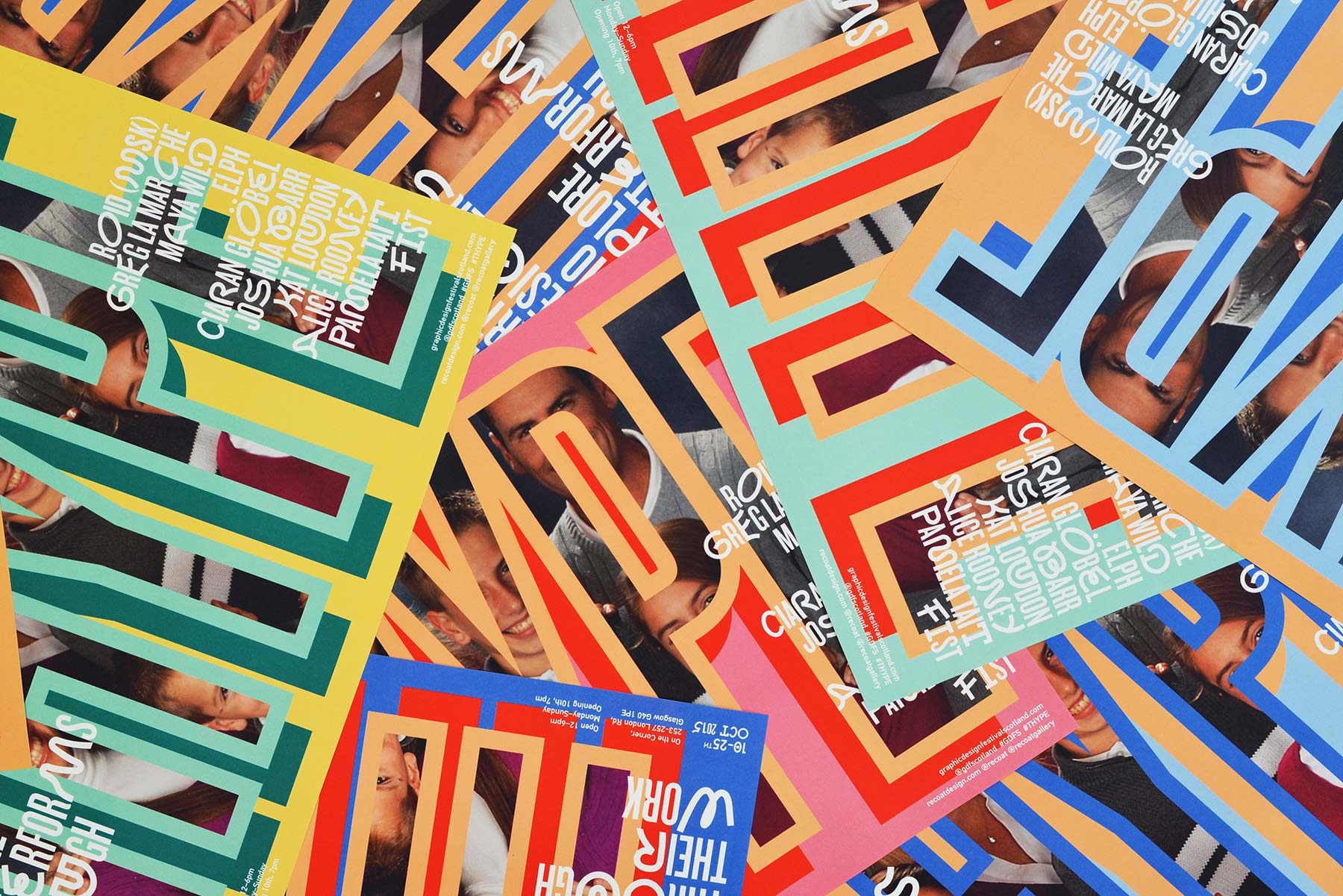
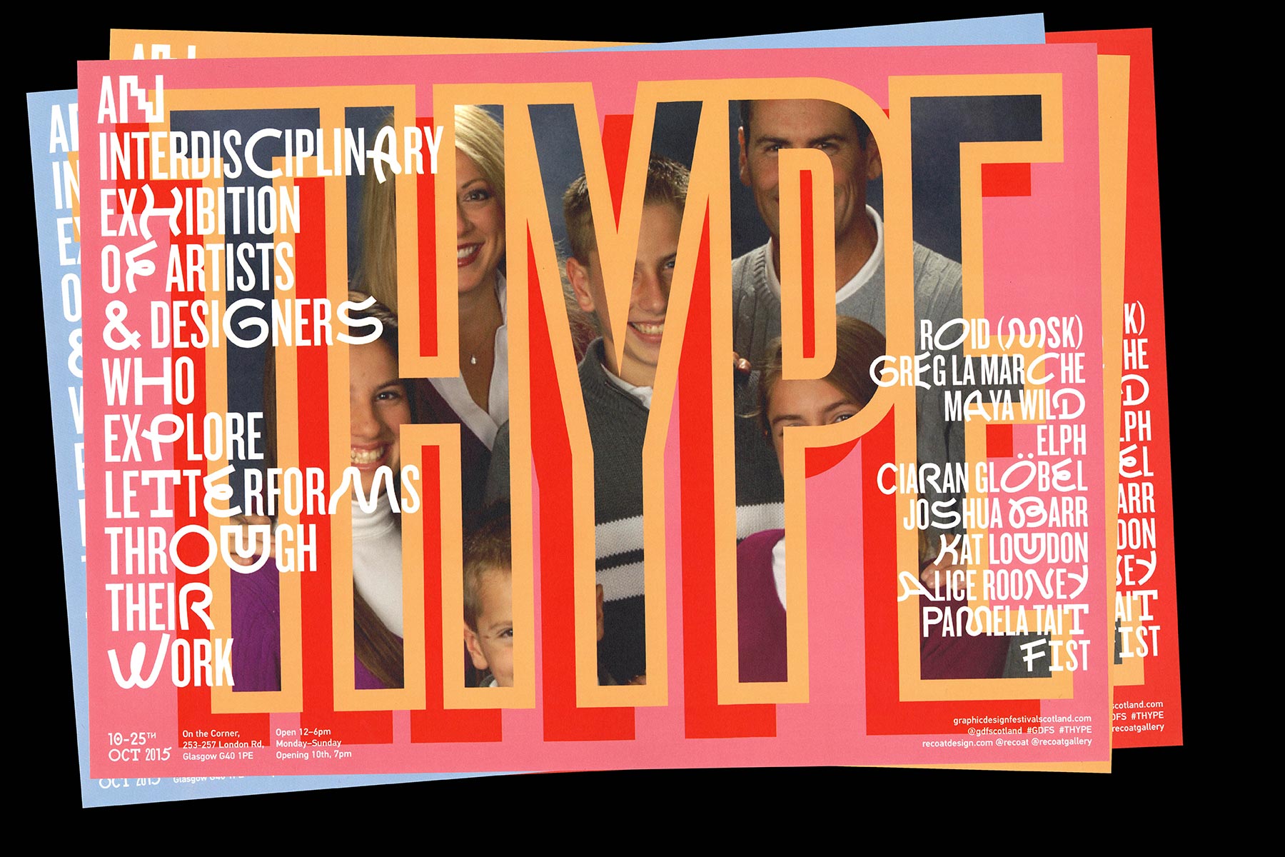
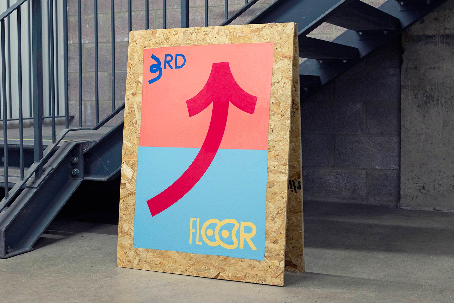
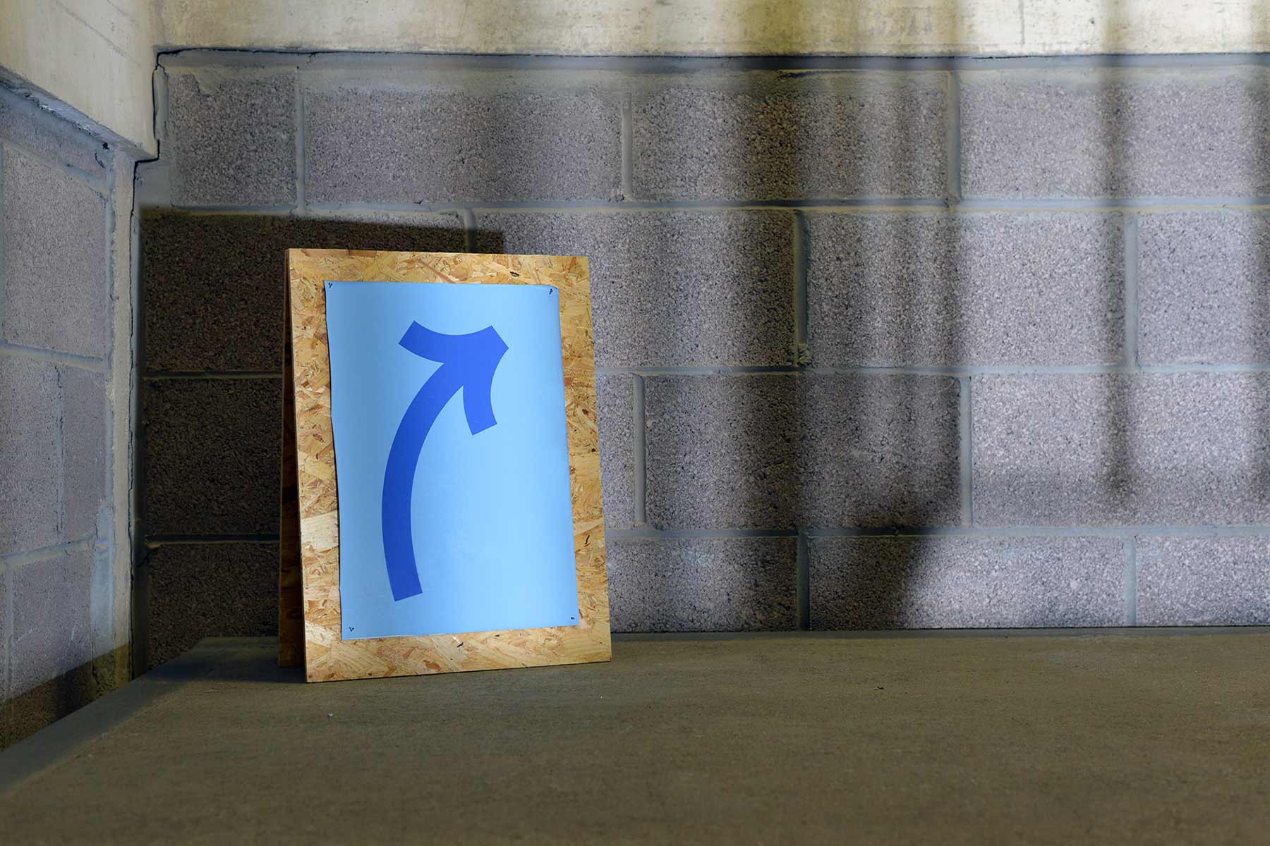
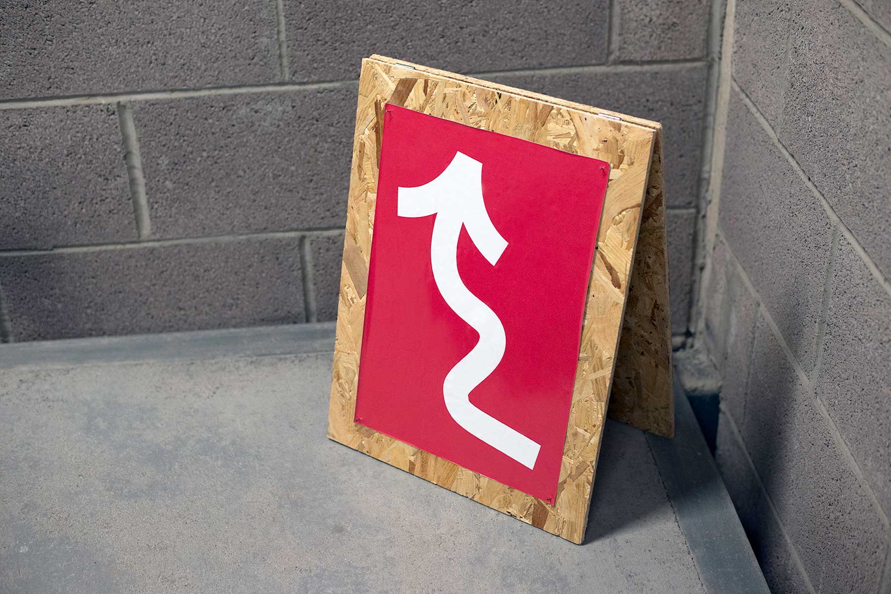
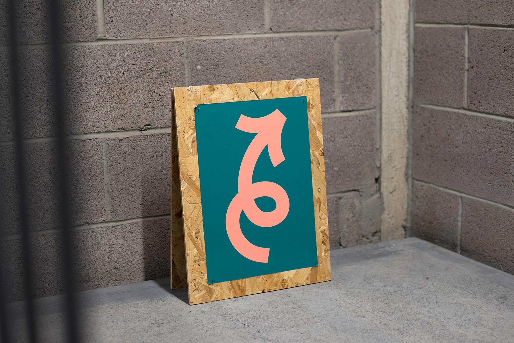
We developed an identity for THYPE, to be used across print and digital promotion, employing bold colours, playful typography, a family portrait and a simple way finding system.
Featured on It's Nice That and Étapes.

-
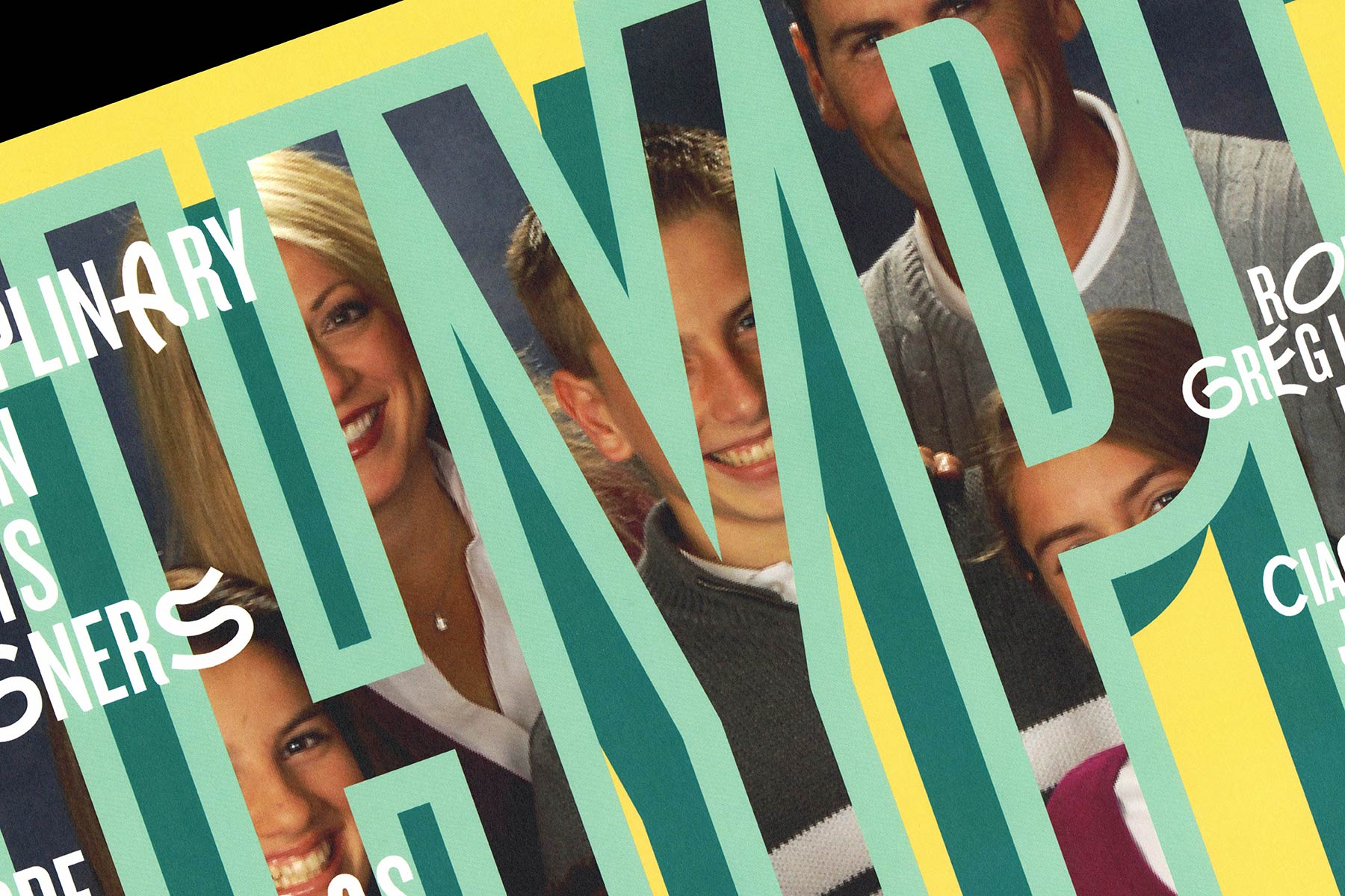
Using typography was a logical decision but introducing a family portrait brought a personal quality and also an element of intrigue.
The portrait represents the close relationship between the artists through their area of work but also ‘type family’ a term used to describe to a related group of fonts.
-
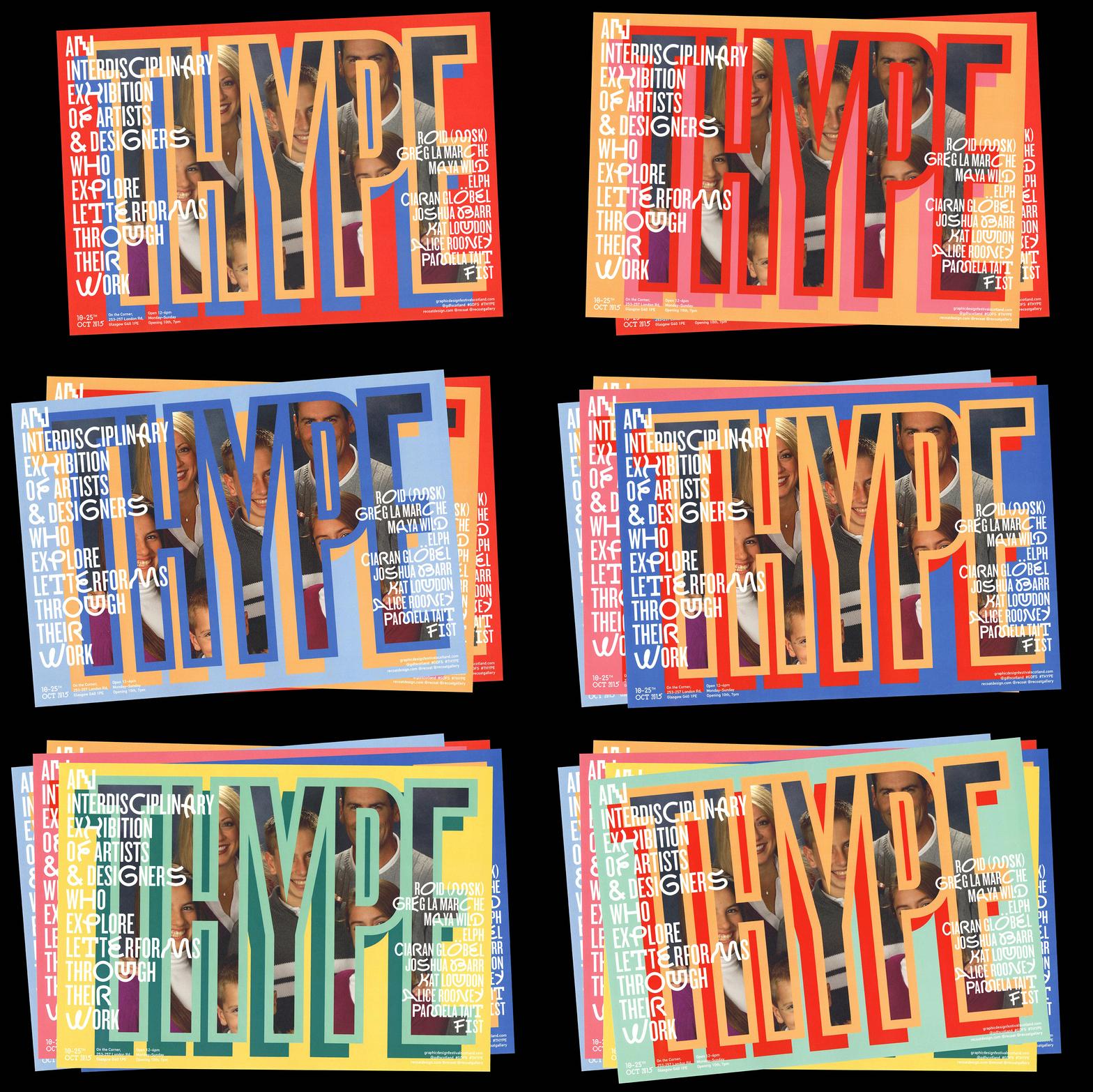
Many of the artists involved, create bold, colourful work, so we did the same.
Printing the posters digitally, allowed us to print 8 different colourways, which were carried into the artwork used for online marketing.
-
-
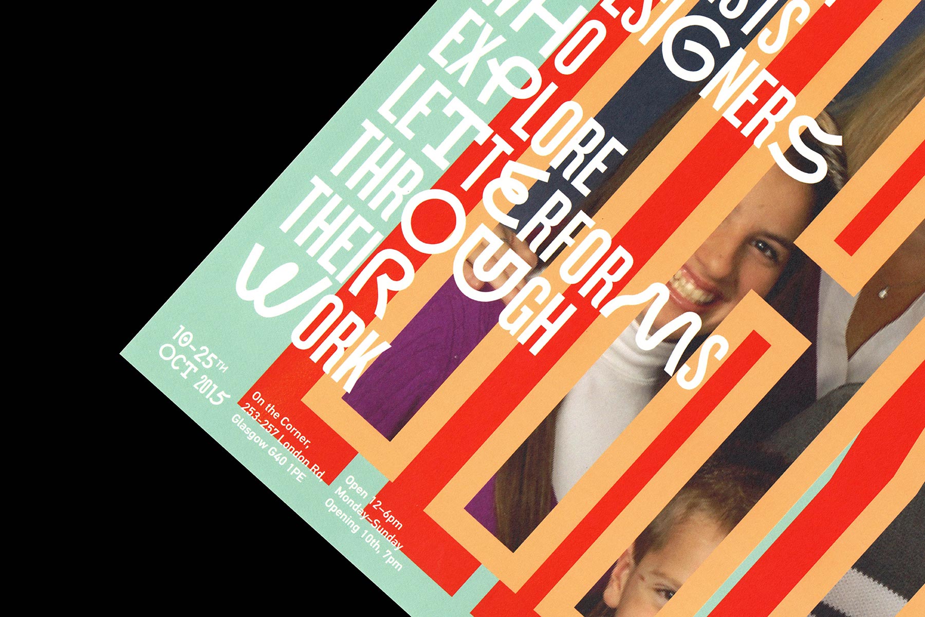
Zigzag, an experimental display font designed by Benoît Bodhuin, gives the lettering playful energy and a human characteristic.
Several of the artists also come from a background in street art or graffiti, so it was important for us to capture this.
-
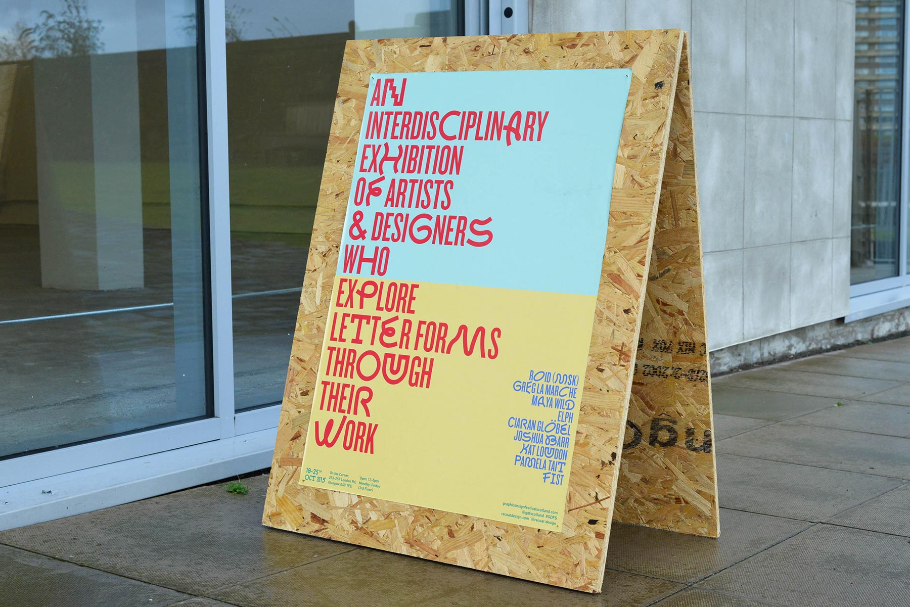
We designed a simple way finding system of sandwich boards and posters, which was both effective and cost efficient.
-
-
-
-
-
-
-
