Wikipedia
- identity
- web
- brand development
We were invited by Icon Magazine popup: yes to redesign something which we thought needs updating, has been designed badly or has a problem which needs solving. The project was published in the April 2015 edition as part of Icon's Rethink project and can be viewed online here popup: yes.
We want to take a positive step towards improving Wikipedia popup: yes's visual identity and offer alternative solutions to how the information could be organised, displayed and navigated. We consider this to be only an initial proposal as we realise that this project would be a mammoth undertaking!
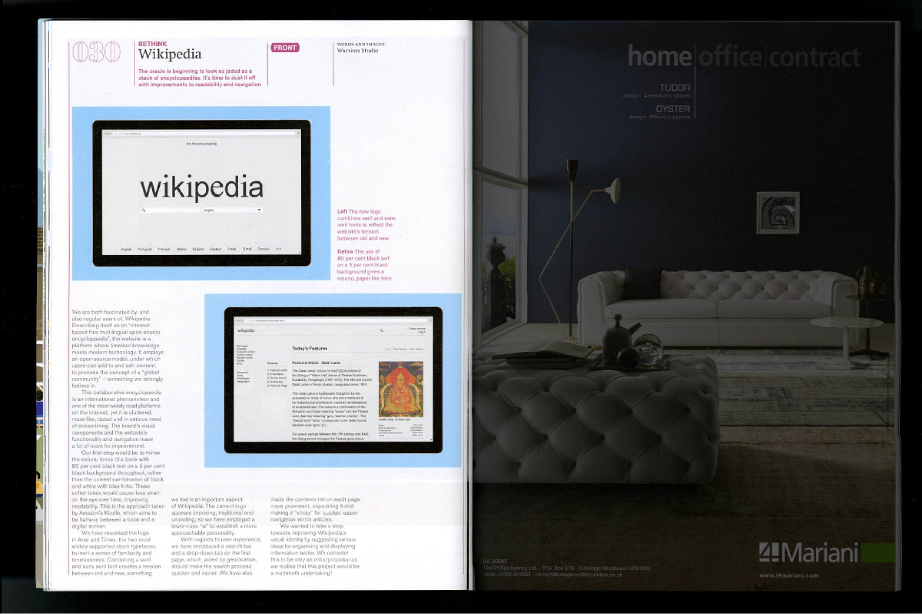
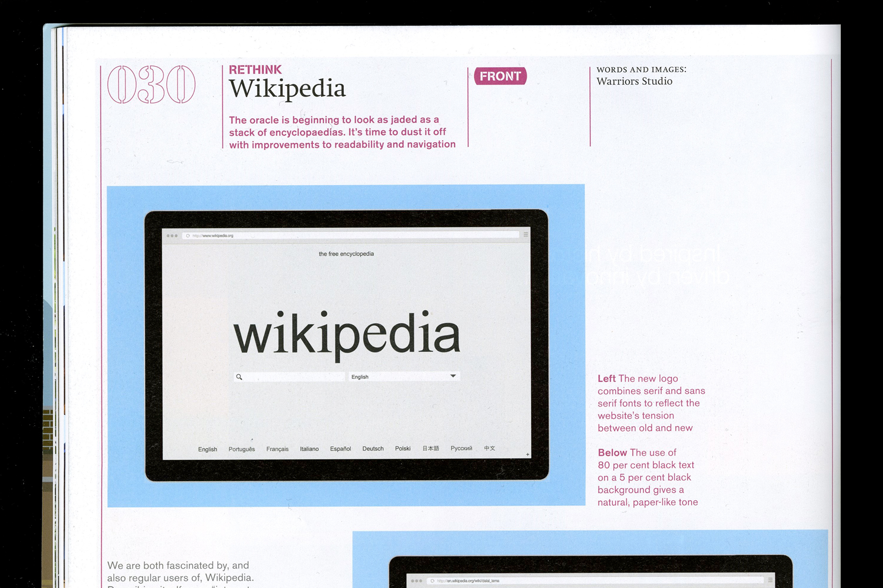
We are both fascinated by, and also regular users of, Wikipedia. Describing itself as an “internet-based free multilingual open-source encyclopedia”, the website is a platform where timeless knowledge meets modern technology. It employs an open-source model, under which users can add to and edit content, promoting the concept of a “global community” - something we strongly believe in.
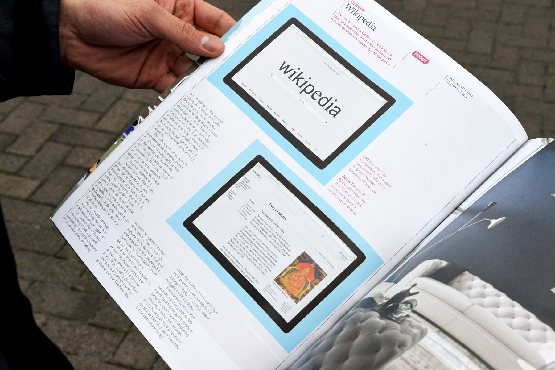
Aspects we redesigned include the logo, typography, colour palette and also the interface, making it more user-friendly by reconsidering the menu options, making better use of the contents section, improving image organisation, simplifying the navigation and improving the article's readability.
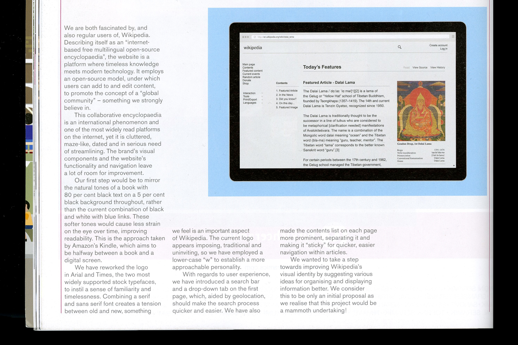
This collaborative encyclopedia is an international phenomenon and one of the most widely read platforms on the internet, yet it is cluttered, maze-like, dated and in serious need of streamlining.
-
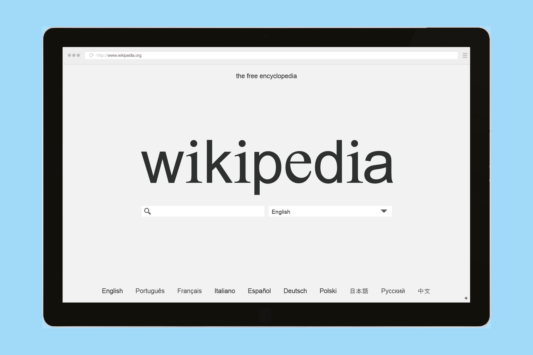
With regards to user experience, we have introduced a search bar and a drop-down tab on the first page, which aided by geolocation, should make the search process quicker and easier. We have also made the contents list on each page more prominent, separating it and making it “sticky” for quicker, easier navigation within articles.
-
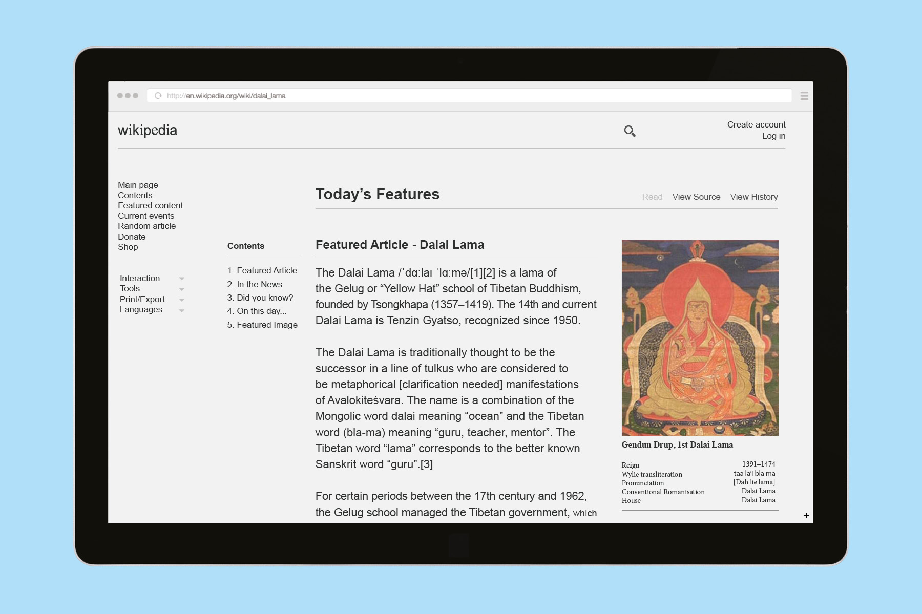
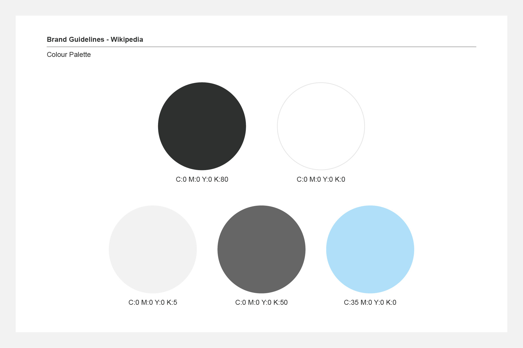
To improve readability, we mirrored the natural tones of a book with 80% black text on a 5% black background throughout, rather than the current combination of 100% black on white with blue.
These softer tones would cause less strain on the eye over time. This is the approach taken by Amazon’s kindle, which aims to exist halfway between a book and a digital screen.
-
-
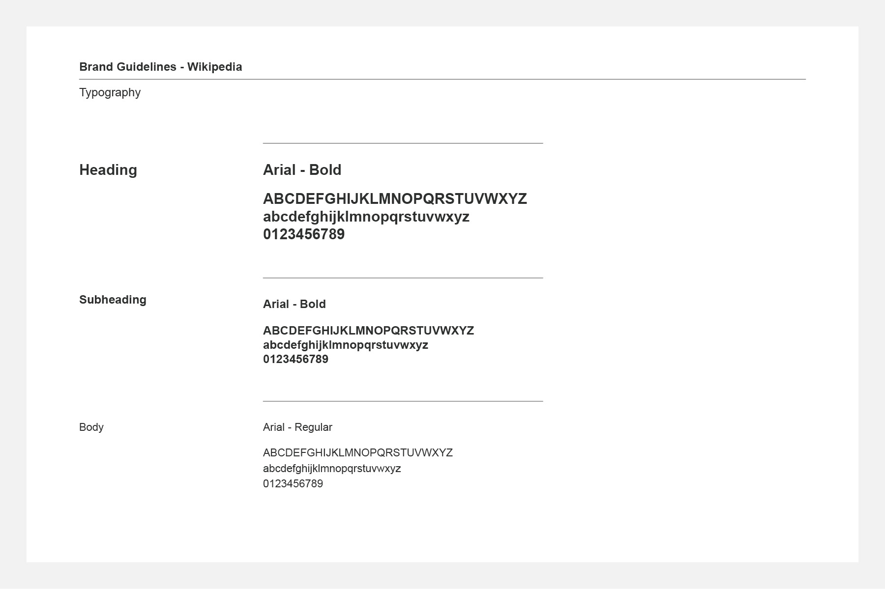
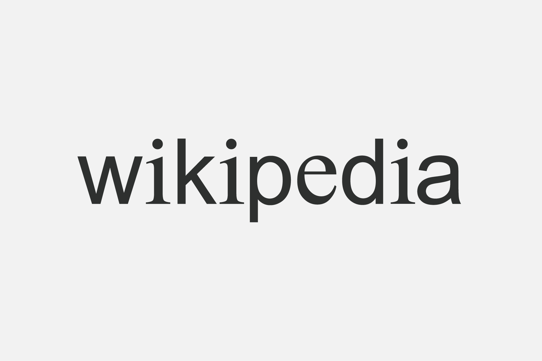
We have reworked the logo in Arial and Times, the two most widely supported stock typefaces, to instill a sense of familiarity and timelessness. Combining a serif and sans serif font creates a tension between old and new, something we feel is an important aspect of Wikipedia. The current logo appears imposing, traditional and uninviting, so we have employed a lowercase ‘w’ to establish a more approachable personality.
-
-
-
-
-
-